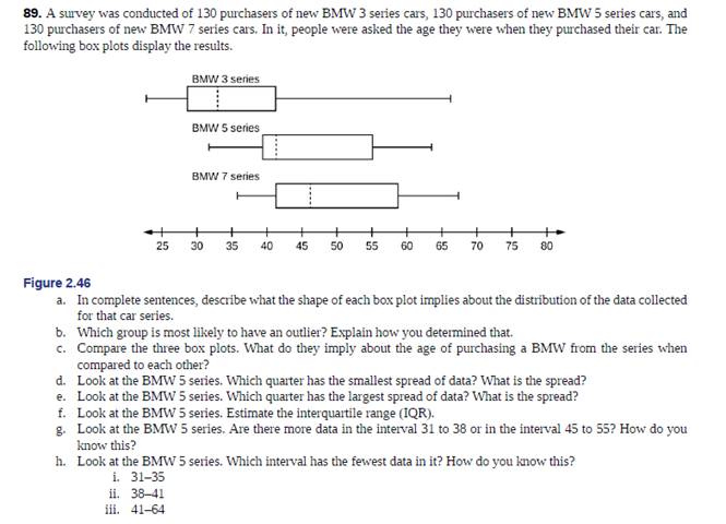
A survey was conducted of 130 purchases of new BMW 3 series cars, 130 purchasers of new BNIVV 5 series cars, and 130 purchasers of new BMW 7 series cars. In it, people were asked the age they were when they purchased their car. The following box plots display the results. Figure 2.46 In complete sentences, describe what the of each box plot implies about the distribution of the data collected for that car series. b. Which group is most likely to have an outlier? Explain how you determined that. c. Compare the three box plots. What do they simply about the age of purchasing a BMW from the series when compared to each other? d. Look at the BMW 5 series. Which quarter has the smallest spread of data? What is the spread? e. Look at the BMW 5 series. Which quarter has the largest spread of data? What is the spread? f. Look at the BMW 5 series. Estimate the interquartile range (IQR). g. Look at the BMW 5 series. Are there more data in the interval 31 to 38 or in the interval 45 to 55? How do you know this? h. Look at the BMW 5 series. Which interval has the fewest data in it? How do you know this? i. 31-35 ii. 38-41 iii. 41-64
A survey was conducted of 130 purchases of new BMW 3 series cars, 130 purchasers of new BNIVV 5 series cars, and 130 purchasers of new BMW 7 series cars. In it, people were asked the age they were when they purchased their car. The following box plots display the results. Figure 2.46 In complete sentences, describe what the of each box plot implies about the distribution of the data collected for that car series. b. Which group is most likely to have an outlier? Explain how you determined that. c. Compare the three box plots. What do they simply about the age of purchasing a BMW from the series when compared to each other? d. Look at the BMW 5 series. Which quarter has the smallest spread of data? What is the spread? e. Look at the BMW 5 series. Which quarter has the largest spread of data? What is the spread? f. Look at the BMW 5 series. Estimate the interquartile range (IQR). g. Look at the BMW 5 series. Are there more data in the interval 31 to 38 or in the interval 45 to 55? How do you know this? h. Look at the BMW 5 series. Which interval has the fewest data in it? How do you know this? i. 31-35 ii. 38-41 iii. 41-64
A survey was conducted of 130 purchases of new BMW 3 series cars, 130 purchasers of new BNIVV 5 series cars, and 130 purchasers of new BMW 7 series cars. In it, people were asked the age they were when they purchased their car. The
following box plots display the results.
Figure 2.46
In complete sentences, describe what the of each box plot implies about the distribution of the data collected for that car series.
b. Which group is most likely to have an outlier? Explain how you determined that.
c. Compare the three box plots. What do they simply about the age of purchasing a BMW from the series when compared to each other?
d. Look at the BMW 5 series. Which quarter has the smallest spread of data? What is the spread?
e. Look at the BMW 5 series. Which quarter has the largest spread of data? What is the spread?
f. Look at the BMW 5 series. Estimate the interquartile range (IQR).
g. Look at the BMW 5 series. Are there more data in the interval 31 to 38 or in the interval 45 to 55? How do you know this?
h. Look at the BMW 5 series. Which interval has the fewest data in it? How do you know this?
Consider an event X comprised of three outcomes whose probabilities are 9/18, 1/18,and 6/18.
Compute the probability of the complement of the event.
Question content area bottom
Part 1
A.1/2
B.2/18
C.16/18
D.16/3
John and Mike were offered mints. What is the probability that at least John or Mike would respond favorably? (Hint: Use the classical definition.)
Question content area bottom
Part 1
A.1/2
B.3/4
C.1/8
D.3/8
The details of the clock sales at a supermarket for the past 6 weeks are shown in the table below. The time series appears to be relatively stable, without trend, seasonal, or cyclical effects. The simple moving average value of k is set at 2. What is the simple moving average root mean square error? Round to two decimal places.
Week
Units sold
1
88
2
44
3
54
4
65
5
72
6
85
Question content area bottom
Part 1
A.
207.13
B.
20.12
C.
14.39
D.
0.21
Need a deep-dive on the concept behind this application? Look no further. Learn more about this topic, statistics and related others by exploring similar questions and additional content below.
Which is the best chart: Selecting among 14 types of charts Part II; Author: 365 Data Science;https://www.youtube.com/watch?v=qGaIB-bRn-A;License: Standard YouTube License, CC-BY


 Glencoe Algebra 1, Student Edition, 9780079039897...AlgebraISBN:9780079039897Author:CarterPublisher:McGraw Hill
 Holt Mcdougal Larson Pre-algebra: Student Edition...AlgebraISBN:9780547587776Author:HOLT MCDOUGALPublisher:HOLT MCDOUGAL
 Big Ideas Math A Bridge To Success Algebra 1: Stu...AlgebraISBN:9781680331141Author:HOUGHTON MIFFLIN HARCOURTPublisher:Houghton Mifflin Harcourt