Concept explainers
To determine: The difference shown by the second set of sample from the first one.
Introduction
Company TT is a division of company DM. It was about to launch a new product. Ms. MY, the
Table 1
| Sample | Mean | Range |
| 1 | 45.01 | 0.85 |
| 2 | 44.99 | 0.89 |
| 3 | 45.02 | 0.86 |
| 4 | 45 | 0.91 |
| 5 | 45.04 | 0.87 |
| 6 | 44.98 | 0.9 |
| 7 | 44.91 | 0.86 |
| 8 | 45.04 | 0.89 |
| 9 | 45 | 0.85 |
| 10 | 44.97 | 0.91 |
| 11 | 45.11 | 0.84 |
| 12 | 44.96 | 0.87 |
| 13 | 45 | 0.86 |
| 14 | 44.92 | 0.89 |
| 15 | 45.06 | 0.87 |
| 16 | 44.94 | 0.86 |
| 17 | 45 | 0.85 |
| 18 | 45.03 | 0.88 |
Quiet disappointed with the end results, the manager was figuring out ways to improve the process and free the capital expenditure of $10,000. A former professor suggested going for more samples with less sample sizes. JM conducted the analysis on 27 samples of 5 observations each and the results are tabulated below:
Table 2
| Sample | Mean | Range |
| 1 | 44.96 | 0.42 |
| 2 | 44.98 | 0.39 |
| 3 | 44.96 | 0.41 |
| 4 | 44.97 | 0.37 |
| 5 | 45.02 | 0.39 |
| 6 | 45.03 | 0.4 |
| 7 | 45.04 | 0.39 |
| 8 | 45.02 | 0.42 |
| 9 | 45.08 | 0.38 |
| 10 | 45.12 | 0.4 |
| 11 | 45.07 | 0.41 |
| 12 | 45.02 | 0.38 |
| 13 | 45.01 | 0.41 |
| 14 | 44.98 | 0.4 |
| 15 | 45 | 0.39 |
| 16 | 44.95 | 0.41 |
| 17 | 44.94 | 0.43 |
| 18 | 44.94 | 0.4 |
| 19 | 44.87 | 0.38 |
| 20 | 44.95 | 0.41 |
| 21 | 44.93 | 0.39 |
| 22 | 44.96 | 0.41 |
| 23 | 44.99 | 0.4 |
| 24 | 45 | 0.44 |
| 25 | 45.03 | 0.42 |
| 26 | 45.04 | 0.38 |
| 27 | 45.03 | 0.4 |
Answer to Problem 2.2CQ
Explanation of Solution
Given information:
Table 3
| Sample | Mean | Range |
| 1 | 45.01 | 0.85 |
| 2 | 44.99 | 0.89 |
| 3 | 45.02 | 0.86 |
| 4 | 45 | 0.91 |
| 5 | 45.04 | 0.87 |
| 6 | 44.98 | 0.9 |
| 7 | 44.91 | 0.86 |
| 8 | 45.04 | 0.89 |
| 9 | 45 | 0.85 |
| 10 | 44.97 | 0.91 |
| 11 | 45.11 | 0.84 |
| 12 | 44.96 | 0.87 |
| 13 | 45 | 0.86 |
| 14 | 44.92 | 0.89 |
| 15 | 45.06 | 0.87 |
| 16 | 44.94 | 0.86 |
| 17 | 45 | 0.85 |
| 18 | 45.03 | 0.88 |
Formula:
Mean Chart:
Difference shown by the second set of sample from the first one:
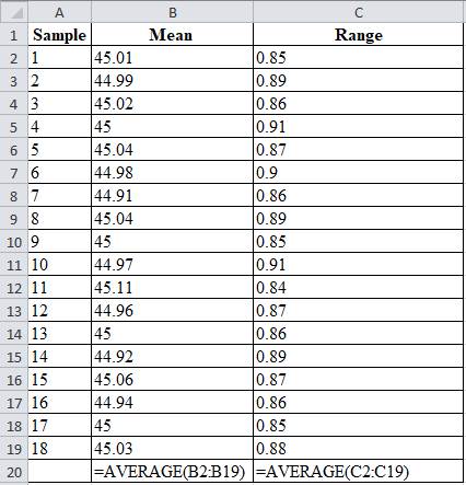
Date set:1
Table 4
| Sample | Mean | Range |
| 1 | 45.01 | 0.85 |
| 2 | 44.99 | 0.89 |
| 3 | 45.02 | 0.86 |
| 4 | 45 | 0.91 |
| 5 | 45.04 | 0.87 |
| 6 | 44.98 | 0.9 |
| 7 | 44.91 | 0.86 |
| 8 | 45.04 | 0.89 |
| 9 | 45 | 0.85 |
| 10 | 44.97 | 0.91 |
| 11 | 45.11 | 0.84 |
| 12 | 44.96 | 0.87 |
| 13 | 45 | 0.86 |
| 14 | 44.92 | 0.89 |
| 15 | 45.06 | 0.87 |
| 16 | 44.94 | 0.86 |
| 17 | 45 | 0.85 |
| 18 | 45.03 | 0.88 |
| 45 | 0.872777778 |
Excel worksheet:

From factors of three-sigma chart, for n=20, A2 = 0.18; D3 = 0.41; D4 = 1.59
Mean control chart:
Range control chart:
Upper control limit:
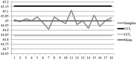
The upper control limit is calculated by adding the product of 0.18 and 0.873 with 45, which yields 45.156.
Lower control limit:
The lower control limit is calculated by subtracting the product of 0.18 and 0.873 with 45, which yields 44.842.
A graph is plotted using the UCL, LCL and samples values.

Diagram 1
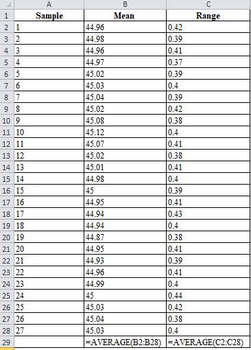
Date set: 2
Table 5
| Sample | Mean | Range |
| 1 | 44.96 | 0.42 |
| 2 | 44.98 | 0.39 |
| 3 | 44.96 | 0.41 |
| 4 | 44.97 | 0.37 |
| 5 | 45.02 | 0.39 |
| 6 | 45.03 | 0.4 |
| 7 | 45.04 | 0.39 |
| 8 | 45.02 | 0.42 |
| 9 | 45.08 | 0.38 |
| 10 | 45.12 | 0.4 |
| 11 | 45.07 | 0.41 |
| 12 | 45.02 | 0.38 |
| 13 | 45.01 | 0.41 |
| 14 | 44.98 | 0.4 |
| 15 | 45 | 0.39 |
| 16 | 44.95 | 0.41 |
| 17 | 44.94 | 0.43 |
| 18 | 44.94 | 0.4 |
| 19 | 44.87 | 0.38 |
| 20 | 44.95 | 0.41 |
| 21 | 44.93 | 0.39 |
| 22 | 44.96 | 0.41 |
| 23 | 44.99 | 0.4 |
| 24 | 45 | 0.44 |
| 25 | 45.03 | 0.42 |
| 26 | 45.04 | 0.38 |
| 27 | 45.03 | 0.4 |
| 44.9959 | 0.40111 |
Excel worksheet:

From factors of three-sigma chart, for n=20, A2 = 0.58
Mean control chart:
Range control chart:
Upper control limit:
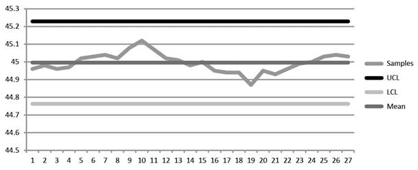
The upper control limit is calculated by adding the product of 0.58 and 0.401 with 44.99, which yields 45.229.
Lower control limit:
The lower control limit is calculated by subtracting the product of 0.58 and 0.401 with 44.99, which yields 44.763.

Diagram 2
On comparing Diagrams 1 and 2, it is evident that the second set of data has closer range of changes while the first set of data is scattered and reveals no information about the changes in the process.
Hence, the second sample reveals the changes in the process changes more clearly than the first set of data.
Want to see more full solutions like this?
Chapter 10 Solutions
Operations Management
- Choose a specific cars company. E.g Toyota, Volkswagen, Hyundai, Mercedes-Benz, BMW, Honda, Ford, Audi, Tesla Define a list of required machinery, equipment, workstations, offices, rest areas, materials, etc. Develop and define the location of machinery, equipment, workstations, offices, rest areas, materials. Make the distribution in the manufacturing facility the most efficient way possible. Develop a process distribution for one specific product. Explain why you consider this is the most efficient distribution for this specific manufacturing facility. demonstrate the benefits of optimizing a production line with the best distribution of its equipment and spaces. To be more productive and profitable.arrow_forwardProvide a Synposis of the Articlearrow_forwardThe goal of understanding personality in negotiation is to better predict behavior, such as the counterparty's acceptance or rejection of a negotiation offer. One investigation used acoustic and visual cues to predict the likely behavior of a counterparty to a proposal. The best visual cue predictor of the counterparty (55%) was whether they _____. A. tilted their head B. had their arms and legs crossed C. steepled their fingers D. tapped a penarrow_forward
- Women who ask for what they want in negotiation are less well-liked than women who do not self-advocate. However, nonassertive, other-advocating women suffer a leadership backlash and are regarded as less competent because their behavior is regarded to be _____ and _____. A. high-negative feminine; low-positive masculine B. high-positive feminine; high-positive masculine C. high-negative masculine; low-negative feminine D. low-positive masculine; low-positive femininearrow_forwardThere are five most recognized personality traits that can reliably be measured and predict negotiator behavior in a number of different situations. All of the following are one of those "Big 5" personality traits except _____. A. conscientiousness B. introversion C. agreeableness D. openness to experiencearrow_forwardWith regard to reputation in negotiation, negotiators who use adversarial, stubborn, and ethically questionable behavior often have the effect of _____. A. improving their business relationships B. decreasing their effectiveness as a negotiator C. improving their business relationships D. decreasing their group statusarrow_forward
- When it comes to assertiveness, there is only a modest link between negotiators' self-views and how the counterparty sees them. Many negotiators come away from a negotiation thinking they came on too strong with the counterparty. The _____ refers to the fact that negotiators believe they are coming on too strong with the counterparty, but they actually are not. A. Collective trap illusion B. Attribution error C. Aggressive anchoring bias D. Line-crossing illusionarrow_forwardAs you think about the issue of using chatbots in contract negotiations, consider whether other facets and concepts of negotiations that we have discussed and whether they would be adequately addressed.arrow_forwardWhile I am not a fan of AI as of yet, I do understand the endless possibilities. Based on the research, it is clear that AI has great potential for negotiation (Yang, 2025). Herold et al. (2025) suggested that AI can flag potential risks and liabilities, allowing negotiators to address them and mitigate potential problems proactively. AI can draft new contract templates by examining industry standards and past contracts, and AI technology can help lawyers spot errors and inconsistencies in contract drafts. In relation to risk management, AI can flag possible risks and liabilities, allowing negotiators to proactively address them and lessen potential problems, which can speed up the negotiation process, making the negotiation efficient because AI can industrialize tasks like document review, redlining, and finding potential issues, significantly reducing negotiation time. Lastly, AI can analyze vast amounts of data and identify errors, inconsistencies, and irregularities in…arrow_forward
- What is a main thought on using AI in contract negotiations?arrow_forwardWhat are some people thoughts on using AI in contract negotiations?arrow_forward3. Develop a high-level or summary: a. Risk Management Plan Focus on specific, actionable steps for each risk and mitigation strategy.Provide detailed timelines for procurement, stakeholder engagement, and risk monitoring.Avoid over-simplifying and add more technical details in areas like quality assurance and financial control measures. Add a risk prioritization method and mention how risks will be monitored and reviewed throughout the project lifecycle. Overall, it is well organized andc overs key risks.arrow_forward
 Practical Management ScienceOperations ManagementISBN:9781337406659Author:WINSTON, Wayne L.Publisher:Cengage,
 Foundations of Business (MindTap Course List)MarketingISBN:9781337386920Author:William M. Pride, Robert J. Hughes, Jack R. KapoorPublisher:Cengage Learning
 Foundations of Business - Standalone book (MindTa...MarketingISBN:9781285193946Author:William M. Pride, Robert J. Hughes, Jack R. KapoorPublisher:Cengage Learning


