Concept explainers
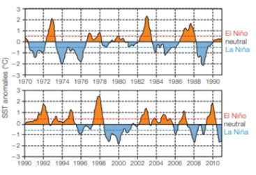
Sea Temperature To predict the effect of El Niño or La Niña events in the future, the National Oceanographic and Atmospheric Administration collects information about sea surface temperature (SST) and atmospheric conditions. They compare monthly temperature averages in the eastern equatorial Pacific Ocean to historical data and calculate the difference (the degree of anomaly) to determine if El Niño conditions, La Niña conditions, or neutral conditions are developing. El Niño is a rise in the average SST above 0.5°C. A decline of the same amount is La Niña. FIGURE 47.8 shows data for 42 years.

FIGURE 47.8 Sea surface temperature anomalies (difference from the historical mean) in the eastern equatorial Pacific Ocean. A rise above the dashed red line is an El Niño event, a decline below the blue line is La Niña
What type or conditions were in effect in the fall of 2007 when California suffered severe wildfires?
Want to see the full answer?
Check out a sample textbook solution
Chapter 47 Solutions
Biology: The Unity and Diversity of Life (MindTap Course List)
- How many milligrams of zinc did you consume on average per day over the 3 days? (See the Actual Intakes vs. Recommended Intakes Report with all days checked.) Enter the number of milligrams of zinc rounded to the first decimal place in the box below. ______ mg ?arrow_forwardthe direct output from molecular replacement is a coordinate file showing the orientation of the unknown target protein in the unit cell. true or false?arrow_forwardthe direct output from molecular replacement is a coordinate file showing the orientation of the unknown target protein in the unit cell. true or false?arrow_forward
- Did your intake of vitamin C meet or come very close to the recommended amount? yes noarrow_forwardWhich of the following statements about hydration is true? Absence of thirst is a reliable indication that an individual is adequately hydrated. All of these statements are true. Although a popular way to monitor hydration status, weighing yourself before and after intensive physical activity is not a reliable method to monitor hydration. Urine that is the color of apple juice indicates dehydration. I don't know yetarrow_forwardThree of the many recessive mutations in Drosophila melanogaster that affect body color, wing shape, or bristle morphology are black (b) body versus grey in wild type, dumpy (dp), obliquely truncated wings versus long wings in the male, and hooked (hk) bristles versus not hooked in the wild type. From a cross of a dumpy female with a black and hooked male, all of the F1 were wild type for all three of the characters. The testcross of an F1 female with a dumpy, black, hooked male gave the following results: Trait Number of individuals Wild type 169 Black 19 Black, hooked 301 Dumpy, hooked 21 Hooked, dumpy, black 172 Dumpy, black 6 Dumpy 305 Hooked 8 Determine the order of the genes and the mapping distance between genes. Determine the coefficient of confidence for the portion of the chromosome involved in the cross. How much interference takes place in the cross?arrow_forward
- What happens to a microbes membrane at colder temperature?arrow_forwardGenes at loci f, m, and w are linked, but their order is unknown. The F1 heterozygotes from a cross of FFMMWW x ffmmww are test crossed. The most frequent phenotypes in the test cross progeny will be FMW and fmw regardless of what the gene order turns out to be. What classes of testcross progeny (phenotypes) would be least frequent if locus m is in the middle? What classes would be least frequent if locus f is in the middle? What classes would be least frequent if locus w is in the middle?arrow_forward1. In the following illustration of a phospholipid... (Chemistry Primer and Video 2-2, 2-3 and 2-5) a. Label which chains contain saturated fatty acids and non-saturated fatty acids. b. Label all the areas where the following bonds could form with other molecules which are not shown. i. Hydrogen bonds ii. Ionic Bonds iii. Hydrophobic Interactions 12-6 HICIH HICIH HICHH HICHH HICIH OHHHHHHHHHHHHHHHHH C-C-C-C-C-c-c-c-c-c-c-c-c-c-c-c-C-C-H HH H H H H H H H H H H H H H H H H H HO H-C-O H-C-O- O O-P-O-C-H H T HICIH HICIH HICIH HICIH HHHHHHH HICIH HICIH HICIH 0=C HIC -C-C-C-C-C-C-C-C-CC-C-C-C-C-C-C-C-C-H HHHHHHHHH IIIIIIII HHHHHHHH (e-osbiv)arrow_forward
 Biology: The Unity and Diversity of Life (MindTap...BiologyISBN:9781305073951Author:Cecie Starr, Ralph Taggart, Christine Evers, Lisa StarrPublisher:Cengage Learning
 Biology Today and Tomorrow without Physiology (Mi...BiologyISBN:9781305117396Author:Cecie Starr, Christine Evers, Lisa StarrPublisher:Cengage Learning
 Biology: The Unity and Diversity of Life (MindTap...BiologyISBN:9781337408332Author:Cecie Starr, Ralph Taggart, Christine Evers, Lisa StarrPublisher:Cengage LearningCase Studies In Health Information ManagementBiologyISBN:9781337676908Author:SCHNERINGPublisher:Cengage


