Number of College Faculty The number of faculty listed for a sample of private colleges that offer only bachelor’s degrees is listed below. Use these data to construct a frequency distribution with 7 classes, a histogram, a frequency

A grouped frequency distribution with 7 classes and draw a histogram, frequency polygon, and ogive; the explanation of these shapes and calculate the proportions of schools that have 180 or more faculty.
Answer to Problem 4E
Output using EXCEL software is given below:
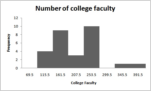
Histogram:

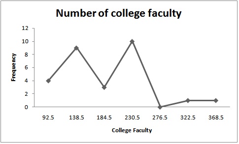
Frequency polygon:

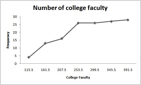
Ogive:

The proportion of schools that has 180 or more faculty is 0.448.
Explanation of Solution
Given info:
The data shows the number of college faculty listed in the table is given below:
| 165 | 221 | 218 | 206 | 138 | 135 | 224 | 204 |
| 70 | 210 | 207 | 154 | 155 | 82 | 120 | 116 |
| 176 | 162 | 225 | 214 | 93 | 389 | 77 | 135 |
| 221 | 161 | 128 | 310 |
Calculation:
The class boundaries for any class are given by:
Where,
The grouped frequency distribution is as follows:
| Class limit | Class boundaries | Tally | Frequency |
| 70-115 | 69.5-115.5 |
|
4 |
| 116-161 | 115.5-161.5 |
|
9 |
| 162-207 | 161.5-207.5 |
|
3 |
| 208-253 | 207.5-253.5 |
|
10 |
| 254-299 | 253.5-299.5 | 0 | |
| 300-345 | 299.5-345.5 | | | 1 |
| 346-391 | 345.5-391.5 | | | 1 |
| Total | 28 |
The midpoint of class boundaries is obtained by adding lower and upper limit and dividing by 2.
The relative frequency is the ration of a class frequency to the total frequency. Cumulative relative frequency can also defined as the sum of all previous frequencies up to the current point.
| Class boundaries | Mid point | Frequency | Cumulative frequency |
| 69.5-115.5 | 92.5 | 4 | 4 |
| 115.5-161.5 | 138.5 | 9 | 13 |
| 161.5-207.5 | 184.5 | 3 | 16 |
| 207.5-253.5 | 230.5 | 10 | 26 |
| 253.5-299.5 | 276.5 | 0 | 26 |
| 299.5-345.5 | 322.5 | 1 | 27 |
| 345.5-391.5 | 368.5 | 1 | 28 |
The histogram is a graph that displays the data by using contiguous vertical bars of various heights to represent the frequencies of the classes.
| Upper Limit | Frequency |
| 69.5 | 0 |
| 115.5 | 4 |
| 161.5 | 9 |
| 207.5 | 3 |
| 253.5 | 10 |
| 299.5 | 0 |
| 345.5 | 1 |
| 391.5 | 1 |
Histogram:
Software procedure:
Step-by-step procedure to construct the histogram using EXCEL software is given below:
- Press [Ctrl]-N for a new workbook.
- Enter the data in column A, one number per cell.
- Enter the upper boundaries into column B.
- From the toolbar, select the Data tab, then select Data Analysis.
- In Data Analysis, select Histogram and click [OK].
- In the Histogram dialog box, select relative column in the Input Range box and select upper limit column in the Bin Range box.
- Select New Worksheet Ply and Chart Output. Click [OK].
The distribution is slightly symmetric as the histogram shows that majority of the data value fall around the mean of the data. And the frequency is maximum at 253.5 and minimum at 391.5.
Frequency polygon:
Software procedure:
Frequency polygons are a graphical device for understanding the shapes of distributions. They serve the same purpose as histograms, but are especially helpful for comparing sets of data.
Step-by-step procedure to construct the frequency polygon using EXCEL software is given below:
- Press [CTRL]-N for a new notebook.
- Enter the midpoints of the data into column A and the frequencies into column B including labels.
- Press and hold the left mouse button, and drag over the Frequencies (including the label) from column B.
- Select the Insert tab from the toolbar and the Line Chart option.
- Select the 2-D line chart type.
Ogive:
Software procedure:
Step-by-step procedure to construct the ogive using EXCEL software is given below:
- Create an ogive, use the upper class boundaries (horizontal axis) and cumulative frequencies (vertical axis) from the frequency distribution.
- Type the upper class boundaries (including a class with frequency 0 before the lowest class to anchor the graph to the horizontal axis) and
- Corresponding cumulative frequencies into adjacent columns of an Excel worksheet.
- Press and hold the left mouse button, and drag over the Cumulative Frequencies from column B.
- Select Line Chart, then the 2-D Line option.
The points plotted are the upper class limit and the corresponding cumulative frequency.
The observations are based on number of faculty is greater or equal to 180 given as:
| 224 | 204 | 210 | 207 | 225 | 214 | 389 | 221 | 310 |
The sum of the above observations is 2204.
The total observations for number of college faculty are given as:
| 165 | 221 | 218 | 206 | 138 | 135 | 224 | 204 |
| 70 | 210 | 207 | 154 | 155 | 82 | 120 | 116 |
| 176 | 162 | 225 | 214 | 93 | 389 | 77 | 135 |
| 221 | 161 | 128 | 310 |
The sum of all above observations is 4916.
The proportion is calculated by dividing 2204 with 4916, that is,
The value 0.448 is the proportion of schools that has 180 or more faculty
Want to see more full solutions like this?
Chapter 2 Solutions
Elementary Statistics: A Step By Step Approach
- A survey of 581 citizens found that 313 of them favor a new bill introduced by the city. We want to find a 95% confidence interval for the true proportion of the population who favor the bill. What is the lower limit of the interval? Enter the result as a decimal rounded to 3 decimal digits. Your Answer:arrow_forwardLet X be a continuous RV with PDF where a > 0 and 0 > 0 are parameters. verify that f-∞ /x (x)dx = 1. Find the CDF, Fx (7), of X.arrow_forward6. [20] Let X be a continuous RV with PDF 2(1), 1≤x≤2 fx(x) = 0, otherwisearrow_forward
- A survey of 581 citizens found that 313 of them favor a new bill introduced by the city. We want to find a 95% confidence interval for the true proportion of the population who favor the bill. What is the lower limit of the interval? Enter the result as a decimal rounded to 3 decimal digits. Your Answer:arrow_forwardA survey of 581 citizens found that 313 of them favor a new bill introduced by the city. We want to find a 95% confidence interval for the true proportion of the population who favor the bill. What is the lower limit of the interval? Enter the result as a decimal rounded to 3 decimal digits. Your Answer:arrow_forward2. The SMSA data consisting of 141 observations on 10 variables is fitted by the model below: 1 y = Bo+B1x4 + ẞ2x6 + ẞ3x8 + √1X4X8 + V2X6X8 + €. See Question 2, Tutorial 3 for the meaning of the variables in the above model. The following results are obtained: Estimate Std. Error t value Pr(>|t|) (Intercept) 1.302e+03 4.320e+02 3.015 0.00307 x4 x6 x8 x4:x8 x6:x8 -1.442e+02 2.056e+01 -7.013 1.02e-10 6.340e-01 6.099e+00 0.104 0.91737 -9.455e-02 5.802e-02 -1.630 0.10550 2.882e-02 2.589e-03 11.132 1.673e-03 7.215e-04 2.319 F) x4 1 3486722 3486722 17.9286 4.214e-05 x6 1 14595537 x8 x4:x8 x6:x8 1 132.4836 < 2.2e-16 1045693 194478 5.3769 0.02191 1 1198603043 1198603043 6163.1900 < 2.2e-16 1 25765100 25765100 1045693 Residuals 135 26254490 Estimated variance matrix (Intercept) x4 x6 x8 x4:x8 x6:x8 (Intercept) x4 x6 x8 x4:x8 x6:x8 0.18875694 1.866030e+05 -5.931735e+03 -2.322825e+03 -16.25142055 0.57188953 -5.931735e+03 4.228816e+02 3.160915e+01 0.61621781 -0.03608028 -0.00445013 -2.322825e+03…arrow_forward
- In some applications the distribution of a discrete RV, X resembles the Poisson distribution except that 0 is not a possible value of X. Consider such a RV with PMF where 1 > 0 is a parameter, and c is a constant. (a) Find the expression of c in terms of 1. (b) Find E(X). (Hint: You can use the fact that, if Y ~ Poisson(1), the E(Y) = 1.)arrow_forwardSuppose that X ~Bin(n,p). Show that E[(1 - p)] = (1-p²)".arrow_forwardI need help with this problem and an explanation of the solution for the image described below. (Statistics: Engineering Probabilities)arrow_forward
- I need help with this problem and an explanation of the solution for the image described below. (Statistics: Engineering Probabilities)arrow_forwardThis exercise is based on the following data on four bodybuilding supplements. (Figures shown correspond to a single serving.) Creatine(grams) L-Glutamine(grams) BCAAs(grams) Cost($) Xtend(SciVation) 0 2.5 7 1.00 Gainz(MP Hardcore) 2 3 6 1.10 Strongevity(Bill Phillips) 2.5 1 0 1.20 Muscle Physique(EAS) 2 2 0 1.00 Your personal trainer suggests that you supplement with at least 10 grams of creatine, 39 grams of L-glutamine, and 90 grams of BCAAs each week. You are thinking of combining Xtend and Gainz to provide you with the required nutrients. How many servings of each should you combine to obtain a week's supply that meets your trainer's specifications at the least cost? (If an answer does not exist, enter DNE.) servings of xtend servings of gainzarrow_forwardI need help with this problem and an explanation of the solution for the image described below. (Statistics: Engineering Probabilities)arrow_forward
 Glencoe Algebra 1, Student Edition, 9780079039897...AlgebraISBN:9780079039897Author:CarterPublisher:McGraw Hill
 Holt Mcdougal Larson Pre-algebra: Student Edition...AlgebraISBN:9780547587776Author:HOLT MCDOUGALPublisher:HOLT MCDOUGAL
 Big Ideas Math A Bridge To Success Algebra 1: Stu...AlgebraISBN:9781680331141Author:HOUGHTON MIFFLIN HARCOURTPublisher:Houghton Mifflin Harcourt


