Concept explainers
Videos
Construct a histogram, frequency
To construct: The histogram, frequency polygon, and ogive for given data.
Answer to Problem 2.2.9RE
The histogram, frequency polygon and Ogive shown below:
Histogram:
Frequency polygon:
Ogive:
Explanation of Solution
Given info: The given data is shown below,
| 90 | 420 | 300 | 194 |
| 640 | 68 | 268 | 276 |
| 620 | 76 | 165 | 833 |
| 370 | 53 | 132 | 600 |
| 594 | 70 | 308 | |
| 574 | 215 | 109 | |
| 317 | 850 | 212 | |
| 300 | 256 | 187 |
Calculation:
Step-by-step procedure to construct frequency distribution table is as follows:
The number of classes is 6.
Here the minimum number is 53 and maximum number is 850.
Thus, the range is,
Class width is obtained by dividing the range by the number of classes.
Thus,
Since, we have to make 6 classes for given data we take class width 135 for convenient.
Lower class limits:
The class limits are obtained by taking the minimum value or less than minimum value as lower limit for the first class. For second class, the lower limit is obtained by adding the class width to the previous class lower limit. That is,
Similarly, the lower limits for the remaining classes can be obtained.
Upper class limits:
For the first class, the upper limit is one less than the lower limit of the second class that is,
The other upper limits are obtained by adding the upper limit of the preceding class and the class width.
Thus, the lower class and upper class limits are as follows:
| Lower limit | Upper limit |
| 52.5 |
|
| 52.5+135=187.5 | 322.5 |
| 187.5+135=322.5 | 457.5 |
| 322.5+135=457.5 | 592.5 |
| 457.5+135=592.5 | 727.5 |
| 592.5+135=727.7 | 862.5 |
| 727.5+135=862.5 | 997.5 |
Make a tally mark for each entry in the corresponding class and continue for all number of children in the data.
The number of tally marks in each class represents the frequency, f of that class.
Thus, the frequency distribution table the distribution of declaration of independence is as follows,
| Class | Tally | Frequency
|
| 52.5-187.5 |
|
9 |
| 187.5-322.5 |
|
10 |
| 322.5-457.5 |
|
3 |
| 457.5-592.5 |
|
3 |
| 592.5-727.5 |
|
1 |
| 727.5-862.5 |
|
2 |
Relative frequency:
The portion of the data that falls in the corresponding class is relative frequency of that class.
Thus, the relative frequency for each class is tabulated below,
| Class | Frequency
|
Relative frequency |
| 52.5-187.5 | 9 |
|
| 187.5-322.5 | 10 |
|
| 322.5-457.5 | 3 |
|
| 457.5-592.5 | 3 |
|
| 592.5-727.5 | 1 |
|
| 727.5-862.5 | 2 |
|
| Total | 28 |
From the frequency table it is observed that maximum relative frequency is for class 187.5-322.5 and also frequency is maximum for that class.
Adding the frequency and write in next column.
Determine the mid value of class boundaries as taking average between the lower boundaries and higher boundaries.
Thus grouped frequency table for the given data is,
| Class | Frequency
|
Mid value | Cumulative frequency | Cumulative percentage |
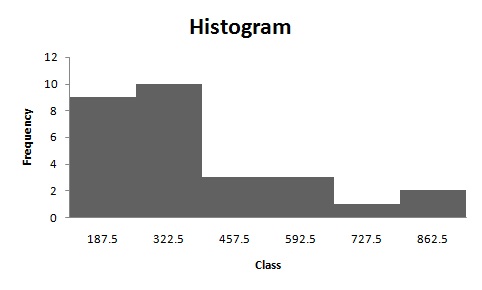
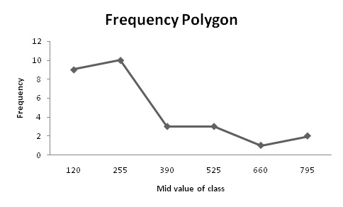
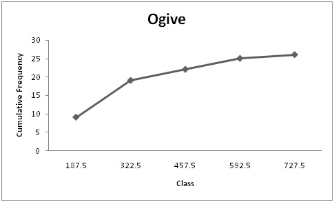
| 52.5-187.5 | 9 | 120 | 9 | 32.14 |
| 187.5-322.5 | 10 | 255 | 19 | 67.85 |
| 322.5-457.5 | 3 | 390 | 22 | 78.57 |
| 457.5-592.5 | 3 | 525 | 25 | 89.28 |
| 592.5-727.5 | 1 | 660 | 26 |
|
| 727.5-862.5 | 2 | 795 | 28 |
|
| Total | 28 |
Thus, the table shows the frequency distribution table for the given data.
Histogram:
Software procedure:
Step-by-step procedure to construct the histogram by using EXCEL is given below:
- Enter the data in column A of new worksheet, one number per cell.
- Enter the boundaries in column B.
- From the toolbar, select the Data tab, the select data analysis.
- In data analysis, select HISTOGRAM and click ok.
- In HISTOGRAM dialog box, type A1:A6 in the input range.
- Click ok and histogram shown below,
The shape of the distribution is positive skewed.
Frequency polygon:
Software procedure:
Step-by-step procedure to construct the histogram by using EXCEL is given below:
- Enter midpoint and frequency in column A and column B respectively.
- Select the insert tab from the toolbar and line chart option.
- Select 2-D line chart.
- Frequency polygon shown below,
The frequency polygon shows that distribution is positively skewed.
Ogive:
Software procedure:
- Enter upper class boundaries and cumulative frequency in column A and column B respectively.
- Select the insert tab from the toolbar and line chart option.
- Select 2-D line chart.
Therefore, from the ogive it can say that distribution is increasing in trend.
Want to see more full solutions like this?
Chapter 2 Solutions
Elementary Statistics: A Step By Step Approach


- Q.2.3 The probability that a randomly selected employee of Company Z is female is 0.75. The probability that an employee of the same company works in the Production department, given that the employee is female, is 0.25. What is the probability that a randomly selected employee of the company will be female and will work in the Production department? Q.2.4 There are twelve (12) teams participating in a pub quiz. What is the probability of correctly predicting the top three teams at the end of the competition, in the correct order? Give your final answer as a fraction in its simplest form.arrow_forwardQ.2.1 A bag contains 13 red and 9 green marbles. You are asked to select two (2) marbles from the bag. The first marble selected will not be placed back into the bag. Q.2.1.1 Construct a probability tree to indicate the various possible outcomes and their probabilities (as fractions). Q.2.1.2 What is the probability that the two selected marbles will be the same colour? Q.2.2 The following contingency table gives the results of a sample survey of South African male and female respondents with regard to their preferred brand of sports watch: PREFERRED BRAND OF SPORTS WATCH Samsung Apple Garmin TOTAL No. of Females 30 100 40 170 No. of Males 75 125 80 280 TOTAL 105 225 120 450 Q.2.2.1 What is the probability of randomly selecting a respondent from the sample who prefers Garmin? Q.2.2.2 What is the probability of randomly selecting a respondent from the sample who is not female? Q.2.2.3 What is the probability of randomly…arrow_forwardTest the claim that a student's pulse rate is different when taking a quiz than attending a regular class. The mean pulse rate difference is 2.7 with 10 students. Use a significance level of 0.005. Pulse rate difference(Quiz - Lecture) 2 -1 5 -8 1 20 15 -4 9 -12arrow_forward
- The following ordered data list shows the data speeds for cell phones used by a telephone company at an airport: A. Calculate the Measures of Central Tendency from the ungrouped data list. B. Group the data in an appropriate frequency table. C. Calculate the Measures of Central Tendency using the table in point B. D. Are there differences in the measurements obtained in A and C? Why (give at least one justified reason)? I leave the answers to A and B to resolve the remaining two. 0.8 1.4 1.8 1.9 3.2 3.6 4.5 4.5 4.6 6.2 6.5 7.7 7.9 9.9 10.2 10.3 10.9 11.1 11.1 11.6 11.8 12.0 13.1 13.5 13.7 14.1 14.2 14.7 15.0 15.1 15.5 15.8 16.0 17.5 18.2 20.2 21.1 21.5 22.2 22.4 23.1 24.5 25.7 28.5 34.6 38.5 43.0 55.6 71.3 77.8 A. Measures of Central Tendency We are to calculate: Mean, Median, Mode The data (already ordered) is: 0.8, 1.4, 1.8, 1.9, 3.2, 3.6, 4.5, 4.5, 4.6, 6.2, 6.5, 7.7, 7.9, 9.9, 10.2, 10.3, 10.9, 11.1, 11.1, 11.6, 11.8, 12.0, 13.1, 13.5, 13.7, 14.1, 14.2, 14.7, 15.0, 15.1, 15.5,…arrow_forwardPEER REPLY 1: Choose a classmate's Main Post. 1. Indicate a range of values for the independent variable (x) that is reasonable based on the data provided. 2. Explain what the predicted range of dependent values should be based on the range of independent values.arrow_forwardIn a company with 80 employees, 60 earn $10.00 per hour and 20 earn $13.00 per hour. Is this average hourly wage considered representative?arrow_forward
- The following is a list of questions answered correctly on an exam. Calculate the Measures of Central Tendency from the ungrouped data list. NUMBER OF QUESTIONS ANSWERED CORRECTLY ON AN APTITUDE EXAM 112 72 69 97 107 73 92 76 86 73 126 128 118 127 124 82 104 132 134 83 92 108 96 100 92 115 76 91 102 81 95 141 81 80 106 84 119 113 98 75 68 98 115 106 95 100 85 94 106 119arrow_forwardThe following ordered data list shows the data speeds for cell phones used by a telephone company at an airport: A. Calculate the Measures of Central Tendency using the table in point B. B. Are there differences in the measurements obtained in A and C? Why (give at least one justified reason)? 0.8 1.4 1.8 1.9 3.2 3.6 4.5 4.5 4.6 6.2 6.5 7.7 7.9 9.9 10.2 10.3 10.9 11.1 11.1 11.6 11.8 12.0 13.1 13.5 13.7 14.1 14.2 14.7 15.0 15.1 15.5 15.8 16.0 17.5 18.2 20.2 21.1 21.5 22.2 22.4 23.1 24.5 25.7 28.5 34.6 38.5 43.0 55.6 71.3 77.8arrow_forwardIn a company with 80 employees, 60 earn $10.00 per hour and 20 earn $13.00 per hour. a) Determine the average hourly wage. b) In part a), is the same answer obtained if the 60 employees have an average wage of $10.00 per hour? Prove your answer.arrow_forward
- The following ordered data list shows the data speeds for cell phones used by a telephone company at an airport: A. Calculate the Measures of Central Tendency from the ungrouped data list. B. Group the data in an appropriate frequency table. 0.8 1.4 1.8 1.9 3.2 3.6 4.5 4.5 4.6 6.2 6.5 7.7 7.9 9.9 10.2 10.3 10.9 11.1 11.1 11.6 11.8 12.0 13.1 13.5 13.7 14.1 14.2 14.7 15.0 15.1 15.5 15.8 16.0 17.5 18.2 20.2 21.1 21.5 22.2 22.4 23.1 24.5 25.7 28.5 34.6 38.5 43.0 55.6 71.3 77.8arrow_forwardBusinessarrow_forwardhttps://www.hawkeslearning.com/Statistics/dbs2/datasets.htmlarrow_forward
 Holt Mcdougal Larson Pre-algebra: Student Edition...AlgebraISBN:9780547587776Author:HOLT MCDOUGALPublisher:HOLT MCDOUGAL
 Glencoe Algebra 1, Student Edition, 9780079039897...AlgebraISBN:9780079039897Author:CarterPublisher:McGraw Hill
 Big Ideas Math A Bridge To Success Algebra 1: Stu...AlgebraISBN:9781680331141Author:HOUGHTON MIFFLIN HARCOURTPublisher:Houghton Mifflin Harcourt