Is there a relationship between wine consumption and deaths from heart disease? The table gives data from 19 developed countries. a. Use the statistical menu of your graphing utility to enter the 19 ordered pairs of data items shown in the table. b. Use the scatter plot capability to draw a scatter plot of the data. c. Select the linear regression option. Use your utility to obtain values for a and b for the equation of the regression line, y = a x + b . You may also be given a correlation coefficient , r. Values of r close to-1 indicate that the points can be described by a linear relationship and the regression line has a positive slope. Values of r close to y indicate that the points can be described by a linear relationship and the regression line has a negative slope. Values of r close to 0 indicate no linear relationship between the variables. In this case, a linear model does not accurately describe the data. d. Use the appropriate sequence (consult your manual) to graph the regression equation on top of the points in the scatter plot.
Is there a relationship between wine consumption and deaths from heart disease? The table gives data from 19 developed countries. a. Use the statistical menu of your graphing utility to enter the 19 ordered pairs of data items shown in the table. b. Use the scatter plot capability to draw a scatter plot of the data. c. Select the linear regression option. Use your utility to obtain values for a and b for the equation of the regression line, y = a x + b . You may also be given a correlation coefficient , r. Values of r close to-1 indicate that the points can be described by a linear relationship and the regression line has a positive slope. Values of r close to y indicate that the points can be described by a linear relationship and the regression line has a negative slope. Values of r close to 0 indicate no linear relationship between the variables. In this case, a linear model does not accurately describe the data. d. Use the appropriate sequence (consult your manual) to graph the regression equation on top of the points in the scatter plot.
Solution Summary: The author explains how to determine a table by entering 19 ordered pairs of data items using the statistical menu of the graphing utility.
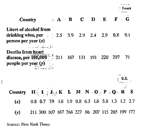
Is there a relationship between wine consumption and deaths from heart disease? The table gives data from 19 developed countries.
a. Use the statistical menu of your graphing utility to enter the 19 ordered pairs of data items shown in the table.
b. Use the scatter plot capability to draw a scatter plot of the data.
c. Select the linear regression option. Use your utility to obtain values for a and b for the equation of the regression line,
y
=
a
x
+
b
. You may also be given a correlation coefficient, r. Values of r close to-1 indicate that the points can be described by a linear relationship and the regression line has a positive slope. Values of r close to y indicate that the points can be described by a linear relationship and the regression line has a negative slope. Values of r close to 0 indicate no linear relationship between the variables. In this case, a linear model does not accurately describe the data.
d. Use the appropriate sequence (consult your manual) to graph the regression equation on top of the points in the scatter plot.
Definition Definition Statistical measure used to assess the strength and direction of relationships between two variables. Correlation coefficients range between -1 and 1. A coefficient value of 0 indicates that there is no relationship between the variables, whereas a -1 or 1 indicates that there is a perfect negative or positive correlation.
Solutions of inequalitie
Google Classroom
Mic
Is (-3, 2) a solution of 7x+9y > -3?
Choose 1 answer:
A
Yes
B
No
Related content
▶6:06
Testing solutions to inequalities
2 of 4
Are natural logarithms used in real life ? How ? Can u give me two or three ways we can use them. Thanks
?
Chapter 2 Solutions
MyLab Math with Pearson eText -- Standalone Access Card -- for Algebra and Trigonometry (6th Edition)
Need a deep-dive on the concept behind this application? Look no further. Learn more about this topic, algebra and related others by exploring similar questions and additional content below.
Correlation Vs Regression: Difference Between them with definition & Comparison Chart; Author: Key Differences;https://www.youtube.com/watch?v=Ou2QGSJVd0U;License: Standard YouTube License, CC-BY
Correlation and Regression: Concepts with Illustrative examples; Author: LEARN & APPLY : Lean and Six Sigma;https://www.youtube.com/watch?v=xTpHD5WLuoA;License: Standard YouTube License, CC-BY


 Glencoe Algebra 1, Student Edition, 9780079039897...AlgebraISBN:9780079039897Author:CarterPublisher:McGraw Hill
 Functions and Change: A Modeling Approach to Coll...AlgebraISBN:9781337111348Author:Bruce Crauder, Benny Evans, Alan NoellPublisher:Cengage Learning
 Algebra and Trigonometry (MindTap Course List)AlgebraISBN:9781305071742Author:James Stewart, Lothar Redlin, Saleem WatsonPublisher:Cengage Learning
 Algebra & Trigonometry with Analytic GeometryAlgebraISBN:9781133382119Author:SwokowskiPublisher:Cengage
 Big Ideas Math A Bridge To Success Algebra 1: Stu...AlgebraISBN:9781680331141Author:HOUGHTON MIFFLIN HARCOURTPublisher:Houghton Mifflin Harcourt