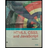
New Perspectives On Html5, Css3, And Javascript, Loose-leaf Version
6th Edition
ISBN: 9781337685764
Author: Patrick M. Carey
Publisher: Cengage Learning
expand_more
expand_more
format_list_bulleted
Question
Chapter 5, Problem 15CP1
Program Plan Intro
To create a style rule within the media query to display the ul elementwithin the horizontal navigation list with row direction oriented with the 40 pixels in file gp_layout.css.
Expert Solution & Answer
Trending nowThis is a popular solution!
Students have asked these similar questions
CSS question
Add another div element to the web form containing the following code:
Insert an input element to create an option button for the orderType field with the ID delivery. Make the option button checked by default. After the option button, insert a label associated with the delivery control containing the text Delivery.
Add an input element to create a second option button for the orderType field with the ID pickup, followed by a label associated with the pickup control containing the text Pickup.
Help me complete this task.
In the style rules for the mobile viewport, below the main style rule, add a new style rule for the section element that sets the background-color to #183440, the color to #fff, top margin to 4%, and padding to 3%.
Below the section style rule, create a new style rule for the article element that sets the top margin to 1% and padding to 2%.
Below the article style rule, create a new style rule for the aside element that sets the background-color to rgba(24, 52, 64, 0.3), padding to 2%, top margin to 1%, color to #183440, and a box-shadow with values of 4px 4px 10px #183440.
My CSS
/* CSS Reset */
body, header, nav, main, footer, h1, div, section, article, aside {
margin: 0;
padding: 0;
border: 0;
}
/* Style rule for body */
body {
background-color: #c8dbE3;
}
/* Style rules for mobile viewport */
/*style rule for section*/
section {
background-color: #183440;
color: #fff;
margin-top: 4%;
padding: 3%;
}
/*style rule for…
Add a blank line after the contact id style rule, add a comment with the text Style rules for footer content, and then create the following style rules for the footer and footer a selectors.
Create a style rule for the footer selector that aligns text center, sets a font size value of 0.85em, sets a background color value of #2a1f14, sets a font color value of #f6eee4, and sets top and bottom padding values to 1% and right and left padding values to 0%.
Create a style rule for footer a that sets the font color value to #f3e6d8 and removes the text decoration.
I'm not sure what is wrong then my footer section.
--- HTML
<!-- Write your code here -->
<!--Student Name:
File Name: contact.html
Date:10/04/2022
-->
<!DOCTYPE html>
<html lang="en">
<head>
<title>Wild Rescues: Contact</title>
<meta charset="utf-8">
<link rel="stylesheet" href="css/styles.css" />
<body>
<header>
<img…
Chapter 5 Solutions
New Perspectives On Html5, Css3, And Javascript, Loose-leaf Version
Ch. 5.2 - Prob. 8QCCh. 5.2 - Prob. 9QCCh. 5.3 - Prob. 8QCCh. 5.3 - Prob. 9QCCh. 5 - Prob. 1RACh. 5 - Prob. 2RACh. 5 - Prob. 3RACh. 5 - Prob. 4RACh. 5 - Prob. 5RACh. 5 - Prob. 6RA
Ch. 5 - Prob. 7RACh. 5 - Prob. 8RACh. 5 - Prob. 9RACh. 5 - Prob. 10RACh. 5 - Prob. 11RACh. 5 - Prob. 12RACh. 5 - Prob. 13RACh. 5 - Prob. 14RACh. 5 - Prob. 15RACh. 5 - Prob. 16RACh. 5 - Prob. 17RACh. 5 - Prob. 18RACh. 5 - Prob. 19RACh. 5 - Prob. 20RACh. 5 - Prob. 21RACh. 5 - Prob. 22RACh. 5 - Prob. 23RACh. 5 - Prob. 24RACh. 5 - Prob. 25RACh. 5 - Prob. 26RACh. 5 - Prob. 1CP1Ch. 5 - Prob. 2CP1Ch. 5 - Prob. 3CP1Ch. 5 - Prob. 4CP1Ch. 5 - Prob. 5CP1Ch. 5 - Prob. 6CP1Ch. 5 - Prob. 7CP1Ch. 5 - Prob. 8CP1Ch. 5 - Prob. 9CP1Ch. 5 - Prob. 10CP1Ch. 5 - Prob. 11CP1Ch. 5 - Prob. 12CP1Ch. 5 - Prob. 13CP1Ch. 5 - Prob. 14CP1Ch. 5 - Prob. 15CP1Ch. 5 - Prob. 16CP1Ch. 5 - Prob. 17CP1Ch. 5 - Prob. 18CP1Ch. 5 - Prob. 19CP1Ch. 5 - Prob. 1CP2Ch. 5 - Prob. 2CP2Ch. 5 - Prob. 3CP2Ch. 5 - Prob. 4CP2Ch. 5 - Prob. 5CP2Ch. 5 - Prob. 6CP2Ch. 5 - Prob. 7CP2Ch. 5 - Prob. 8CP2Ch. 5 - Prob. 9CP2Ch. 5 - Prob. 10CP2Ch. 5 - Prob. 11CP2Ch. 5 - Prob. 12CP2Ch. 5 - Prob. 13CP2Ch. 5 - Prob. 14CP2Ch. 5 - Prob. 15CP2Ch. 5 - Prob. 16CP2Ch. 5 - Prob. 17CP2Ch. 5 - Prob. 18CP2Ch. 5 - Prob. 19CP2Ch. 5 - Prob. 20CP2Ch. 5 - Prob. 21CP2Ch. 5 - Prob. 1CP3Ch. 5 - Prob. 2CP3Ch. 5 - Prob. 3CP3Ch. 5 - Prob. 4CP3Ch. 5 - Prob. 5CP3Ch. 5 - Prob. 6CP3Ch. 5 - Prob. 9CP3Ch. 5 - Prob. 2CP4
Knowledge Booster
Similar questions
- Help me complete this task. Add the following style rules for the form elements. Create a style rule for the fieldset and input elements that sets the bottom margin to 2%. Create a style rule for the fieldset legend that sets the font-size to 1.25em and makes the font bold. Create a style rule for the label that sets the display to block and sets padding-top to 3%. Create a style rule for the btn class selector that removes the border, sets the top and bottom margin to zero and the left and right margin to auto, sets the display to a block, sets the padding to 5%, sets the background-color to 003399, sets the font-size to 1.25em, sets the border-radius to 10px, and sets the color to white (fff). --my css /* Style for body specifies a background color */ body { background: linear-gradient(to top right, #fff 0%, #6699ff 100%) no-repeat fixed center; font-family: Geneva, Arial, sans-serif; } /* Style for the container element */ #container { width: 90%; margin: 0 auto; }…arrow_forwardStep 20: Mobile Styles When the user views the page on a mobile device, we don't want the label elements to appear to the left of the input elements because that takes up too much horizontal space. We need to adjust our layout to be more vertical. Create a media query for screens with a maximum width of 767 pixels. Inside the media query, add a rule for any label elements inside the form element with the id registration that removes the float, sets the width to 100%, and aligns the text to the left. Add a rule inside the media query for any input element inside the form element with the id registration that removes the float and sets the width to 100%. Because we set specific widths for the input elements that appear on a single row, we need to override those settings in the mobile view. Add a rule inside the media query for the input elements with the ids city, state, and zip inside the form element with the id registration that sets the maximum width to 100%. Add a rule…arrow_forwardAdd a blank line after the header h1 style rule, add a comment with the text Style rules for navigation area, and then create the following style rules for the nav, nav ul, nav li, and nav li a selectors. Create a style rule for the nav selector that sets the background color to #1d396d. Create a style rule for nav ul that sets the list style type to none, sets the margin to 0, and aligns text center. Create a style rule for nav li that sets the display to an inline-block, sets a font size of 1.5em, sets a font family value of Verdana, Arial, sans-serif, and a font weight value of bold. Create a style rule for nav li a that sets the display to a block, sets a font color value of #e3eaf8, sets top and bottom padding values of 0.5em and left and right padding values of 2em, and removes the text decoration. 6 Add a blank line after the nav li a style rule, add a comment with the text Style rules for main content, and then create the following style rules for the main, main…arrow_forward
- Add a blank line after the header h1 style rule, add a comment with the text Style rules for navigation area, and then create the following style rules for the nav, nav ul, nav li, and nav li a selectors. Create a style rule for the nav selector that sets the background color to #1d396d. Create a style rule for nav ul that sets the list style type to none, sets the margin to 0, and aligns text center. Create a style rule for nav li that sets the display to an inline-block, sets a font size of 1.5em, sets a font family value of Verdana, Arial, sans-serif, and a font weight value of bold. Create a style rule for nav li a that sets the display to a block, sets a font color value of #e3eaf8, sets top and bottom padding values of 0.5em and left and right padding values of 2em, and removes the text decoration.arrow_forwardTablet Media Query Next, you’ll define the layout for tablet and desktop devices. Create a media query for screen devices whose width is 481 pixels or greater. Within this media query, display the page body as a flexbox in row orientation with wrapping. Sofia doesn’t want the links paragraph displayed for tablet and desktop devices. Complete the media query for tablet and desktop devices by hiding this paragraph. Tablet Element Styles The page body has four children: the header, the footer, the article element, and the aside element. The article and aside elements will share a row with more space given to the article element. Set the growth, shrink, and basis values of the article element to 2, 1, and 400 pixels. Set those same values for the aside element to 1, 2, and 200 pixels. Tablet Navigation Lists For tablet and desktop devices, the top navigation list should be displayed as a horizontal row with no wrapping. Enter a style rule to display the top navigation list ul as a flexbox…arrow_forwardStep 2 Below the tablet media query, add a new comment with the text, Media Query for Desktop Viewport. Below the comment, add a new media query that targets a screen with a minimum width of 769px and print. Within the desktop media query, add a new comment with the text, Desktop Viewport: Style rule for header. Below the comment, add a style rule for the header selector that sets the padding to 2%. Within the desktop media query, below the header style rule, add a new comment with the text, Desktop Viewport: Style rules for nav area. Below the comment, add a style rule for the nav li a selector that sets the padding to 0.5em on the top and bottom and 1.5em on the left and right. Add another style rule for the nav li a selector that uses the hover pseudo-class and sets the color to #373684 and the background-color to #e5e9fc. 2 Within the desktop media query, below the nav area style rules, add a new comment with the text, Desktop Viewport: Style rules…arrow_forward
- CSS question Scroll down to the section element and, directly after the initial paragraph, insert a form element that employs the action at the fictional address http://www.example.com/redball/customer using the post method. Within the form element, insert a div element that encloses a label with the text Name* associated with the nameBox control. Also, within the divelement, add an input text box with the ID nameBox, field name custName, and placeholder text First and Last Name. Make custName a required field. (Hint: To make a field required, add the required attribute to the corresponding control element e.g. <input ... required>)arrow_forwardAdd the following comments to the tablet media query: Tablet Viewport: Show tab-desk class, hide mobile class Tablet Viewport: Style rules for nav area Add the following style rules below the "Show tab-desk class, hide mobile class" comment: Style rule for the tab-desk class selector that sets the display to a block. Style rule for the mobile class selector that sets the display to none.arrow_forwardGo to the Blockquote Styles section. Amy has included three sample reviews from users of the Save your Fork website. Amy wants the text of these reviews to appear within the image of a speech bubble. For every blockquote element, create a style rule that does the following: a) sets the background image to the sf_speech.png with no repeat and a horizontal and vertical size of 100% to cover the entire block quote (Hint: use property background-size: 100% 100%; ) b) uses the drop-shadow filter to add a drop shadow around the speech bubble with horizontal and vertical offsets of 5 pixels, a blur of 10 pixels and the color rgb(51, 51, 51) (Hint: use property filter: drop-shadow(5px 5px 10px rgb(51, 51, 51));)arrow_forward
- Table Layout Open the mi_tables.css and go to the Table Styles section and add a style rule for the table element that: sets the background color to a linear gradient that goes to the bottom of the table background starting from rgb(190, 215, 255) and ending in black and adds a 5-pixels solid gray border. this is a programming question. The following is what I currently have (under table styles), but I am having a hard time getting more of the background columns to show. Thanks. /* Table Styles */ table { background: linear-gradient(to bottom , rgb(190, 215, 255), black); border: 5px solid gray; } th, td { border: 3px solid gray; line-height: 1.4em; padding: 8px; } th { background: black; color: rgb(130, 210, 255); font-weight: normal; } td { color: white; font-size: 0.9em; vertical-align: top; }arrow_forwardGo to the "Flex Layout Styles" section and insert a style rule to display the body element as a flexbox oriented as rows with wrapping. The page body content has two main elements. The section element with the ID sheet contains the panels from the comic book page. The article element contains information about the comic book industry during the Golden Age. Devan wants more of the page width to be given to the comic book sheet. Add a style rule that sets the flex growth and shrink rate of the section#sheet selector to 3 and 1 respectively and set its flex basis size to 301 pixels. Less page width will be given to the article element. Create a style rule to set its flex growth and shrink values to 1 and 3 respectively and set its flex basis size to 180 pixels. Mobile Devices Go to the "Mobile Devices" section and create a media query for screen devices with a maximum width of 480 pixels. With mobile devices, Devan wants each comic book panel image to occupy a single row. Create a style…arrow_forwardGo to the Navigation Tabs List Styles section. Amy has created a navigation list with the class name tabs that appears at the top of the page with the body header. Create a style rule for the body > header nav.tabs selector that changes the background to the image files f_back1.png with no-repeat, centered horizontally and vertically within the element and sized to cover the entire navigation list. (Hint: to cover the entire navigation list use property: background-size: cover; )arrow_forward
arrow_back_ios
SEE MORE QUESTIONS
arrow_forward_ios
Recommended textbooks for you
- New Perspectives on HTML5, CSS3, and JavaScriptComputer ScienceISBN:9781305503922Author:Patrick M. CareyPublisher:Cengage LearningNp Ms Office 365/Excel 2016 I NtermedComputer ScienceISBN:9781337508841Author:CareyPublisher:Cengage
New Perspectives on HTML5, CSS3, and JavaScript
Computer Science
ISBN:9781305503922
Author:Patrick M. Carey
Publisher:Cengage Learning
Np Ms Office 365/Excel 2016 I Ntermed
Computer Science
ISBN:9781337508841
Author:Carey
Publisher:Cengage