Videos
Refer to the Lincolnville School District bus data. Select the variable referring to the number of miles traveled since the last maintenance, and then organize these data into a frequency distribution.
- a. What is a typical amount of miles traveled? What is the
range ? - b. Comment on the shape of the distribution. Are there any outliers in terms of miles driven?
- c. Draw a cumulative relative frequency distribution. Forty percent of the buses were driven fewer than how many miles? How many buses were driven less than 10,500 miles?
- d. Refer to the variables regarding the bus manufacturer and the bus capacity. Draw a pie chart of each variable and write a description of your results.
a.
Obtain a frequency distribution for the variable Team salary.
Find the typical amount of miles travelled.
Find the range of the miles.
Answer to Problem 53DA
The frequency distribution for the salary is given below:
| Miles | Frequency |
Cumulative frequency |
| 9,900-10,200 | 8 | 8 |
| 10,200-10,500 | 8 | 16 |
| 10,500-10,800 | 11 | 27 |
| 10,800-11,100 | 8 | 35 |
| 11,100-11,400 | 13 | 48 |
| 11,400-11,700 | 12 | 60 |
| 11,700-12,000 | 20 | 80 |
| Total | 80 |
The typical mile driven is about 11,100 miles.
The range of the salaries is 2,100 miles.
Explanation of Solution
Selection of the number of classes:
The “2 to the k rule” suggests that the number of classes is the smallest value of k, where
It is given that the data set consists of 80 observations. The value of k can be obtained as follows:
Here,
Therefore, the number of classes for the given data set is 7.
From the data set, the maximum and minimum values are 11,973 and 10,000, respectively.
The formula for the class interval is given as follows:
Where, i is the class interval and k is the number of classes.
Therefore, the class interval for the given data can be obtained as follows:
In practice, the class interval size is usually rounded up to some convenient number. Therefore, the reasonable class interval is 300.
Frequency distribution:
The frequency table is a collection of mutually exclusive and exhaustive classes, which shows the number of observations in each class.
Since the minimum value is 10,000 and the class interval is 300, the first class would be 9,900-10,200. The frequency distribution for miles can be constructed as follows:
| Miles | Frequency |
Cumulative frequency |
| 9,900-10,200 | 8 | 8 |
| 10,200-10,500 | 8 | |
| 10,500-10,800 | 11 | |
| 10,800-11,100 | 8 | |
| 11,100-11,400 | 13 | |
| 11,400-11,700 | 12 | |
| 11,700-12,000 | 20 | |
| Total | 80 |
From the above frequency distribution, the typical miles driven is about 11,100 miles.
The range of miles is from 12,000 to 9,900 million dollars. Thus, the range of salaries is 2,100 miles.
b.
Make a comment on the shape of the distribution.
Check whether there are any outliers in terms of miles driven.
Answer to Problem 53DA
Thus, the distribution of miles is negatively skewed.
There are no outliers detected in the data.
Explanation of Solution
From the frequency distribution in Part (a), the large number of frequencies occurred in last three classes. Therefore, the distribution of miles is negatively skewed.
There are no observations much higher or much lower than the remaining observations. Thus, no outliers were detected in the data.
c.
Create a cumulative relative frequency polygon for the frequency distribution.
Identify the distance for which less than 40% of the buses are driven.
Find the number of buses that drives less than 10,500 miles.
Answer to Problem 53DA
The cumulative frequency polygon for the given data is as follows:
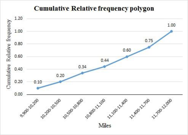
There are 40% of the buses driven less than 1,100 miles.
There are 16 of the buses driven less than 10,500 miles.
Explanation of Solution
For the given data set, the cumulative relative frequency table with midpoints of classes is obtained as follows:
| Miles | Midpoint |
Cumulative frequency |
Relative cumulative frequency |
| 9,900-10,200 | 8 | ||
| 10,200-10,500 | 16 | ||
| 10,500-10,800 | 27 | ||
| 10,800-11,100 | 35 | ||
| 11,100-11,400 | 48 | ||
| 11,400-11,700 | 60 | ||
| 11,700-12,000 | 80 |
The cumulative relative frequency polygon for the given data can be drawn using EXCEL:
Step-by-step procedure to obtain the frequency polygon using EXCEL:
- Enter the column of midpoints along with the cumulative relative frequency column.
- Select the total data range with labels.
- Go to Insert > Charts > line chart.
- Select the appropriate line chart.
- Click OK.
From the above cumulative relative frequency polygon, 40% of the buses are driven less than 1,100 miles.
There are 16 of the buses driven less than 10,500 miles.
d.
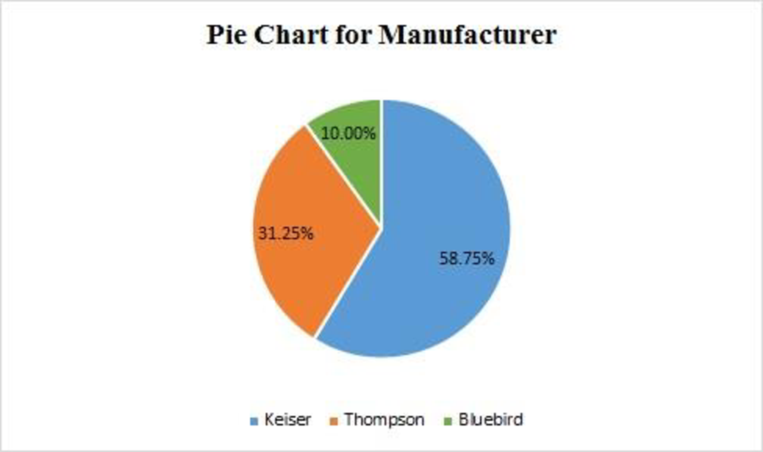
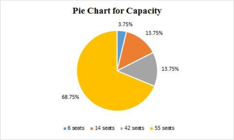
Create pie charts for the variables Manufacturer and Capacity.
Answer to Problem 53DA
The pie chart for the variable Manufacturer is given as follows:
The pie chart for the variable Capacity is given as follows:
Explanation of Solution
Manufacturer:
From the data set, there are three manufacturers in the variable Manufacturer, their corresponding frequencies and percentages of the frequencies are given in the below table:
| Manufacturer | Frequency | % of frequency |
| Bluebird | 47 | |
| Keiser | 25 | |
| Thompson | 8 | |
| Total | 80 |
Step-by-step procedure to obtain the pie chart using EXCEL:
- Enter the Manufacturer column along with the corresponding percentage of frequencies.
- Select the total data range with labels.
- Go to Insert > Charts > Pie chart.
- Select the appropriate Pie chart.
- Click OK.
Capacity:
From the data set, there are four capacities of seats in the variable Capacity, their corresponding frequencies and percentages of the frequencies are given in the below table:
| Capacity | Frequency | % of frequency |
| 6 seats | 3 | |
| 14 seats | 11 | |
| 42 seats | 11 | |
| 55 seats | 55 | |
| Total | 80 |
Step-by-step procedure to obtain the pie chart using EXCEL:
- Enter the Capacity column along with the corresponding percentage of frequencies.
- Select the total data range with labels.
- Go to Insert > Charts > Pie chart.
- Select the appropriate Pie chart.
- Click OK.
Want to see more full solutions like this?
Chapter 2 Solutions
Loose Leaf for Statistical Techniques in Business and Economics


- The following ordered data list shows the data speeds for cell phones used by a telephone company at an airport: A. Calculate the Measures of Central Tendency from the ungrouped data list. B. Group the data in an appropriate frequency table. C. Calculate the Measures of Central Tendency using the table in point B. 0.8 1.4 1.8 1.9 3.2 3.6 4.5 4.5 4.6 6.2 6.5 7.7 7.9 9.9 10.2 10.3 10.9 11.1 11.1 11.6 11.8 12.0 13.1 13.5 13.7 14.1 14.2 14.7 15.0 15.1 15.5 15.8 16.0 17.5 18.2 20.2 21.1 21.5 22.2 22.4 23.1 24.5 25.7 28.5 34.6 38.5 43.0 55.6 71.3 77.8arrow_forwardII Consider the following data matrix X: X1 X2 0.5 0.4 0.2 0.5 0.5 0.5 10.3 10 10.1 10.4 10.1 10.5 What will the resulting clusters be when using the k-Means method with k = 2. In your own words, explain why this result is indeed expected, i.e. why this clustering minimises the ESS map.arrow_forwardwhy the answer is 3 and 10?arrow_forward
- PS 9 Two films are shown on screen A and screen B at a cinema each evening. The numbers of people viewing the films on 12 consecutive evenings are shown in the back-to-back stem-and-leaf diagram. Screen A (12) Screen B (12) 8 037 34 7 6 4 0 534 74 1645678 92 71689 Key: 116|4 represents 61 viewers for A and 64 viewers for B A second stem-and-leaf diagram (with rows of the same width as the previous diagram) is drawn showing the total number of people viewing films at the cinema on each of these 12 evenings. Find the least and greatest possible number of rows that this second diagram could have. TIP On the evening when 30 people viewed films on screen A, there could have been as few as 37 or as many as 79 people viewing films on screen B.arrow_forwardQ.2.4 There are twelve (12) teams participating in a pub quiz. What is the probability of correctly predicting the top three teams at the end of the competition, in the correct order? Give your final answer as a fraction in its simplest form.arrow_forwardThe table below indicates the number of years of experience of a sample of employees who work on a particular production line and the corresponding number of units of a good that each employee produced last month. Years of Experience (x) Number of Goods (y) 11 63 5 57 1 48 4 54 5 45 3 51 Q.1.1 By completing the table below and then applying the relevant formulae, determine the line of best fit for this bivariate data set. Do NOT change the units for the variables. X y X2 xy Ex= Ey= EX2 EXY= Q.1.2 Estimate the number of units of the good that would have been produced last month by an employee with 8 years of experience. Q.1.3 Using your calculator, determine the coefficient of correlation for the data set. Interpret your answer. Q.1.4 Compute the coefficient of determination for the data set. Interpret your answer.arrow_forward
- Can you answer this question for mearrow_forwardTechniques QUAT6221 2025 PT B... TM Tabudi Maphoru Activities Assessments Class Progress lIE Library • Help v The table below shows the prices (R) and quantities (kg) of rice, meat and potatoes items bought during 2013 and 2014: 2013 2014 P1Qo PoQo Q1Po P1Q1 Price Ро Quantity Qo Price P1 Quantity Q1 Rice 7 80 6 70 480 560 490 420 Meat 30 50 35 60 1 750 1 500 1 800 2 100 Potatoes 3 100 3 100 300 300 300 300 TOTAL 40 230 44 230 2 530 2 360 2 590 2 820 Instructions: 1 Corall dawn to tha bottom of thir ceraan urina se se tha haca nariad in archerca antarand cubmit Q Search ENG US 口X 2025/05arrow_forwardThe table below indicates the number of years of experience of a sample of employees who work on a particular production line and the corresponding number of units of a good that each employee produced last month. Years of Experience (x) Number of Goods (y) 11 63 5 57 1 48 4 54 45 3 51 Q.1.1 By completing the table below and then applying the relevant formulae, determine the line of best fit for this bivariate data set. Do NOT change the units for the variables. X y X2 xy Ex= Ey= EX2 EXY= Q.1.2 Estimate the number of units of the good that would have been produced last month by an employee with 8 years of experience. Q.1.3 Using your calculator, determine the coefficient of correlation for the data set. Interpret your answer. Q.1.4 Compute the coefficient of determination for the data set. Interpret your answer.arrow_forward
 Holt Mcdougal Larson Pre-algebra: Student Edition...AlgebraISBN:9780547587776Author:HOLT MCDOUGALPublisher:HOLT MCDOUGAL
 Glencoe Algebra 1, Student Edition, 9780079039897...AlgebraISBN:9780079039897Author:CarterPublisher:McGraw Hill
 Big Ideas Math A Bridge To Success Algebra 1: Stu...AlgebraISBN:9781680331141Author:HOUGHTON MIFFLIN HARCOURTPublisher:Houghton Mifflin Harcourt
 Functions and Change: A Modeling Approach to Coll...AlgebraISBN:9781337111348Author:Bruce Crauder, Benny Evans, Alan NoellPublisher:Cengage Learning