Videos
Refer to the North Valley Real Estate data that reports information on homes sold during the last year. For the variable price, select an appropriate class interval and organize the selling prices into a frequency distribution. Write a brief report summarizing your findings. Be sure to answer the following questions in your report.
- a. Around what values of price do the data tend to cluster?
- b. Based on the frequency distribution, what is the typical selling price in the first class? What is the typical selling price in the last class?
- c. Draw a cumulative relative frequency distribution. Using this distribution, fifty percent of the homes sold for what price or less? Estimate the lower price of the top ten percent of homes sold. About what percent of the homes sold for less than $300,000?
- d. Refer to the variable bedrooms. Draw a bar chart showing the number of homes sold with 2, 3, 4 or more bedrooms. Write a description of the distribution.
a.
Find an appropriate class interval.
Create a frequency distribution for the selling prices and explain the results.
At what values of price the data tend to cluster.
Answer to Problem 51DA
The frequency distribution for the selling price is given below:
|
Selling price (1,000’s) | Frequency |
Cumulative frequency |
| 120-240 | 26 | 26 |
| 240-360 | 36 | |
| 360-480 | 27 | |
| 480-600 | 7 | |
| 600-720 | 4 | |
| 720-840 | 2 | |
| 840-960 | 3 | |
| Total | 105 |
Explanation of Solution
Selection of number of classes:
“2 to the k rule” suggests that the number of classes is the smallest value of k, where
It is given that the data set consists of 105 observations. The value of k can be obtained as follows:
Here,
Therefore, the number of classes for the given data set is 7.
From the data set North Valley Real Estate Data, the maximum and minimum values are 919,480 and 167,962, respectively.
The formula for the class interval is given as follows:
Where, i is the class interval and k is the number of classes.
Therefore, the class interval for the given data can be obtained as follows:
In practice, the class interval size is usually rounded up to some convenient number. Therefore, the reasonable class interval is 120,000.
Frequency distribution:
The frequency table is a collection of mutually exclusive and exhaustive classes, which shows the number of observations in each class.
Since the minimum value is 167,962 and the class interval is 120,000, the first class would be 120,000-240,000 or 160,000-280,000. Here, the first one is preferred as the first class of the frequency distribution. The frequency distribution for the selling price can be constructed as follows:
|
Selling price (1,000’s) | Frequency |
Cumulative frequency |
| 120-240 | 26 | 26 |
| 240-360 | 36 | |
| 360-480 | 27 | |
| 480-600 | 7 | |
| 600-720 | 4 | |
| 720-840 | 2 | |
| 840-960 | 3 | |
| Total | 105 |
From the above table, 89 out of 105 homes are sold between $120,000 and $480,000.
b.
Find the typical selling in first class.
Find the typical selling in last class.
Answer to Problem 51DA
The typical selling price of first class is $180,000.
The typical selling price of last class is $900,000.
Explanation of Solution
The lower and upper limits of the first class are $120,000 and $240,000.
The typical selling price of first class is calculated as follows:
Thus, typical selling price of first class is $180,000.
The lower and upper limits of the last class are $840,000 and $960,000.
The typical selling price of last class is calculated as follows:
Thus, typical selling price of last class is $900,000.
c.
Create a cumulative relative frequency polygon for the frequency distribution.
Identify the price for which less than 50% of the homes are sold.
Find the lower price of the top 10% of homes are sold.
About what percentage of homes are sold for less than $300,000.
Answer to Problem 51DA
The cumulative frequency polygon for the given data is as follows:
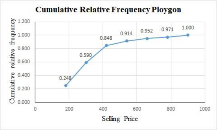
There are 50% of the homes sold approximately less than $254,000.
The top 10% of homes are sold for at least $520,000.
There are 59% of homes sold for less than $300,000.
Explanation of Solution
For the given data set, the cumulative relative frequency table with midpoints of classes is obtained as follows:
|
Selling price (1,000’s) | Midpoint |
Cumulative frequency |
Relative cumulative frequency |
| 120-240 | 26 | ||
| 240-360 | 62 | ||
| 360-480 | 89 | ||
| 480-600 | 96 | ||
| 600-720 | 100 | ||
| 720-840 | 102 | ||
| 840-960 | 105 |
The cumulative relative frequency polygon for the given data can be drawn using EXCEL.
Step-by-step procedure to obtain the frequency polygon using EXCEL is as follows:
- Enter the column of midpoints along with the cumulative relative frequency column.
- Select the total data range with labels.
- Go to Insert > Charts > line chart.
- Select the appropriate line chart.
- Click OK.
From the above cumulative relative frequency polygon, 50% of the homes are sold approximately less than $254,000.
The top 10% of homes are sold for at least $520,000.
There are 59% of homes sold for less than $300,000.
d.
Create a bar chart for the number of bedrooms for the variable bedrooms.
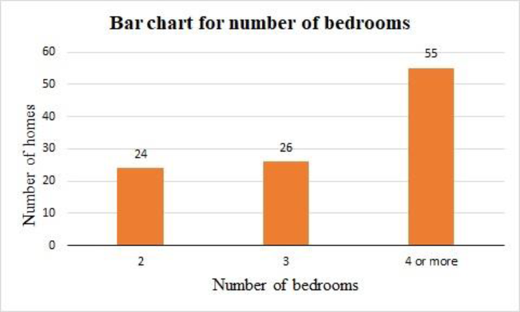
Answer to Problem 51DA
The bar chart for the number of bedrooms for the variable bedrooms is as follows:
Explanation of Solution
For the variable bedrooms, the frequency table is obtained as follows:
|
Number of bedrooms | Frequency |
| 2 | 24 |
| 3 | 26 |
| 4 or more | 55 |
| Total | 105 |
The bar chart for the given data can be drawn using EXCEL.
Step-by-step procedure to obtain the bar chart using EXCEL is as follows:
- Enter the column of bedrooms along with the frequency column.
- Select the total data range with labels.
- Go to Insert > Charts > bar chart.
- Select the appropriate bar chart.
- Click OK.
From the above bar chart, the highest frequency occurred in the last category, the shape of the distribution is negatively skewed.
Want to see more full solutions like this?
Chapter 2 Solutions
Loose Leaf for Statistical Techniques in Business and Economics


- 5. Probability Distributions – Continuous Random Variables A factory machine produces metal rods whose lengths (in cm) follow a continuous uniform distribution on the interval [98, 102]. Questions: a) Define the probability density function (PDF) of the rod length.b) Calculate the probability that a randomly selected rod is shorter than 99 cm.c) Determine the expected value and variance of rod lengths.d) If a sample of 25 rods is selected, what is the probability that their average length is between 99.5 cm and 100.5 cm? Justify your answer using the appropriate distribution.arrow_forward2. Hypothesis Testing - Two Sample Means A nutritionist is investigating the effect of two different diet programs, A and B, on weight loss. Two independent samples of adults were randomly assigned to each diet for 12 weeks. The weight losses (in kg) are normally distributed. Sample A: n = 35, 4.8, s = 1.2 Sample B: n=40, 4.3, 8 = 1.0 Questions: a) State the null and alternative hypotheses to test whether there is a significant difference in mean weight loss between the two diet programs. b) Perform a hypothesis test at the 5% significance level and interpret the result. c) Compute a 95% confidence interval for the difference in means and interpret it. d) Discuss assumptions of this test and explain how violations of these assumptions could impact the results.arrow_forward1. Sampling Distribution and the Central Limit Theorem A company produces batteries with a mean lifetime of 300 hours and a standard deviation of 50 hours. The lifetimes are not normally distributed—they are right-skewed due to some batteries lasting unusually long. Suppose a quality control analyst selects a random sample of 64 batteries from a large production batch. Questions: a) Explain whether the distribution of sample means will be approximately normal. Justify your answer using the Central Limit Theorem. b) Compute the mean and standard deviation of the sampling distribution of the sample mean. c) What is the probability that the sample mean lifetime of the 64 batteries exceeds 310 hours? d) Discuss how the sample size affects the shape and variability of the sampling distribution.arrow_forward
- A biologist is investigating the effect of potential plant hormones by treating 20 stem segments. At the end of the observation period he computes the following length averages: Compound X = 1.18 Compound Y = 1.17 Based on these mean values he concludes that there are no treatment differences. 1) Are you satisfied with his conclusion? Why or why not? 2) If he asked you for help in analyzing these data, what statistical method would you suggest that he use to come to a meaningful conclusion about his data and why? 3) Are there any other questions you would ask him regarding his experiment, data collection, and analysis methods?arrow_forwardBusinessarrow_forwardWhat is the solution and answer to question?arrow_forward
- To: [Boss's Name] From: Nathaniel D Sain Date: 4/5/2025 Subject: Decision Analysis for Business Scenario Introduction to the Business Scenario Our delivery services business has been experiencing steady growth, leading to an increased demand for faster and more efficient deliveries. To meet this demand, we must decide on the best strategy to expand our fleet. The three possible alternatives under consideration are purchasing new delivery vehicles, leasing vehicles, or partnering with third-party drivers. The decision must account for various external factors, including fuel price fluctuations, demand stability, and competition growth, which we categorize as the states of nature. Each alternative presents unique advantages and challenges, and our goal is to select the most viable option using a structured decision-making approach. Alternatives and States of Nature The three alternatives for fleet expansion were chosen based on their cost implications, operational efficiency, and…arrow_forwardBusinessarrow_forwardWhy researchers are interested in describing measures of the center and measures of variation of a data set?arrow_forward
- WHAT IS THE SOLUTION?arrow_forwardThe following ordered data list shows the data speeds for cell phones used by a telephone company at an airport: A. Calculate the Measures of Central Tendency from the ungrouped data list. B. Group the data in an appropriate frequency table. C. Calculate the Measures of Central Tendency using the table in point B. 0.8 1.4 1.8 1.9 3.2 3.6 4.5 4.5 4.6 6.2 6.5 7.7 7.9 9.9 10.2 10.3 10.9 11.1 11.1 11.6 11.8 12.0 13.1 13.5 13.7 14.1 14.2 14.7 15.0 15.1 15.5 15.8 16.0 17.5 18.2 20.2 21.1 21.5 22.2 22.4 23.1 24.5 25.7 28.5 34.6 38.5 43.0 55.6 71.3 77.8arrow_forwardII Consider the following data matrix X: X1 X2 0.5 0.4 0.2 0.5 0.5 0.5 10.3 10 10.1 10.4 10.1 10.5 What will the resulting clusters be when using the k-Means method with k = 2. In your own words, explain why this result is indeed expected, i.e. why this clustering minimises the ESS map.arrow_forward
 Holt Mcdougal Larson Pre-algebra: Student Edition...AlgebraISBN:9780547587776Author:HOLT MCDOUGALPublisher:HOLT MCDOUGAL
 Glencoe Algebra 1, Student Edition, 9780079039897...AlgebraISBN:9780079039897Author:CarterPublisher:McGraw Hill
 Big Ideas Math A Bridge To Success Algebra 1: Stu...AlgebraISBN:9781680331141Author:HOUGHTON MIFFLIN HARCOURTPublisher:Houghton Mifflin Harcourt
 Functions and Change: A Modeling Approach to Coll...AlgebraISBN:9781337111348Author:Bruce Crauder, Benny Evans, Alan NoellPublisher:Cengage Learning