Concept explainers
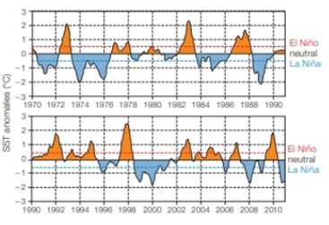
Sea Temperature To predict the effect of El Niño or La Niña events in the future, the National Oceanographic and Atmospheric Administration collects information about sea surface temperature (SST) and atmospheric conditions. They compare monthly temperature averages in the eastern equatorial Pacific Ocean to historical data and calculate the difference (the degree of anomaly) to determine if El Niño conditions, La Niña conditions, or neutral conditions are developing. El Niño is a rise in the average SST above 0.5°C. A decline of the same amount is La Niña. FIGURE 47.8 shows data for 42 years.

FIGURE 47.8 Sea surface temperature anomalies (difference from the historical mean) in the eastern equatorial Pacific Ocean. A rise above the dashed red line is an El Niño event, a decline below the blue line is La Niña
What type of event, if any, occurred during the winter of 1982–1983? What about the winter of 2001–2002?
Want to see the full answer?
Check out a sample textbook solution
Chapter 47 Solutions
Biology: The Unity and Diversity of Life
Additional Science Textbook Solutions
Introductory Chemistry (6th Edition)
Genetics: From Genes to Genomes
Campbell Essential Biology (7th Edition)
HUMAN ANATOMY
Microbiology Fundamentals: A Clinical Approach
Human Physiology: An Integrated Approach (8th Edition)
- identify the indicated cell in white arrowarrow_forwardGloeocaspa Genus - diagram a colony and label the sheath, cell wall, and cytoplasm. Oscillatoria Genus - Diagram a trichome, and label the shealth and individual cells Nostoc Genus- diagram a sketch of the colonoy microscopically from low power to the left of the drawing. Draw a filament showing intercalary heterocysts, and vegatative cells to the right of the drawing Merismopedia Genus- diagram a sketch of the colony. draw and label a filament showing the colony, cell wall, and sheath. Gloeotrichia Genus- diagram a habit sketch of the colony. draw a filament showing the heterocyst, akimetes and vegatative cells of the filamentarrow_forwardOf this list shown, which genus does the image belong toarrow_forward
- As a medical professional, it is important to be able to discuss how genetic processes such as translation regulation can directly affect patients. Think about some situations that might involve translation regulation. Respond to the following in a minimum of 175 words: Why is translation regulation important? What are some examples of translation regulation in humans? Select one of the examples you provided and explain what happens when translation regulation goes wrong.arrow_forwardThe metabolic pathway below is used for the production of the purine nucleotides adenosine monophosphate (AMP) and guanosine monophosphate (GMP) in eukaryotic cells. Assume each arrow represents a reaction catalyzed by a different enzyme. Using the principles of feedback inhibition, propose a regulatory scheme for this pathway that ensures an adequate supply of both AMP and GMP, and prevents the buildup of Intermediates A through G when supplies of both AMP and GMP are adequate.arrow_forwardQUESTION 27 Label the structures marked A, B, C and explain the role of structure A. W plasma membrane For the toolbar, press ALT+F10 (PC) or ALT+FN+F10 (Mac). BIUS ☐ Paragraph Π " ΩΘΗ Β Open Sans, a... 10pt EEarrow_forward
- examples of synamptomorphyarrow_forwardexamples of synamtomorphy.arrow_forwardE. Bar Graph Use the same technique to upload the completed image. We will use a different type of graph to derive additional information from the CO2 data (Fig A1.6.2) 1. Calculate the average rate of increase in COz concentration per year for the time intervals 1959-1969, 1969- 1979, etc. and write the results in the spaces provided. The value for 1959-1969 is provided for you as an example. 2. Plot the results as a bar graph. The 1959-1969 is plotted for you. 3. Choose the graph that looks the most like yours A) E BAR GRAPH We will use a different type of graph to derive additional information from the CU, data (rig. nive). Average Yearly Rate of Observatory, Hawall interval Rate of increase per year 1959-1969 0.9 1969-1979 1979-1989 1989-1999 1999-2009 Figure A1.6.2 1999-2009 *- mrame -11- -n4 P2 جية 1989-1999 1979-1989 1969-1979 1959-1969 This bar drawn for you as an example 1.0 CO, Average Increase/Year (ppmv) B) E BAR GRAPH We will use a different type of graph to derive…arrow_forward
 Biology: The Unity and Diversity of Life (MindTap...BiologyISBN:9781305073951Author:Cecie Starr, Ralph Taggart, Christine Evers, Lisa StarrPublisher:Cengage Learning
 Biology Today and Tomorrow without Physiology (Mi...BiologyISBN:9781305117396Author:Cecie Starr, Christine Evers, Lisa StarrPublisher:Cengage Learning
 Biology: The Unity and Diversity of Life (MindTap...BiologyISBN:9781337408332Author:Cecie Starr, Ralph Taggart, Christine Evers, Lisa StarrPublisher:Cengage LearningCase Studies In Health Information ManagementBiologyISBN:9781337676908Author:SCHNERINGPublisher:Cengage


