Concept explainers
Videos
The following tables show the first-round winning scores of the NCAA men's and women's basketball teams.
TABLE 2-17 Men's Winning First-Round NCAA Tournament Scores
| 95 | 70 | 79 | 99 | 83 | 72 | 79 | 101 |
| 69 | 82 | 86 | 70 | 79 | 69 | 69 | 70 |
| 95 | 70 | 77 | 61 | 69 | 68 | 69 | 72 |
| 89 | 66 | 84 | 77 | 50 | 83 | 63 | 58 |
TABLE 2-18 Women's Winning First-Round NCAA Tournament Scores
| 80 | 68 | 51 | 80 | 83 | 75 | 77 | 100 |
| 96 | 68 | 89 | 80 | 67 | 84 | 76 | 70 |
| 98 | 81 | 79 | 89 | 98 | 83 | 72 | 100 |
| 101 | 83 | 66 | 76 | 77 | 84 | 71 | 77 |
Use the software or method of your choice to construct separate histograms for the men's and women's winning scores Try 5, 7, and 10 classes for each. Which number of classes seems to be the best choice? Why?
To graph: The histogram for men’s and women’s winning score data..
Explanation of Solution
Calculation: For Men’s winning score data:
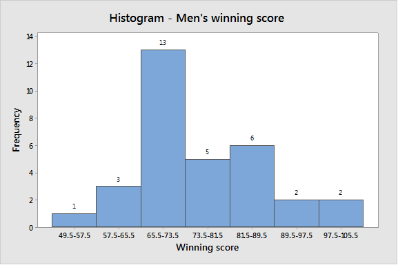
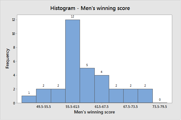
The largest value of the data set is 101 and the smallest value is 50 in the men’s winning score data.
Using five classes, the class width is calculated in the following way:
The frequency table is as follows:
| Class-limits | Class boundaries | Frequency |
| 50–60 | 49.5–60.5 | 2 |
| 61–71 | 60.5–71.5 | 13 |
| 72–82 | 71.5–82.5 | 8 |
| 83–93 | 82.5–93.5 | 5 |
| 94–104 | 93.5–104.5 | 4 |
To construct the histogram by using the MINITAB, the steps are as follows:
Step 1: Enter the class boundaries in C1 and frequency in C2.
Step 2: Go to Graph > Histogram > Simple.
Step 3: Enter C1 in Graph variable, then go to Data options > Frequency > C2.
Step 4: Click on OK.
The obtained histogram is
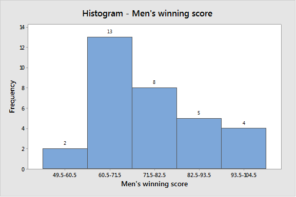
Using seven classes, the class width is calculated in the following way:
| Class-limits | Class boundaries | Frequency |
| 50–57 | 49.5–57.5 | 1 |
| 58–65 | 57.5–65.5 | 3 |
| 66–73 | 65.5–73.5 | 13 |
| 74–81 | 73.5–81.5 | 5 |
| 82–89 | 81.5–89.5 | 6 |
| 90–97 | 89.5–97.5 | 2 |
| 98–105 | 97.5–10.5 | 2 |
To construct the histogram by using the MINITAB, the steps are as follows:
Step 1: Enter the class boundaries in C3 and frequency in C4.
Step 2: Go to Graph > Histogram > Simple.
Step 3: Enter C3 in Graph variable, then go to Data options > Frequency > C4.
Step 4: Click on OK.
The obtained histogram is
Using 10 classes, the class width is calculated in the following way:
| Class-limits | Class boundaries | Frequency |
| 50–55 | 49.5–55.5 | 1 |
| 56–61 | 55.5–61.5 | 2 |
| 62–67 | 61.5–67.5 | 2 |
| 68–73 | 67.5–73.5 | 12 |
| 74–79 | 73.5–79.5 | 5 |
| 80–85 | 79.5–85.5 | 4 |
| 86–91 | 85.5–91.5 | 2 |
| 92–97 | 91.5–97.5 | 2 |
| 98–103 | 97.5–103.5 | 2 |
| 104–109 | 103.5–109.5 | 0 |
To construct the histogram by using the MINITAB, the steps are as follows:
Step 1: Enter the class boundaries in C5 and frequency in C6.
Step 2: Go to Graph > Histogram > Simple.
Step 3: Enter C5 in Graph variable, then go to Data options > Frequency > C6.
Step 4: Click on OK.
The obtained histogram is
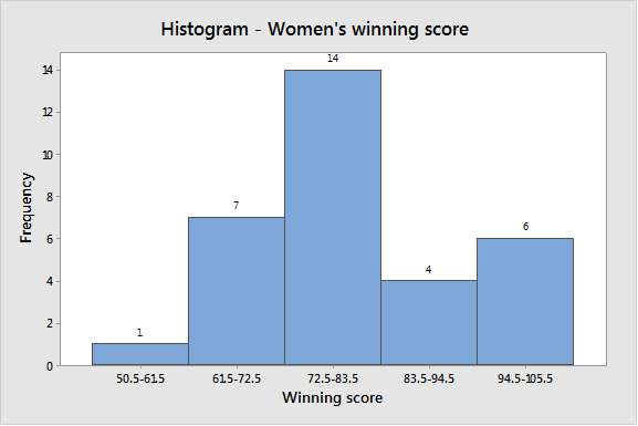
For Women’s winning score data:
The largest value of the data set is 101 and the smallest value is 51 in the women’s winning score data.
Using five classes, the class width calculated in the following way:
The frequency table is as follows:
| Class-limits | Class boundaries | Frequency |
| 51–61 | 50.5–61.5 | 1 |
| 62–72 | 61.5–72.5 | 7 |
| 73–83 | 72.5–83.5 | 14 |
| 84–94 | 83.5–94.5 | 4 |
| 95–105 | 94.5–105.5 | 6 |
To construct the histogram by using the MINITAB, the steps are as follows:
Step 1: Enter the class boundaries in C7 and frequency in C8.
Step 2: Go to Graph > Histogram > Simple.
Step 3: Enter C8 in Graph variable, then go to Data options > Frequency > C8.
Step 4: Click on OK.
The obtained histogram is
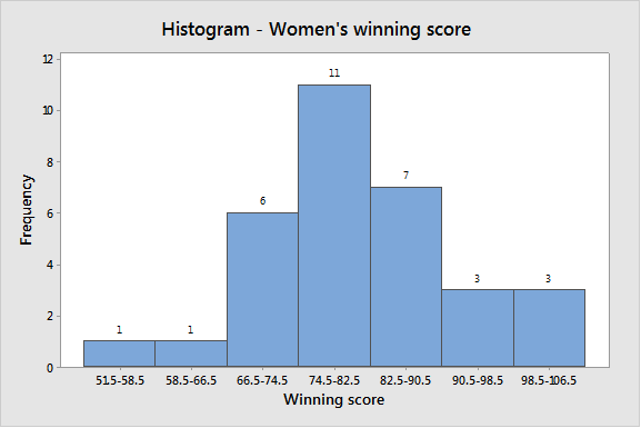
Using seven classes, the class width is calculated in the following way:
The frequency table is as follows:
| Class-limits | Class boundaries | Frequency |
| 51–58 | 51.5–58.5 | 1 |
| 59–66 | 58.5–66.5 | 1 |
| 67–74 | 66.5–74.5 | 6 |
| 75–82 | 74.5–82.5 | 11 |
| 83–90 | 82.5–90.5 | 7 |
| 91–98 | 90.5–98.5 | 3 |
| 99–106 | 98.5–106.5 | 3 |
To construct the histogram by using the MINITAB, the steps are as follows:
Step 1: Enter the class boundaries in C9 and frequency in C10.
Step 2: Go to Graph > Histogram > Simple.
Step 3: Enter C9 in Graph variable, then go to Data options > Frequency > C10.
Step 4: Click on OK.
The obtained histogram is:
Using 10 classes, the class width calculated in the following way:
The frequency table is as follows:
| Class-limits | Class boundaries | Frequency |
| 51–55 | 50.5–55.5 | 1 |
| 56–60 | 55.5–60.5 | 0 |
| 61–65 | 60.5–65.5 | 0 |
| 66–70 | 65.5–70.5 | 5 |
| 71–75 | 70.5–75.5 | 3 |
| 76–80 | 75.5–80.5 | 9 |
| 81–85 | 80.5–85.5 | 6 |
| 86–90 | 85.5–90.5 | 2 |
| 91–95 | 90.5–95.5 | 0 |
| 96 and more | 95.5 and more | 6 |
To construct the histogram by using the MINITAB, the steps are as follows:
Step 1: Enter the class boundaries in C11 and frequency in C12.
Step 2: Go to Graph > Histogram > Simple.
Step 3: Enter C11 in Graph variable, then go to Data options > Frequency > C12.
Step 4: Click on OK.
The obtained histogram is
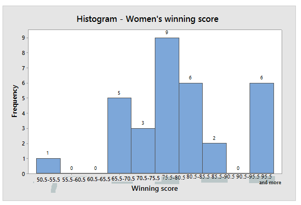
Using number classes five and seven in both data sets of men’s and women’s seem to be the best because histograms for that classes shows reliable distribution but using classes ten show gap between the bars. Since, using five classes seems best than using classes seven.
Want to see more full solutions like this?
Chapter 2 Solutions
Understanding Basic Statistics


- The following ordered data list shows the data speeds for cell phones used by a telephone company at an airport: A. Calculate the Measures of Central Tendency from the ungrouped data list. B. Group the data in an appropriate frequency table. C. Calculate the Measures of Central Tendency using the table in point B. 0.8 1.4 1.8 1.9 3.2 3.6 4.5 4.5 4.6 6.2 6.5 7.7 7.9 9.9 10.2 10.3 10.9 11.1 11.1 11.6 11.8 12.0 13.1 13.5 13.7 14.1 14.2 14.7 15.0 15.1 15.5 15.8 16.0 17.5 18.2 20.2 21.1 21.5 22.2 22.4 23.1 24.5 25.7 28.5 34.6 38.5 43.0 55.6 71.3 77.8arrow_forwardII Consider the following data matrix X: X1 X2 0.5 0.4 0.2 0.5 0.5 0.5 10.3 10 10.1 10.4 10.1 10.5 What will the resulting clusters be when using the k-Means method with k = 2. In your own words, explain why this result is indeed expected, i.e. why this clustering minimises the ESS map.arrow_forwardwhy the answer is 3 and 10?arrow_forward
- PS 9 Two films are shown on screen A and screen B at a cinema each evening. The numbers of people viewing the films on 12 consecutive evenings are shown in the back-to-back stem-and-leaf diagram. Screen A (12) Screen B (12) 8 037 34 7 6 4 0 534 74 1645678 92 71689 Key: 116|4 represents 61 viewers for A and 64 viewers for B A second stem-and-leaf diagram (with rows of the same width as the previous diagram) is drawn showing the total number of people viewing films at the cinema on each of these 12 evenings. Find the least and greatest possible number of rows that this second diagram could have. TIP On the evening when 30 people viewed films on screen A, there could have been as few as 37 or as many as 79 people viewing films on screen B.arrow_forwardQ.2.4 There are twelve (12) teams participating in a pub quiz. What is the probability of correctly predicting the top three teams at the end of the competition, in the correct order? Give your final answer as a fraction in its simplest form.arrow_forwardThe table below indicates the number of years of experience of a sample of employees who work on a particular production line and the corresponding number of units of a good that each employee produced last month. Years of Experience (x) Number of Goods (y) 11 63 5 57 1 48 4 54 5 45 3 51 Q.1.1 By completing the table below and then applying the relevant formulae, determine the line of best fit for this bivariate data set. Do NOT change the units for the variables. X y X2 xy Ex= Ey= EX2 EXY= Q.1.2 Estimate the number of units of the good that would have been produced last month by an employee with 8 years of experience. Q.1.3 Using your calculator, determine the coefficient of correlation for the data set. Interpret your answer. Q.1.4 Compute the coefficient of determination for the data set. Interpret your answer.arrow_forward
- Can you answer this question for mearrow_forwardTechniques QUAT6221 2025 PT B... TM Tabudi Maphoru Activities Assessments Class Progress lIE Library • Help v The table below shows the prices (R) and quantities (kg) of rice, meat and potatoes items bought during 2013 and 2014: 2013 2014 P1Qo PoQo Q1Po P1Q1 Price Ро Quantity Qo Price P1 Quantity Q1 Rice 7 80 6 70 480 560 490 420 Meat 30 50 35 60 1 750 1 500 1 800 2 100 Potatoes 3 100 3 100 300 300 300 300 TOTAL 40 230 44 230 2 530 2 360 2 590 2 820 Instructions: 1 Corall dawn to tha bottom of thir ceraan urina se se tha haca nariad in archerca antarand cubmit Q Search ENG US 口X 2025/05arrow_forwardThe table below indicates the number of years of experience of a sample of employees who work on a particular production line and the corresponding number of units of a good that each employee produced last month. Years of Experience (x) Number of Goods (y) 11 63 5 57 1 48 4 54 45 3 51 Q.1.1 By completing the table below and then applying the relevant formulae, determine the line of best fit for this bivariate data set. Do NOT change the units for the variables. X y X2 xy Ex= Ey= EX2 EXY= Q.1.2 Estimate the number of units of the good that would have been produced last month by an employee with 8 years of experience. Q.1.3 Using your calculator, determine the coefficient of correlation for the data set. Interpret your answer. Q.1.4 Compute the coefficient of determination for the data set. Interpret your answer.arrow_forward
 Glencoe Algebra 1, Student Edition, 9780079039897...AlgebraISBN:9780079039897Author:CarterPublisher:McGraw Hill
 Holt Mcdougal Larson Pre-algebra: Student Edition...AlgebraISBN:9780547587776Author:HOLT MCDOUGALPublisher:HOLT MCDOUGAL