Videos
Create frequency histograms for the data on men’s winning scores with classes of 5, 7, and 10.
Create frequency histograms for the data on women’s winning scores with classes of 5, 7, and 10.
Identify the best choice of the number of classes and give reason.
Answer to Problem 1UT
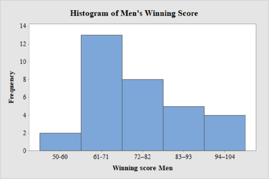
The frequency histogram for the data on men’s winning scores with five classes is shown below:
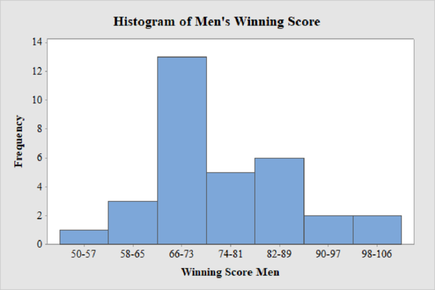
The frequency histogram for the data on men’s winning scores with seven classes is shown below:
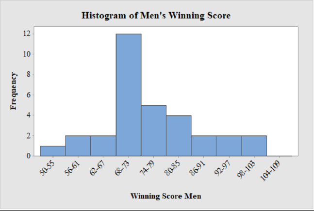
The frequency histogram for the data on men’s winning scores with ten classes is shown below:
The frequency histogram for the data on women’s winning scores with five classes is shown below:
The frequency histogram for the data on women’s winning scores with seven classes is shown below:
The frequency histogram for the data on women’s winning scores with ten classes is shown below:
The best choice for the number of classes is seven.
Explanation of Solution
Calculation:
Class limits:
Class limits are the maximum and minimum values in the class interval
Class Boundaries:
A class boundary is the midpoint between the upper limit of one class and the lower limit of the next class where the upper limit of the preceding class interval and the lower limit of the next class interval will be equal. The upper class boundary is calculated by adding 0.5 to the upper class limit and the lower class boundary is calculated by subtracting 0.5 from the lower class limit.
Frequency:
Frequency is the number of data points that fall under each class.
Men’s Winning Score with five classes:
From the given data set, the largest data point is 101 and the smallest data point is 50.
Class Width:
The class width is calculated as follows:
The class width is 11. Hence, the lower class limit for the second class 61 is calculated by adding 11 to 50. Following this pattern, all the lower class limits are established. Then, the upper class limits are calculated.
The frequency distribution table is given below:
| Class Limits | Class Boundaries | Frequency |
| 50-60 | 49.5–60.5 | 2 |
| 61-71 | 60.5–71.5 | 13 |
| 72–82 | 71.5–82.5 | 8 |
| 83–93 | 82.5–93.5 | 5 |
| 94–104 | 93.5–104.5 | 4 |
Step-by-step procedure to draw the histogram using MINITAB software:
- Choose Graph > Bar Chart.
- From Bars represent, choose Values from a table.
- Under One column of values, choose Simple. Click OK.
- In Graph variables, enter the column of Frequency.
- In Categorical variables, enter the column of Winning Score Men.
- Click OK.
Thus, the histogram for men’s winning score with five classes is obtained.
Men’s Winning Score with seven classes:
From the given data set, the largest data point is 101 and the smallest data point is 50.
Class Width:
The class width is calculated as follows:
The class width is 8. Hence, the lower class limit for the second class 58 is calculated by adding 8 to 50. Following this pattern, all the lower class limits are established. Then, the upper class limits are calculated.
The frequency distribution table is given below:
| Class Limits | Class Boundaries | Frequency |
| 50-57 | 49.5-57.5 | 1 |
| 58-65 | 57.5-65.5 | 3 |
| 66-73 | 65.5-73.5 | 13 |
| 74-81 | 73.5-81.5 | 5 |
| 82-89 | 81.5-89.5 | 6 |
| 90-97 | 89.5-97.5 | 2 |
| 98-106 | 97.5-106.5 | 2 |
Step-by-step procedure to draw the histogram using MINITAB software:
- Choose Graph > Bar Chart.
- From Bars represent, choose Values from a table.
- Under One column of values, choose Simple. Click OK.
- In Graph variables, enter the column of Frequency.
- In Categorical variables, enter the column of Winning Score Men.
- Click OK.
Thus, the histogram for men’s winning score with seven classes is obtained.
Men’s Winning Score with ten classes:
From the given data set, the largest data point is 101 and the smallest data point is 50.
Class Width:
The class width is calculated as follows:
The class width is 6. Hence, the lower class limit for the second class 56 is calculated by adding 6 to 50. Following this pattern, all the lower class limits are established. Then, the upper class limits are calculated.
The frequency distribution table is given below:
| Class Limits | Class Boundaries | Frequency |
| 50-55 | 49.5-55.5 | 1 |
| 56-61 | 55.5-61.5 | 2 |
| 62-67 | 61.5-67.5 | 2 |
| 68-73 | 67.5-73.5 | 12 |
| 74-79 | 73.5-79.5 | 5 |
| 80-85 | 79.5-85.5 | 4 |
| 86-91 | 85.5-91.5 | 2 |
| 92-97 | 91.5-97.5 | 2 |
| 98-103 | 97.5-103.5 | 2 |
| 104-109 | 103.5-109.5 | 0 |
Step-by-step procedure to draw the histogram using MINITAB software:
- Choose Graph > Bar Chart.
- From Bars represent, choose Values from a table.
- Under One column of values, choose Simple. Click OK.
- In Graph variables, enter the column of Frequency.
- In Categorical variables, enter the column of Winning Score Men.
- Click OK.
Thus, the histogram for men’s winning score with ten classes is obtained.
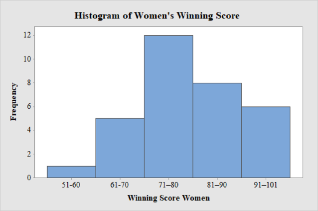
Women’s Winning Score with five classes:
From the given data set, the largest data point is 101 and the smallest data point is 51.
Class Width:
The class width is calculated as follows:
The class width is 10. Hence, the lower class limit for the second class 61 is calculated by adding 10 to 51. Following this pattern, all the lower class limits are established. Then, the upper class limits are calculated.
The frequency distribution table is given below:
| Class Limits | Class Boundaries | Frequency |
| 51-60 | 50.5-60.5 | 1 |
| 61-70 | 60.5-70.5 | 5 |
| 71–80 | 70.5–80.5 | 12 |
| 81–90 | 80.5–90.5 | 8 |
| 91–101 | 90.5–101.5 | 6 |
Step-by-step procedure to draw the histogram using MINITAB software:
- Choose Graph > Bar Chart.
- From Bars represent, choose Values from a table.
- Under One column of values, choose Simple. Click OK.
- In Graph variables, enter the column of Frequency.
- In Categorical variables, enter the column of Winning Score Women.
- Click OK.
Thus, the histogram for women’s winning score with five classes is obtained.
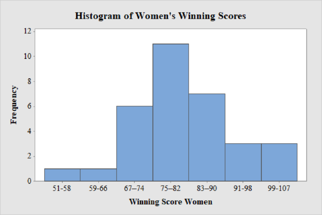
Women’s Winning Score with seven classes:
From the given data set, the largest data point is 101 and the smallest data point is 51.
Class Width:
The class width is calculated as follows:
The class width is 8. Hence, the lower class limit for the second class 59 is calculated by adding 8 to 51. Following this pattern, all the lower class limits are established. Then, the upper class limits are calculated.
The frequency distribution table is given below:
| Class Limits | Class Boundaries | Frequency |
| 51-58 | 50.5-58.5 | 1 |
| 59-66 | 58.5-66.5 | 1 |
| 67–74 | 66.5–74.5 | 6 |
| 75–82 | 74.5–82.5 | 11 |
| 83–90 | 82.5–90.5 | 7 |
| 91-98 | 90.5-98.5 | 3 |
| 99-107 | 98.5-107.5 | 3 |
Step-by-step procedure to draw the histogram using MINITAB software:
- Choose Graph > Bar Chart.
- From Bars represent, choose Values from a table.
- Under One column of values, choose Simple. Click OK.
- In Graph variables, enter the column of Frequency.
- In Categorical variables, enter the column of Winning Score Women.
- Click OK.
Thus, the histogram for women’s winning score with seven classes is obtained.
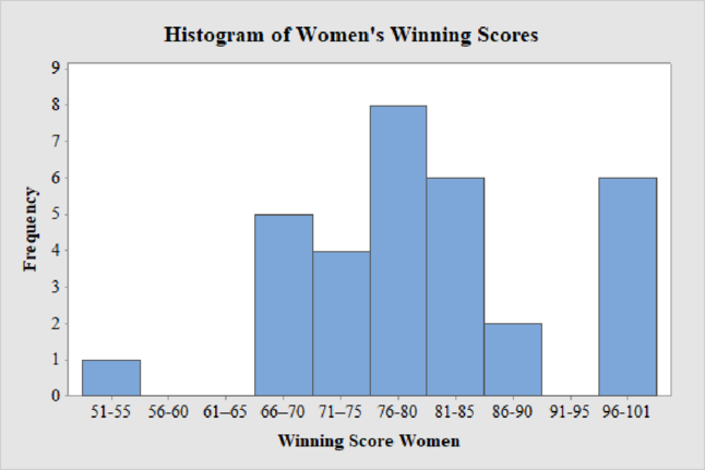
Women’s Winning Score with ten classes:
From the given data set, the largest data point is 101 and the smallest data point is 51.
Class Width:
The class width is calculated as follows:
The class width is 5. Hence, the lower class limit for the second class 56 is calculated by adding 5 to 51. Following this pattern, all the lower class limits are established. Then, the upper class limits are calculated.
The frequency distribution table is given below:
| Class Limits | Class Boundaries | Frequency |
| 51-55 | 50.5–55.5 | 1 |
| 56-60 | 55.5–60.5 | 0 |
| 61–65 | 60.5–65.5 | 0 |
| 66–70 | 65.5–70.5 | 5 |
| 71–75 | 70.5–75.5 | 4 |
| 76-80 | 75.5-80.5 | 8 |
| 81-85 | 80.5-85.5 | 6 |
| 86-90 | 85.5-90.5 | 2 |
| 91-95 | 90.5-95.5 | 0 |
| 96-101 | 95.5-101.5 | 6 |
Step-by-step procedure to draw the histogram using MINITAB software:
- Choose Graph > Bar Chart.
- From Bars represent, choose Values from a table.
- Under One column of values, choose Simple. Click OK.
- In Graph variables, enter the column of Frequency.
- In Categorical variables, enter the column of Winning Score Women.
- Click OK.
Thus, the histogram for women’s winning score with ten classes is obtained.
Best Choice of Number of classes:
From the Histograms of men and women winning scores for three different classes 5, 7 and 10, it can be observed that the histogram with seven numbers of classes is the best choice as the distribution of both men’s and women’s winning scores are approximately mound-shaped or symmetric with a single peak without any outliers.
Want to see more full solutions like this?
Chapter 2 Solutions
Understandable Statistics: Concepts and Methods


- why the answer is 3 and 10?arrow_forwardPS 9 Two films are shown on screen A and screen B at a cinema each evening. The numbers of people viewing the films on 12 consecutive evenings are shown in the back-to-back stem-and-leaf diagram. Screen A (12) Screen B (12) 8 037 34 7 6 4 0 534 74 1645678 92 71689 Key: 116|4 represents 61 viewers for A and 64 viewers for B A second stem-and-leaf diagram (with rows of the same width as the previous diagram) is drawn showing the total number of people viewing films at the cinema on each of these 12 evenings. Find the least and greatest possible number of rows that this second diagram could have. TIP On the evening when 30 people viewed films on screen A, there could have been as few as 37 or as many as 79 people viewing films on screen B.arrow_forwardQ.2.4 There are twelve (12) teams participating in a pub quiz. What is the probability of correctly predicting the top three teams at the end of the competition, in the correct order? Give your final answer as a fraction in its simplest form.arrow_forward
- The table below indicates the number of years of experience of a sample of employees who work on a particular production line and the corresponding number of units of a good that each employee produced last month. Years of Experience (x) Number of Goods (y) 11 63 5 57 1 48 4 54 5 45 3 51 Q.1.1 By completing the table below and then applying the relevant formulae, determine the line of best fit for this bivariate data set. Do NOT change the units for the variables. X y X2 xy Ex= Ey= EX2 EXY= Q.1.2 Estimate the number of units of the good that would have been produced last month by an employee with 8 years of experience. Q.1.3 Using your calculator, determine the coefficient of correlation for the data set. Interpret your answer. Q.1.4 Compute the coefficient of determination for the data set. Interpret your answer.arrow_forwardCan you answer this question for mearrow_forwardTechniques QUAT6221 2025 PT B... TM Tabudi Maphoru Activities Assessments Class Progress lIE Library • Help v The table below shows the prices (R) and quantities (kg) of rice, meat and potatoes items bought during 2013 and 2014: 2013 2014 P1Qo PoQo Q1Po P1Q1 Price Ро Quantity Qo Price P1 Quantity Q1 Rice 7 80 6 70 480 560 490 420 Meat 30 50 35 60 1 750 1 500 1 800 2 100 Potatoes 3 100 3 100 300 300 300 300 TOTAL 40 230 44 230 2 530 2 360 2 590 2 820 Instructions: 1 Corall dawn to tha bottom of thir ceraan urina se se tha haca nariad in archerca antarand cubmit Q Search ENG US 口X 2025/05arrow_forward
- The table below indicates the number of years of experience of a sample of employees who work on a particular production line and the corresponding number of units of a good that each employee produced last month. Years of Experience (x) Number of Goods (y) 11 63 5 57 1 48 4 54 45 3 51 Q.1.1 By completing the table below and then applying the relevant formulae, determine the line of best fit for this bivariate data set. Do NOT change the units for the variables. X y X2 xy Ex= Ey= EX2 EXY= Q.1.2 Estimate the number of units of the good that would have been produced last month by an employee with 8 years of experience. Q.1.3 Using your calculator, determine the coefficient of correlation for the data set. Interpret your answer. Q.1.4 Compute the coefficient of determination for the data set. Interpret your answer.arrow_forwardQ.3.2 A sample of consumers was asked to name their favourite fruit. The results regarding the popularity of the different fruits are given in the following table. Type of Fruit Number of Consumers Banana 25 Apple 20 Orange 5 TOTAL 50 Draw a bar chart to graphically illustrate the results given in the table.arrow_forwardQ.2.3 The probability that a randomly selected employee of Company Z is female is 0.75. The probability that an employee of the same company works in the Production department, given that the employee is female, is 0.25. What is the probability that a randomly selected employee of the company will be female and will work in the Production department? Q.2.4 There are twelve (12) teams participating in a pub quiz. What is the probability of correctly predicting the top three teams at the end of the competition, in the correct order? Give your final answer as a fraction in its simplest form.arrow_forward
- Q.2.1 A bag contains 13 red and 9 green marbles. You are asked to select two (2) marbles from the bag. The first marble selected will not be placed back into the bag. Q.2.1.1 Construct a probability tree to indicate the various possible outcomes and their probabilities (as fractions). Q.2.1.2 What is the probability that the two selected marbles will be the same colour? Q.2.2 The following contingency table gives the results of a sample survey of South African male and female respondents with regard to their preferred brand of sports watch: PREFERRED BRAND OF SPORTS WATCH Samsung Apple Garmin TOTAL No. of Females 30 100 40 170 No. of Males 75 125 80 280 TOTAL 105 225 120 450 Q.2.2.1 What is the probability of randomly selecting a respondent from the sample who prefers Garmin? Q.2.2.2 What is the probability of randomly selecting a respondent from the sample who is not female? Q.2.2.3 What is the probability of randomly…arrow_forwardTest the claim that a student's pulse rate is different when taking a quiz than attending a regular class. The mean pulse rate difference is 2.7 with 10 students. Use a significance level of 0.005. Pulse rate difference(Quiz - Lecture) 2 -1 5 -8 1 20 15 -4 9 -12arrow_forwardThe following ordered data list shows the data speeds for cell phones used by a telephone company at an airport: A. Calculate the Measures of Central Tendency from the ungrouped data list. B. Group the data in an appropriate frequency table. C. Calculate the Measures of Central Tendency using the table in point B. D. Are there differences in the measurements obtained in A and C? Why (give at least one justified reason)? I leave the answers to A and B to resolve the remaining two. 0.8 1.4 1.8 1.9 3.2 3.6 4.5 4.5 4.6 6.2 6.5 7.7 7.9 9.9 10.2 10.3 10.9 11.1 11.1 11.6 11.8 12.0 13.1 13.5 13.7 14.1 14.2 14.7 15.0 15.1 15.5 15.8 16.0 17.5 18.2 20.2 21.1 21.5 22.2 22.4 23.1 24.5 25.7 28.5 34.6 38.5 43.0 55.6 71.3 77.8 A. Measures of Central Tendency We are to calculate: Mean, Median, Mode The data (already ordered) is: 0.8, 1.4, 1.8, 1.9, 3.2, 3.6, 4.5, 4.5, 4.6, 6.2, 6.5, 7.7, 7.9, 9.9, 10.2, 10.3, 10.9, 11.1, 11.1, 11.6, 11.8, 12.0, 13.1, 13.5, 13.7, 14.1, 14.2, 14.7, 15.0, 15.1, 15.5,…arrow_forward
 Glencoe Algebra 1, Student Edition, 9780079039897...AlgebraISBN:9780079039897Author:CarterPublisher:McGraw Hill
 Big Ideas Math A Bridge To Success Algebra 1: Stu...AlgebraISBN:9781680331141Author:HOUGHTON MIFFLIN HARCOURTPublisher:Houghton Mifflin Harcourt
 Holt Mcdougal Larson Pre-algebra: Student Edition...AlgebraISBN:9780547587776Author:HOLT MCDOUGALPublisher:HOLT MCDOUGAL
 Functions and Change: A Modeling Approach to Coll...AlgebraISBN:9781337111348Author:Bruce Crauder, Benny Evans, Alan NoellPublisher:Cengage Learning