
Concept explainers
Videos
Politics
Who Benefited Most from Lower Tax Rates?
Politicians have a remarkable capacity to cast numbers in whatever light best supports their positions. There are many ways in which numbers can be made to support a particular position, but one of the most common occurs through selective use of relative (percentages) and absolute numbers.
Consider the two charts shown in Figure 2.4. Both purport to show effects of the tax rate cuts enacted under President Bush in 2001, which remained in effect until tax rates were raised in 2013. The chart in Figure 2.4a, created by supporters of the tax cuts, indicates that the rich ended up paying more under the tax cuts than they would have otherwise. Figure 2.4b, created by opponents of the tax cuts, shows that the rich received far more benefit from the tax cuts than lower-income taxpayers. The two charts therefore seem contradictory, because the first seems to indicate that the rich paid more while the second seems to indicate that they paid less.
Which story is right? In fact, both of the graphs are accurate and show data from reputable sources. (The U.S. Department of the Treasury, cited as the source of the data for Figure 2.4a, is an agency of the federal government; the Joint Committee on Taxation, cited for Figure 2.4b, is a nonpartisan committee of the U.S. Congress.) The seemingly opposing claims arise from the way in which each group chose its data.
The tax cut supporters show the percentage of total taxes that the rich paid with the cuts and what calculations suggest they would have paid without them. The title stating that the “rich pay more” therefore means that the tax cuts led them to pay a higher percentage of total taxes. However, if total tax revenue also was lower than it would have been without the cuts (as it was), a higher percentage of total taxes could still mean lower absolute dollars. It is these lower absolute dollars that are shown by the opponents of the tax cut.
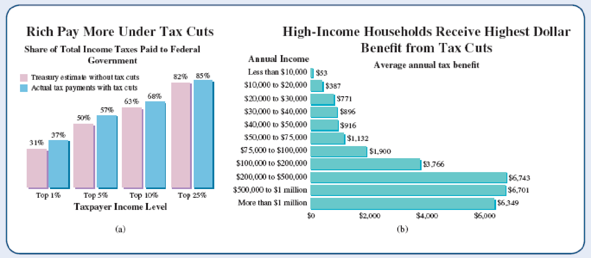
Figure 2.4 Both charts purport to show effects on higher-income households of tax cuts that were in effect from 2001 through 2012, but they were designed to support opposing conclusions. (a) Based on a graph published in The American—The Journal of the American Enterprise Institute. (b) Based on a graph published by the Center on Budget and Policy Priorities (cbpp.org).
Which side was being more fair? Neither, really. The supporters have deliberately focused on a relative change (percentage) in order to mask the absolute change, which would be less favorable to their position. The opponents focused on the absolute change, but neglected to mention the fact that the wealthy pay most of the taxes. Unfortunately, this type of “selective truth” is very common when it comes to numbers, especially those tied up in politics.
“Politicians and government officials usually abuse numbers and logic in the most elementary ways. They simply cook figures to suit their purpose, use obscure measures of economic performance, and indulge in horrendous examples of chart abuse, all in the name of disguising unpalatable truths.”
—A. K. Dewdney, 200% of Nothing
Questions for Discussion
Discuss the chart in Figure 2.4a. Why does it only show taxpayer income levels from the top 1% to the top 25%? What does it tell us about the relative tax burden on each group shown? Do you think its claim that the “rich pay more” is an honest depiction or a distortion of the facts? Defend your opinion.
Want to see the full answer?
Check out a sample textbook solution
Chapter 2 Solutions
Statistical Reasoning for Everyday Life - MyStatLab


- Examine the Variables: Carefully review and note the names of all variables in the dataset. Examples of these variables include: Mileage (mpg) Number of Cylinders (cyl) Displacement (disp) Horsepower (hp) Research: Google to understand these variables. Statistical Analysis: Select mpg variable, and perform the following statistical tests. Once you are done with these tests using mpg variable, repeat the same with hp Mean Median First Quartile (Q1) Second Quartile (Q2) Third Quartile (Q3) Fourth Quartile (Q4) 10th Percentile 70th Percentile Skewness Kurtosis Document Your Results: In RStudio: Before running each statistical test, provide a heading in the format shown at the bottom. “# Mean of mileage – Your name’s command” In Microsoft Word: Once you've completed all tests, take a screenshot of your results in RStudio and paste it into a Microsoft Word document. Make sure that snapshots are very clear. You will need multiple snapshots. Also transfer these results to the…arrow_forward2 (VaR and ES) Suppose X1 are independent. Prove that ~ Unif[-0.5, 0.5] and X2 VaRa (X1X2) < VaRa(X1) + VaRa (X2). ~ Unif[-0.5, 0.5]arrow_forward8 (Correlation and Diversification) Assume we have two stocks, A and B, show that a particular combination of the two stocks produce a risk-free portfolio when the correlation between the return of A and B is -1.arrow_forward
- 9 (Portfolio allocation) Suppose R₁ and R2 are returns of 2 assets and with expected return and variance respectively r₁ and 72 and variance-covariance σ2, 0%½ and σ12. Find −∞ ≤ w ≤ ∞ such that the portfolio wR₁ + (1 - w) R₂ has the smallest risk.arrow_forward7 (Multivariate random variable) Suppose X, €1, €2, €3 are IID N(0, 1) and Y2 Y₁ = 0.2 0.8X + €1, Y₂ = 0.3 +0.7X+ €2, Y3 = 0.2 + 0.9X + €3. = (In models like this, X is called the common factors of Y₁, Y₂, Y3.) Y = (Y1, Y2, Y3). (a) Find E(Y) and cov(Y). (b) What can you observe from cov(Y). Writearrow_forward1 (VaR and ES) Suppose X ~ f(x) with 1+x, if 0> x > −1 f(x) = 1−x if 1 x > 0 Find VaRo.05 (X) and ES0.05 (X).arrow_forward
- Joy is making Christmas gifts. She has 6 1/12 feet of yarn and will need 4 1/4 to complete our project. How much yarn will she have left over compute this solution in two different ways arrow_forwardSolve for X. Explain each step. 2^2x • 2^-4=8arrow_forwardOne hundred people were surveyed, and one question pertained to their educational background. The results of this question and their genders are given in the following table. Female (F) Male (F′) Total College degree (D) 30 20 50 No college degree (D′) 30 20 50 Total 60 40 100 If a person is selected at random from those surveyed, find the probability of each of the following events.1. The person is female or has a college degree. Answer: equation editor Equation Editor 2. The person is male or does not have a college degree. Answer: equation editor Equation Editor 3. The person is female or does not have a college degree.arrow_forward
 Glencoe Algebra 1, Student Edition, 9780079039897...AlgebraISBN:9780079039897Author:CarterPublisher:McGraw Hill
 Holt Mcdougal Larson Pre-algebra: Student Edition...AlgebraISBN:9780547587776Author:HOLT MCDOUGALPublisher:HOLT MCDOUGAL
 Algebra: Structure And Method, Book 1AlgebraISBN:9780395977224Author:Richard G. Brown, Mary P. Dolciani, Robert H. Sorgenfrey, William L. ColePublisher:McDougal Littell