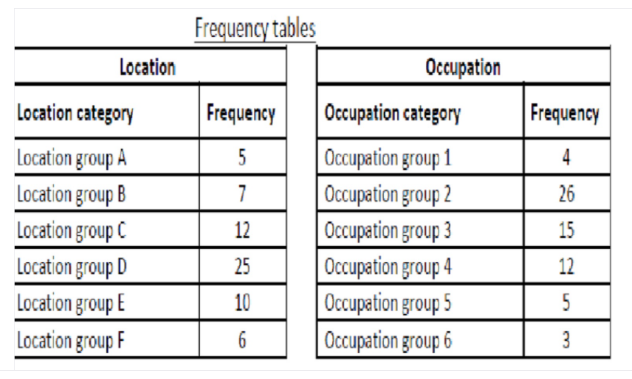
First, the researcher categorised the data into six location groups and six occupation groups, and calculated the frequencies given below: Using Excel and the data in the frequency tables above, answer the following questions. a) Which graphical technique or chart should be used if the researcher is interested in comparing the number of individuals in each location group? Explain the reason for the selection of this graphical chart. Construct and display the chart, also briefly describe what you can observe about the number of individuals belonging to each location category. b) Which graphical technique or chart should be used if the researcher is interested in comparing the proportion of the number of individuals in each occupation group? Explain the reason for the selection of this graphical chart. Construct and display the chart, also briefly describe what you can observe about the proportion of the number of individuals belonging to each occupation category. Frequency tables Location Occupation Location category Frequency Occupation category Frequency Location group A Occupation group 1 Occupation group 2 Occupation group 3 Occupation group 4 Occupation group 5 Occupation group 6 4 Location group B 7 26 Location group C 12 15 Location group D 25 12 Location group E 10 5 Location group F 6 3
First, the researcher categorised the data into six location groups and six occupation groups, and calculated the frequencies given below: Using Excel and the data in the frequency tables above, answer the following questions. a) Which graphical technique or chart should be used if the researcher is interested in comparing the number of individuals in each location group? Explain the reason for the selection of this graphical chart. Construct and display the chart, also briefly describe what you can observe about the number of individuals belonging to each location category. b) Which graphical technique or chart should be used if the researcher is interested in comparing the proportion of the number of individuals in each occupation group? Explain the reason for the selection of this graphical chart. Construct and display the chart, also briefly describe what you can observe about the proportion of the number of individuals belonging to each occupation category. Frequency tables Location Occupation Location category Frequency Occupation category Frequency Location group A Occupation group 1 Occupation group 2 Occupation group 3 Occupation group 4 Occupation group 5 Occupation group 6 4 Location group B 7 26 Location group C 12 15 Location group D 25 12 Location group E 10 5 Location group F 6 3

MATLAB: An Introduction with Applications
6th Edition
ISBN:9781119256830
Author:Amos Gilat
Publisher:Amos Gilat
Chapter1: Starting With Matlab
Section: Chapter Questions
Problem 1P

Related questions
Question

Transcribed Image Text:First, the researcher categorised the data into six location groups and six occupation groups, and calculated the frequencies given below:
Using Excel and the data in the frequency tables above, answer the following questions.
a) Which graphical technique or chart should be used if the researcher is interested in comparing the number of individuals in each location group? Explain
the reason for the selection of this graphical chart. Construct and display the chart, also briefly describe what you can observe about the number of
individuals belonging to each location category.
b) Which graphical technique or chart should be used if the researcher is interested in comparing the proportion of the number of individuals in each
occupation group? Explain the reason for the selection of this graphical chart. Construct and display the chart, also briefly describe what you can observe
about the proportion of the number of individuals belonging to each occupation category.
Frequency tables
Location
Occupation
Location category
Frequency
Occupation category
Frequency
Location group A
Occupation group 1
Occupation group 2
Occupation group 3
Occupation group 4
Occupation group 5
Occupation group 6
4
Location group B
7
26
Location group C
12
15
Location group D
25
12
Location group E
10
5
Location group F
6
3
Expert Solution
Step 1
Given data is:
Step 2
a) The graphical chart that should be use to compare the number of individuals in each location group is bar graph.
The reason is that bar graph makes its easy to compare the number of individuals (frequency).
The bar graph is given as:
| Location Category | Frequency |
| Location group A | 5 |
| Location group B | 7 |
| Location group C | 12 |
| Location group D | 25 |
| Location group E | 10 |
| Location group F | 6 |
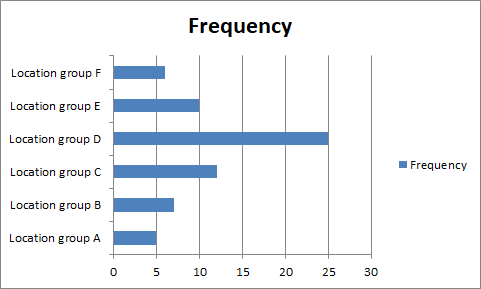
From bar graph it can be observed that, the Location Group D have maximum frequency.

Step by step
Solved in 3 steps with 3 images

Recommended textbooks for you
MATLAB: An Introduction with Applications
Statistics
ISBN:
9781119256830
Author:
Amos Gilat
Publisher:
John Wiley & Sons Inc

Probability and Statistics for Engineering and th…
Statistics
ISBN:
9781305251809
Author:
Jay L. Devore
Publisher:
Cengage Learning

Statistics for The Behavioral Sciences (MindTap C…
Statistics
ISBN:
9781305504912
Author:
Frederick J Gravetter, Larry B. Wallnau
Publisher:
Cengage Learning
MATLAB: An Introduction with Applications
Statistics
ISBN:
9781119256830
Author:
Amos Gilat
Publisher:
John Wiley & Sons Inc
Probability and Statistics for Engineering and th…
Statistics
ISBN:
9781305251809
Author:
Jay L. Devore
Publisher:
Cengage Learning
Statistics for The Behavioral Sciences (MindTap C…
Statistics
ISBN:
9781305504912
Author:
Frederick J Gravetter, Larry B. Wallnau
Publisher:
Cengage Learning

Elementary Statistics: Picturing the World (7th E…
Statistics
ISBN:
9780134683416
Author:
Ron Larson, Betsy Farber
Publisher:
PEARSON

The Basic Practice of Statistics
Statistics
ISBN:
9781319042578
Author:
David S. Moore, William I. Notz, Michael A. Fligner
Publisher:
W. H. Freeman

Introduction to the Practice of Statistics
Statistics
ISBN:
9781319013387
Author:
David S. Moore, George P. McCabe, Bruce A. Craig
Publisher:
W. H. Freeman