Body Temperature. A study by researchers at the University of Maryland addressed the question of whether the mean body temperature of humans is 98.6°F. The results of the study by P. Mackowiak et al. appeared in the article “A Critical Appraisal of 98.6◦F, the Upper Limit of the Normal Body Temperature, and Other Legacies of Carl Reinhold August Wunderlich” (Journal of the American Medical Association, Vol. 268, pp. 1578–1580). Among other data, the researchers obtained the body temperatures of 93 healthy humans, as provided on theWeissStats site. Use the technology of your choice to obtain and interpret a. a frequency histogram or a relative-frequency histogram of the temperatures. b. a dotplot of the temperatures. c. a stem-and-leaf diagram of the temperatures. d. Compare your graphs from parts (a)–(c). Which do you find most useful?
Body Temperature. A study by researchers at the University of Maryland addressed the question of whether the mean body temperature of humans is 98.6°F. The results of the study by P. Mackowiak et al. appeared in the article “A Critical Appraisal of 98.6◦F, the Upper Limit of the Normal Body Temperature, and Other Legacies of Carl Reinhold August Wunderlich” (Journal of the American Medical Association, Vol. 268, pp. 1578–1580). Among other data, the researchers obtained the body temperatures of 93 healthy humans, as provided on theWeissStats site. Use the technology of your choice to obtain and interpret
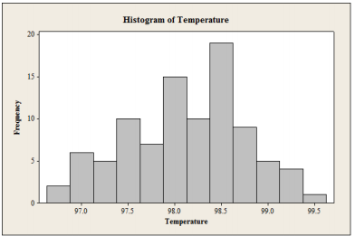
a. a frequency histogram or a relative-frequency histogram of the temperatures.
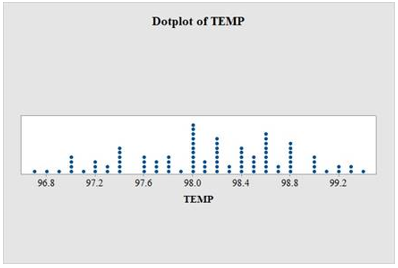
b. a dotplot of the temperatures.
c. a stem-and-leaf diagram of the temperatures.
d. Compare your graphs from parts (a)–(c). Which do you find most useful?
a.
Obtain the frequency histogram or relative frequency histogram of the temperatures.
The data represents the body temperature (in fahren heat) for 93 healthy humans, which is provided from Weiss stats site.
Procedure to draw the frequency histogram chart by using MINITAB software.
- Choose Graph > Histogram.
- Choose Simple, and then click OK.
- In Graph variables, enter the corresponding column of Length.
- Click labels, click the Data labels, make click on y-value labels.
- In scale on y-axis, make click on frequency.
- To modify the width of each bar, double click on the horizontal axis of the graph. Then, select edit bars > Binning. In this box, enter the values for the cut points of the bin intervals (97.0 97.5 98.0 98.5 99.0 99.5)
- Click on ok.
Output:

Thus, the histogram is constructed for the body temperatures of 93 healthy humans
b.
Obtain a dot plot for the data.
Procedure to draw dot plot using MINITAB software is as follows:
- Select Graph > Dot plot.
- Select the column of temp in Graph variables.
- Select OK.
Output:

The dot plot is constructed by locate the original values of the data set as a dot over the horizontal axis
All possible set of values related to the dot plot is displayed in the horizontal axis and the data is arranged from lowest value to the highest values.
Step by step
Solved in 4 steps with 3 images


