Concept explainers
Use a calculator with an
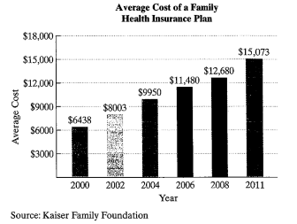
Average annual premiums for employer-sponsored family health insurance policies more than doubled over 11 years The bar graph shows the average cost of a family health insurance plan in the United States for six selected years from 2000 through 2011.
The data can be modeled by
in which f(x) and g(x) represent the average cost of a family health insurance plan x years after 2000. Use these functions to solve Exercises 71–72. Where necessary, round answers to the nearest whole dollar.
a. According to the linear model, what was the average cost of a family health insurance plan in 2011?
b. According to the exponential model, what was the average cost of a family health insurance plan in 2011?
c. Which function is a better model for the data in 2011?
Want to see the full answer?
Check out a sample textbook solutionChapter 4 Solutions
Algebra and Trigonometry
- The U.S. Geological Survey monitors and reports on earthquakes, providing daily real-time, worldwide earthquake lists. Some of the information for four of the 105 earthquakes of magnitude 1.5 or greater that occurred on May 10, 2013, is shown in the following table. Magnitude is given on the Richter scale and NST stands for the number of stations that reported the activity on the same earthquake. Complete parts (a) through (e) below. Time Magnitude Depth (km) NST Region 00:03:16 1.7 75.9 29 Alaska 04:59:11 1.7 134.9 18 Alaska 08:27:04 2.8 64.0 21 Alaska 23:30:09 4.2 10.0 34 China a. Identify the type of data provided by the information in the first column of the table. Also identify the variable under consideration. Quantitative, Continuous, Qualitative, Quantitative, Discrete, region where the earthquake occurred depth of the earthquake in kilometers number of stations reporting the earthquake…arrow_forwardComplete Part D A recent issue of the AARP Bulletin reported that the average weekly pay for a woman with a high school degree is $520 (AARP Bulletin, January–February, 2010). Suppose you would like to determine if the average weekly pay for all working women is significantly greater than that for women with a high school degree. Data providing the weekly pay for a sample of 50 working women are available in the file named WeeklyPay. These data are consistent with the findings reported in the AARP article. Complete D null hyposthesis: H(o)=520Alternative hypothesis: H(a): greater then 520 sample mean=637.94 the test statistic = 5.62 p-value=0.00 Using a=.05, we would reject the null hypothesis. D. Repeat the hypothesis test using the critical value approach. 582 333 759 633 629 523 320 685 599 753 553 641 290 800 696 627 679 667 542 619 950 614 548 570 678 697 750 569…arrow_forward2.62 For the period 2001–2008, the Bristol-Myers Squibb Company, Inc. reported the following amounts (in billions of dollars) for (1) net sales and (2) advertising and product promotion. The data are also in the file XR02062. Source: Bristol-Myers Squibb Company, Annual Reports, 2005, 2008. Year Net Sales Advertising/Promotion 2001 $16.612 $1.201 2002 16.208 1.143 2003 18.653 1.416 2004 19.380 1.411 2005 19.207 1.476 2006 16.208 1.304 2007 18.193 1.415 2008 20.597 1.550 For these data, construct a line graph that shows both net sales and expenditures for advertising/product promotion over time. Some would suggest that increases in advertising should be accompanied by increases in sales. Does your line graph support this?arrow_forward
- Sketch the graph of the functionarrow_forwardIn the rise of online shopping, malls are losing storefronts. The local mall started with 86 stores at the time that it was opened, but has consistently lost 6 stores per year for each year the mall has been open. Which of the following models represents the number of stores in the local mall at any given year, x?arrow_forwardThe graphs below give the diabetes mortality rate for countries with low per capita income and countries with high per capita income.arrow_forward
- 21–23. Language enrollments. The line graph in Figure 2.28 shows total course enrollments in languages other than English in U.S. institutions of higher education from 1960 to 2009. (Enrollments in ancient Greek and Latin are not included.) Exercises 21 through 23 refer to this figure. 1,800,000 1,629,326 1.522.770 1,600,000 - 1,400,000 - 1347.036 1,200,000- 1,073,097 1,067,217 1,000.000 - 975.7m 963,930 883.222 1.06.603 922,439 960.588 B00,000 - 97.077 877.91 600,000 - 608,749 400.000 - 200,000 - 1960 1965 1968 | 1972 1977 1980 1983 1986 1990 1995 199 2002 2006 2009 1970 1974 Figure 2.28 Crauder, et al., Quantitative Literacy, 3e, © 2019 W. H. Freeman and Company FIGURE 2.28 Enrollments in languages other than English in U.S. institutions of higher education (2009). 21. During which time periods did the enrollments decrease? 22. Calculate the average growth rate per year in enrollments over the two periods 1960–1965 and 2006– 2009. Note that the time periods are not of the same…arrow_forwardThe diversity index, from 0 to 100, measures the chance that two randomly selected people are a different race or ethnicity. The diversity index in the United States varies widely from region to region, from as high as 81 in Hawaii to as low as 11 in Vermont. The bar graph shows the national diversity index for the United States for four years in the period from 1980 through 2010.The data in the graph can be modeled by the formulaD = 0.005x2 + 0.55x + 34,where D is the national diversity index in the United States x years after 1980. According to the formula, what was the U.S. diversity index in 2010? How does this compare with the index displayed by the bar graph?arrow_forwardExplain what a time value analysis chart is used for and list the three components within it.arrow_forward
- An aerobic exercise instructor remembers the data given in the following table, which shows the recommended maximum exercise heart rates for individuals of the given ages. Predict the maximum exercise heart rate of a person who is 72 years old Age (x years) 20 30 40 50 60 Maximum heart rate (y beats per minute) 170 168 153 147 136arrow_forwardPage of 11 ZOOM + 5. The table shows how the cost of a carne asada taco at my favorite taco stand has increased as they have become more popular since their opening in 2013. Use the data to answer the questions below. Year, x 2013, 0 2014, 1 2015, 2 2016, 3 2017, 4 2018, 5 2019,6 Cost ($) 0.50 0.55 0.65 0.75 0.90 1.00 1.10 (a) What is the regression line given by your TI-84 for this data? Round values to 3 decimal places. (b) Using the regression equation above, predict the cost of a carne asada taco at my favorite taco stand in 2020. Show the work.arrow_forwardThe scatterplot shows how the pulse rate changes with the weight of a person. Pulse Rate 86.41 - 0.09144(Weight) %3D 100 90 80 70 60 50 100 120 140 160 180 200 220 Pulse Ratearrow_forward
- Glencoe Algebra 1, Student Edition, 9780079039897...AlgebraISBN:9780079039897Author:CarterPublisher:McGraw HillAlgebra & Trigonometry with Analytic GeometryAlgebraISBN:9781133382119Author:SwokowskiPublisher:CengageCollege Algebra (MindTap Course List)AlgebraISBN:9781305652231Author:R. David Gustafson, Jeff HughesPublisher:Cengage Learning