
Subpart (a):
To illustrate the given situation with
Subpart (a):
Explanation of Solution
Figure 1 illustrates the
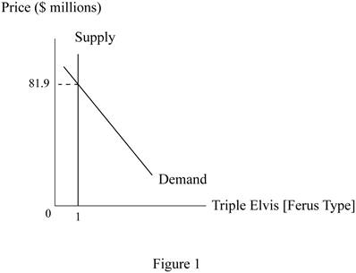
Figure 1 shows the demand and supply curves for the artwork Triple Elvis, which was sold in an auction for $81.9 million. The horizontal axis measures the quantity and the vertical axis measures the price of the commodity. The supply curve is a vertical line because the quantity of the artwork is fixed and unified.
Concept introduction:
Demand curve: A demand curve is a graph which shows the quantities of a commodity that the consumers will buy at different price levels.
Supply curve: A supply curve is a graph which shows the quantities of a commodity that the producers are willing to sell at different price levels.
Subpart (b):
To illustrate the given situation with supply and demand curves.
Subpart (b):
Explanation of Solution
Figure 2 illustrates the change in market equilibrium.
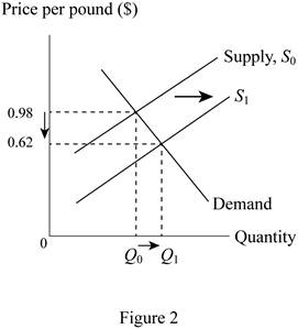
Figure 2 shows the demand and supply curves for the hogs. The horizontal axis measures the quantity and the vertical axis measures the price of the commodity. The increase in the supply of the hogs has led to a rightward shift of the supply curve, all while the demand remains unchanged. As a result, the equilibrium changes and the prices decrease from 98 cents to 62 cents and the quantity increases from Q0 to Q1.
Concept introduction:
Demand curve: A demand curve is a graph which shows the quantities of a commodity that the consumers will buy at different price levels.
Supply curve: A supply curve is a graph which shows the quantities of a commodity that the producers are willing to sell at different price levels.
Subpart (c):
To illustrate the given situation with supply and demand curves.
Subpart (c):
Explanation of Solution
Figure 3 illustrates the change in market equilibrium.
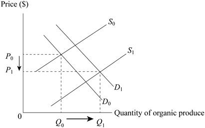
Figure 3 shows the demand and supply curves for the organic produce. The horizontal axis measures the quantity and the vertical axis measures the price of the commodity. The initial increase in the demand for organic produce led to the shift of the demand curve from D0 to D1. However, the increase in the number of farmers producing the organic produce also increased, leading to an increase in the supply of the product which shifts the supply curve from S0 to S1. The combined effect is that the price of organic produce reduces from P0 to P1 as the quantity supplied increases from Q0 to Q1.
Concept introduction:
Demand curve: A demand curve is a graph which shows the quantities of a commodity that the consumers will buy at different price levels.
Supply curve: A supply curve is a graph which shows the quantities of a commodity that the producers are willing to sell at different price levels.
Want to see more full solutions like this?
Chapter 4 Solutions
Principles of Economics (12th Edition)

- Price P 1. Explain the distinction between outputs and outcomes in social service delivery 2. Discuss the Rawlsian theory of justice and briefly comment on its relevance to the political economy of South Africa. [2] [7] 3. Redistributive expenditure can take the form of direct cash transfers (grants) and/or in- kind subsidies. With references to the graphs below, discuss the merits of these two transfer types in the presence and absence of a positive externality. [6] 9 Quantity (a) P, MC, MB MSB MPB+MEB MPB P-MC MEB Quantity (6) MCarrow_forwardDon't use ai to answer I will report you answerarrow_forwardIf 17 Ps are needed and no on-hand inventory exists fot any of thr items, how many Cs will be needed?arrow_forward
- Exercise 5Consider the demand and supply functions for the notebooks market.QD=10,000−100pQS=900pa. Make a table with the corresponding supply and demand schedule.b. Draw the corresponding graph.c. Is it possible to find the price and quantity of equilibrium with the graph method? d. Find the price and quantity of equilibrium by solving the system of equations.arrow_forward1. Consider the market supply curve which passes through the intercept and from which the marketequilibrium data is known, this is, the price and quantity of equilibrium PE=50 and QE=2000.a. Considering those two points, find the equation of the supply. b. Draw a graph for this equation. 2. Considering the previous supply line, determine if the following demand function corresponds to themarket demand equilibrium stated above. QD=.3000-2p.arrow_forwardSupply and demand functions show different relationship between the price and quantities suppliedand demanded. Explain the reason for that relation and provide one reference with your answer.arrow_forward
- 13:53 APP 簸洛瞭對照 Vo 56 5G 48% 48% atheva.cc/index/index/index.html The Most Trusted, Secure, Fast, Reliable Cryptocurrency Exchange Get started with the easiest and most secure platform to buy, sell, trade, and earn Cryptocurrency Balance:0.00 Recharge Withdraw Message About us BTC/USDT ETH/USDT EOS/USDT 83241.12 1841.50 83241.12 +1.00% +0.08% +1.00% Operating norms Symbol Latest price 24hFluctuation B BTC/USDT 83241.12 +1.00% ETH/USDT 1841.50 +0.08% B BTC/USD illı 83241.12 +1.00% Home Markets Trade Record Mine О <arrow_forwardThe production function of a firm is described by the following equation Q=10,000L-3L2 where Lstands for the units of labour.a) Draw a graph for this equation. Use the quantity produced in the y-axis, and the units of labour inthe x-axis. b) What is the maximum production level? c) How many units of labour are needed at that point?arrow_forwardDon't use ai to answer I will report you answerarrow_forward

 Economics (MindTap Course List)EconomicsISBN:9781337617383Author:Roger A. ArnoldPublisher:Cengage Learning

 Exploring EconomicsEconomicsISBN:9781544336329Author:Robert L. SextonPublisher:SAGE Publications, Inc
 Principles of Economics 2eEconomicsISBN:9781947172364Author:Steven A. Greenlaw; David ShapiroPublisher:OpenStax