a.
To graph: Penicillin widespread used in
Given Information:
The data pairs approximately in bar graph
Graph:
A scatter plot of the data. Remember to label the axes if possible.
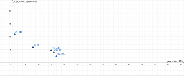
Interpretation :
The data plotted in a scatter plot. Label the
b.
To calculate: Penicillin use grew to such an extent in the
The bar chart gives the incorrect impression that the numbers have changed because it makes it appear as though the years were evenly spaced out.
Given Information:
The scatter plot reveals that the years displayed in the bar chart are unevenly spaced out: there is a
Conclusion:
The bar chart gives the incorrect impression that the numbers have changed because it makes it appear as though the years were evenly spaced out.
Chapter 3 Solutions
PRECALCULUS:GRAPHICAL,...-NASTA ED.
 Calculus: Early TranscendentalsCalculusISBN:9781285741550Author:James StewartPublisher:Cengage Learning
 Thomas' Calculus (14th Edition)CalculusISBN:9780134438986Author:Joel R. Hass, Christopher E. Heil, Maurice D. WeirPublisher:PEARSON
 Calculus: Early Transcendentals (3rd Edition)CalculusISBN:9780134763644Author:William L. Briggs, Lyle Cochran, Bernard Gillett, Eric SchulzPublisher:PEARSON
 Calculus: Early TranscendentalsCalculusISBN:9781319050740Author:Jon Rogawski, Colin Adams, Robert FranzosaPublisher:W. H. Freeman
 Calculus: Early Transcendental FunctionsCalculusISBN:9781337552516Author:Ron Larson, Bruce H. EdwardsPublisher:Cengage Learning
