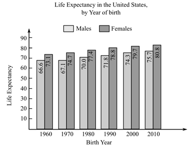
To graph: The scatter plot that represents the data as a set of six points in the rectangular coordinate axis, where x represent the number of birth years after 1960 and y represents female life expectancy. The bar graph for American men and women life expectancy born in six selected years is shown below,
To graph: The scatter plot that represents the data as a set of six points in the rectangular coordinate axis, where x represent the number of birth years after 1960 and y represents female life expectancy. The bar graph for American men and women life expectancy born in six selected years is shown below,
Solution Summary: The author illustrates the linear function that models the life expectancy of American men and women in six selected years.
Definition Definition Representation of the direction and degree of correlation in graphical form. The grouping of points that are plotted makes it a scatter diagram. A line can be drawn showing the relationship based on the direction of points and their distance from each other.
Chapter 2.3, Problem 90PE
(a)
To determine
To graph: The scatter plot that represents the data as a set of six points in the rectangular coordinate axis, where x represent the number of birth years after 1960 and y represents female life expectancy. The bar graph for American men and women life expectancy born in six selected years is shown below,
(b)
To determine
The linear function that models the life expectancy E(x) of the women born x years after 1960 with the help of the coordinates on the scatter plot for the years 1970 and 2000, also draw a line through the two points which shows the life expectancy of the women in 1970 and 2000.
(c)
To determine
To calculate: The life expectancy of a women born in 2020 in America, where the formula that models the life expectancy of the women in Americaafter 1960 is E(x)=0.167x+73.03.
Instructions: Answer each question showing all work.
1. Out of 30 animals at a veterinarian clinic, 8 cats and 4 dogs have been vaccinated. 6 cats and 12 dogs are not yet
vaccinated. Create a two-way frequency table to represent the data.
2. Convert the table from number 1 into a two-way relative frequency table.
Instructions: Based on the tables created in questions 1 and 2 above, answer questions 3-7.
3. What percentage of cats from the total animals are vaccinated?
4. What is the relative frequency of dogs from the total animals that are not yet vaccinated?
5. What is the conditional frequency of cats that have not been vaccinated?
6. What is the marginal frequency of the total number of animals vaccinated?
7. What is the joint frequency of the cats that are vaccinated?
The the high
3000
How long will it take you to double your money if you invest it at a rate
of 8% compounded annually?
Chapter 2 Solutions
College Algebra, Books a la Carte Edition Plus NEW MyMathLab -- Access Card Package (6th Edition)
Need a deep-dive on the concept behind this application? Look no further. Learn more about this topic, algebra and related others by exploring similar questions and additional content below.


 Big Ideas Math A Bridge To Success Algebra 1: Stu...AlgebraISBN:9781680331141Author:HOUGHTON MIFFLIN HARCOURTPublisher:Houghton Mifflin Harcourt
 Algebra & Trigonometry with Analytic GeometryAlgebraISBN:9781133382119Author:SwokowskiPublisher:Cengage
 Mathematics For Machine TechnologyAdvanced MathISBN:9781337798310Author:Peterson, John.Publisher:Cengage Learning,
 Algebra: Structure And Method, Book 1AlgebraISBN:9780395977224Author:Richard G. Brown, Mary P. Dolciani, Robert H. Sorgenfrey, William L. ColePublisher:McDougal Littell