Videos
(a)
To graph: A stem-and-leaf plot for the data of the age distribution.
(a)
Explanation of Solution
The data shows the ages of 50 drivers arrested while driver under the influence of alcohol.
Graph: To construct stem-and-leaf plot by using the Minitab, the steps are as follows:
Step 1: Enter the data in C1.
Step 2: Go to Graph > Stem-and-Leaf plot and select ‘C1’ in Graph variable.
Step 3: Click on OK.
The Stem-and-Leaf plot for these data is obtained as:
| Stem-and-leaf of the age distribution N = 50 | ||
| 1 | 6 8 | |
| 2 | 0 1 1 2 2 2 3 4 4 5 6 6 6 7 7 7 9 | |
| 3 | 0 0 1 1 2 3 4 4 5 5 6 7 8 9 | |
| 4 | 0 0 1 3 5 6 7 7 9 9 | |
| 5 | 1 3 5 6 8 | |
| 6 | 3 4 | |
(b)
To find: The frequency table for the data..
(b)
Answer to Problem 8CR
Solution: The complete frequency table is as:
| Class Limits | Class boundaries | Midpoints | Frequency | Relative Frequency | Cumulative Frequency |
| 16-22 | 15.5-22.5 | 19 | 8 | 0.16 | 8 |
| 23-29 | 22.5-29.5 | 26 | 11 | 0.22 | 19 |
| 30-36 | 29.5-36.5 | 33 | 11 | 0.22 | 30 |
| 37-43 | 36.5-43.5 | 40 | 7 | 0.14 | 37 |
| 44-50 | 43.5-50.5 | 47 | 6 | 0.12 | 43 |
| 51-57 | 50.5-57.5 | 54 | 4 | 0.08 | 47 |
| 58-64 | 57.5-64.5 | 61 | 3 | 0.06 | 50 |
Explanation of Solution
Calculation: To find the class width for the whole data of 50 values, it is observed that largest value of the data set is 64 and the smallest value is 16 in the data. Using 7 classes, the class width calculated in the following way:
The value is round up to the nearest whole number. Hence, the class width of the data set is 7. The class width for the data is 7 and the lowest data value (16) will be the lower class limit of the first class. Because the class width is 7, it must add 7 to the lowest class limit in the first class to find the lowest class limit in the second class. There are 7 desired classes. Hence, the class limits are 16-22, 23-29, 30-36, 37-43, 44-50, 51-57, and 58-64. Now, to find the class boundaries subtract 0.5 from lower limit of every class and add 0.5 to the upper limit of the every class interval. Hence, the class boundaries are 15.5-22.5, 22.5-29.5, 29.5-36.5, 36.5-43.5, 43.5-50.5, 50.5-57.5, and 57.5-64.5.
Next to find the midpoint of the class is calculated by using formula,
Midpoint of first class is calculated as:
The frequencies for respective classes are 8, 11, 11, 7, 6, 4 and 3.
Relative frequency is calculated by using the formula,
The frequency for 1st class is 8 and total frequencies are 50 so the relative frequency is
The calculated frequency table is as follows:
| Class limits | Class boundaries | midpoints | Frequency | Relative Frequency | Cumulative Frequency |
| 16-22 | 15.5-22.5 | 19 | 8 | 0.16 | 8 |
| 23-29 | 22.5-29.5 | 26 | 11 | 0.22 | |
| 30-36 | 29.5-36.5 | 33 | 11 | 0.22 | |
| 37-43 | 36.5-43.5 | 40 | 7 | 0.14 | |
| 44-50 | 43.5-50.5 | 47 | 6 | 0.12 | |
| 51-57 | 50.5-57.5 | 54 | 4 | 0.08 | |
| 58-64 | 57.5-64.5 | 61 | 3 | 0.06 |
Interpretation: Hence, the complete frequency table is as:
| Class limits | Class boundaries | Midpoints | Frequency | Relative Frequency | Cumulative Frequency |
| 16-22 | 15.5-22.5 | 19 | 8 | 0.16 | 8 |
| 23-29 | 22.5-29.5 | 26 | 11 | 0.22 | |
| 30-36 | 29.5-36.5 | 33 | 11 | 0.22 | |
| 37-43 | 36.5-43.5 | 40 | 7 | 0.14 | |
| 44-50 | 43.5-50.5 | 47 | 6 | 0.12 | |
| 51-57 | 50.5-57.5 | 54 | 4 | 0.08 | |
| 58-64 | 57.5-64.5 | 61 | 3 | 0.06 |
(c)
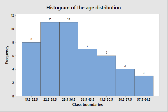
To graph: A histogram for the data of the age distribution.
(c)
Explanation of Solution
The data shows the ages of 50 drivers arrested while driver under the influence of alcohol.
Graph: To construct the histogram by using the MINITAB, the steps are as follows:
Step 1: Enter the class boundaries in C1 and frequency in C2.
Step 2: Go to Graph > Histogram > Simple.
Step 3: Enter C1 in Graph variable then go to Data options > Frequency > C2.
Step 4: Click on OK.
The obtained histogram is
(d)
The shape of the histogram of age distribution..
(d)
Answer to Problem 8CR
Solution: The shape of histogram of age distribution is skewed to the right.
Explanation of Solution
A right-skewed distribution has a long right tail. Right-skewed distributions are also called positive-skew distributions. That’s because there is a long tail in the positive direction on the number line.
From above histogram, there are two class boundaries (22.5-29.5 and 29.5-36) have higher frequencies 11 on left side and most of the data values fall on the left side of the graph. The data to lean towards right side of the graph and also there is tail on right side.
Hence, the shape of histogram of age distribution is skewed to the right.
Want to see more full solutions like this?
Chapter 2 Solutions
Student Solutions Manual for Brase/Brase's Understanding Basic Statistics, 7th


- Calculate the correlation coefficient r, letting Row 1 represent the x-values and Row 2 the y-values. Then calculate it again, letting Row 2 represent the x-values and Row 1 the y-values. What effect does switching the variables have on r? Row 1 Row 2 13 149 25 36 41 60 62 78 S 205 122 195 173 133 197 24 Calculate the correlation coefficient r, letting Row 1 represent the x-values and Row 2 the y-values. r=0.164 (Round to three decimal places as needed.) S 24arrow_forwardThe number of initial public offerings of stock issued in a 10-year period and the total proceeds of these offerings (in millions) are shown in the table. The equation of the regression line is y = 47.109x+18,628.54. Complete parts a and b. 455 679 499 496 378 68 157 58 200 17,942|29,215 43,338 30,221 67,266 67,461 22,066 11,190 30,707| 27,569 Issues, x Proceeds, 421 y (a) Find the coefficient of determination and interpret the result. (Round to three decimal places as needed.)arrow_forwardQuestions An insurance company's cumulative incurred claims for the last 5 accident years are given in the following table: Development Year Accident Year 0 2018 1 2 3 4 245 267 274 289 292 2019 255 276 288 294 2020 265 283 292 2021 263 278 2022 271 It can be assumed that claims are fully run off after 4 years. The premiums received for each year are: Accident Year Premium 2018 306 2019 312 2020 318 2021 326 2022 330 You do not need to make any allowance for inflation. 1. (a) Calculate the reserve at the end of 2022 using the basic chain ladder method. (b) Calculate the reserve at the end of 2022 using the Bornhuetter-Ferguson method. 2. Comment on the differences in the reserves produced by the methods in Part 1.arrow_forward
- Use the accompanying Grade Point Averages data to find 80%,85%, and 99%confidence intervals for the mean GPA. view the Grade Point Averages data. Gender College GPAFemale Arts and Sciences 3.21Male Engineering 3.87Female Health Science 3.85Male Engineering 3.20Female Nursing 3.40Male Engineering 3.01Female Nursing 3.48Female Nursing 3.26Female Arts and Sciences 3.50Male Engineering 3.00Female Arts and Sciences 3.13Female Nursing 3.34Female Nursing 3.67Female Education 3.45Female Engineering 3.17Female Health Science 3.28Female Nursing 3.25Male Engineering 3.72Female Arts and Sciences 2.68Female Nursing 3.40Female Health Science 3.76Female Arts and Sciences 3.72Female Education 3.44Female Arts and Sciences 3.61Female Education 3.29Female Nursing 3.20Female Education 3.80Female Business 3.26Male…arrow_forwardBusiness Discussarrow_forwardCould you please answer this question using excel. For 1a) I got 84.75 and for part 1b) I got 85.33 and was wondering if you could check if my answers were correct. Thanksarrow_forward
- What is one sample T-test? Give an example of business application of this test? What is Two-Sample T-Test. Give an example of business application of this test? .What is paired T-test. Give an example of business application of this test? What is one way ANOVA test. Give an example of business application of this test? 1. One Sample T-Test: Determine whether the average satisfaction rating of customers for a product is significantly different from a hypothetical mean of 75. (Hints: The null can be about maintaining status-quo or no difference; If your alternative hypothesis is non-directional (e.g., μ≠75), you should use the two-tailed p-value from excel file to make a decision about rejecting or not rejecting null. If alternative is directional (e.g., μ < 75), you should use the lower-tailed p-value. For alternative hypothesis μ > 75, you should use the upper-tailed p-value.) H0 = H1= Conclusion: The p value from one sample t-test is _______. Since the two-tailed p-value…arrow_forwardUsing the accompanying Accounting Professionals data to answer the following questions. a. Find and interpret a 90% confidence interval for the mean years of service. b. Find and interpret a 90% confidence interval for the proportion of employees who have a graduate degree. view the Accounting Professionals data. Employee Years of Service Graduate Degree?1 26 Y2 8 N3 10 N4 6 N5 23 N6 5 N7 8 Y8 5 N9 26 N10 14 Y11 10 N12 8 Y13 7 Y14 27 N15 16 Y16 17 N17 21 N18 9 Y19 9 N20 9 N Question content area bottom Part 1 a. A 90% confidence interval for the mean years of service is (Use ascending order. Round to two decimal places as needed.)arrow_forwardIf, based on a sample size of 900,a political candidate finds that 509people would vote for him in a two-person race, what is the 95%confidence interval for his expected proportion of the vote? Would he be confident of winning based on this poll? Question content area bottom Part 1 A 9595% confidence interval for his expected proportion of the vote is (Use ascending order. Round to four decimal places as needed.)arrow_forward
- Questions An insurance company's cumulative incurred claims for the last 5 accident years are given in the following table: Development Year Accident Year 0 2018 1 2 3 4 245 267 274 289 292 2019 255 276 288 294 2020 265 283 292 2021 263 278 2022 271 It can be assumed that claims are fully run off after 4 years. The premiums received for each year are: Accident Year Premium 2018 306 2019 312 2020 318 2021 326 2022 330 You do not need to make any allowance for inflation. 1. (a) Calculate the reserve at the end of 2022 using the basic chain ladder method. (b) Calculate the reserve at the end of 2022 using the Bornhuetter-Ferguson method. 2. Comment on the differences in the reserves produced by the methods in Part 1.arrow_forwardA population that is uniformly distributed between a=0and b=10 is given in sample sizes 50( ), 100( ), 250( ), and 500( ). Find the sample mean and the sample standard deviations for the given data. Compare your results to the average of means for a sample of size 10, and use the empirical rules to analyze the sampling error. For each sample, also find the standard error of the mean using formula given below. Standard Error of the Mean =sigma/Root Complete the following table with the results from the sampling experiment. (Round to four decimal places as needed.) Sample Size Average of 8 Sample Means Standard Deviation of 8 Sample Means Standard Error 50 100 250 500arrow_forwardA survey of 250250 young professionals found that two dash thirdstwo-thirds of them use their cell phones primarily for e-mail. Can you conclude statistically that the population proportion who use cell phones primarily for e-mail is less than 0.720.72? Use a 95% confidence interval. Question content area bottom Part 1 The 95% confidence interval is left bracket nothing comma nothing right bracket0.60820.6082, 0.72510.7251. As 0.720.72 is within the limits of the confidence interval, we cannot conclude that the population proportion is less than 0.720.72. (Use ascending order. Round to four decimal places as needed.)arrow_forward
 Glencoe Algebra 1, Student Edition, 9780079039897...AlgebraISBN:9780079039897Author:CarterPublisher:McGraw Hill