
Videos
Refer to the Real Estate data, which reports information on homes sold in the Goodyear, Arizona, area during the last year. Select an appropriate class interval and organize the selling prices into a frequency distribution. Write a brief report summarizing your findings. Be sure to answer the following questions in your report.
- a. Around what values do the data tend to cluster?
- b. Based on the frequency distribution, what is the typical selling price in the first class? What is the typical selling price in the last class?
- c. Draw a cumulative frequency distribution. How many homes sold for less than $200,000? Estimate the percent of the homes that sold for more than $220,000. What percent of the homes sold for less than $125,000?
- d. Refer to the variable regarding the townships. Draw a bar chart showing the number of homes sold in each township. Are there any differences or is the number of homes sold about the same in each township?
a.
Find an appropriate class interval.
Create a frequency distribution for the selling prices and explain the results.
Find the values of price that the data tend to cluster.
Answer to Problem 51DE
The data tend to cluster between 180 (in $000) and 250 (in $000).
Explanation of Solution
Here, the data set consists of 105 observations. The value of k can be obtained as follows:
Here,
Therefore, the number of classes for the given data set is 7.
From the real estate data, the minimum and maximum values of selling price are 125 (in $000) and 345.3 (in $000), respectively.
The formula for the class interval is given as follows:
Where, i is the class interval and k is the number of classes.
Therefore, the class interval for the given data can be obtained as follows:
In practice, the class interval size is usually rounded up to some convenient number. Therefore, the reasonable class interval is 35.
Frequency distribution:
Frequency table is a collection of mutually exclusive and exhaustive classes, which shows the number of observations in each class.
Since the minimum value is 125 and the class interval is 35, the first class would be 110-145. Here, the first one is preferred as the first class of the frequency distribution. The frequency distribution for selling price is constructed as follows:
|
Selling price (1,000’s) | Frequency |
Cumulative frequency |
| 110-145 | 3 | 3 |
| 145-180 | 19 | |
| 180-215 | 31 | |
| 215-250 | 25 | |
| 250-285 | 14 | |
| 285-320 | 10 | |
| 320-355 | 3 | |
| Total | 105 |
From the above table, it is clear that maximum values of frequency are obtained for the intervals 180-215 and 215-250. Their corresponding frequencies are 31 and 25, respectively.
That is, 53%
b.
Find the typical selling in the first class.
Find the typical selling in the last class.
Answer to Problem 51DE
The typical selling price of the first class is 127.5 (in $000).
The typical selling price of the last class is 337.5 (in $000).
Explanation of Solution
The lower and upper limits of the first class are 110 and 145, respectively.
The typical selling price of the first class is calculated as follows:
Thus, the typical selling price of the first class is 127.5 (in $000).
The lower and upper limits of the last class are 355 and 320, respectively.
The typical selling price of the last class is calculated as follows:
Thus, the typical selling price of the last class is 337.5 (in $000).
c.
Plot the cumulative frequency distribution.
Find the number of homes sold for less than $200,000.
Find the percent of homes sold for more than $220,000.
Find the percentage of homes sold for less than $125,000.
Answer to Problem 51DE
The plot of the cumulative frequency distribution for the given data is as follows:
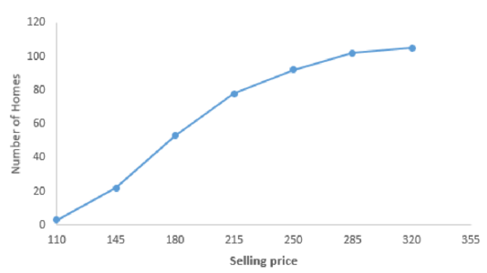
The number of homes sold for less than $200,000 is 42.
The percent of homes sold for more than $200,000 46.7.
The percentage of homes sold for less than $125,000 is 0%.
Explanation of Solution
Step-by-step procedure to obtain the plot using the EXCEL is as follows:
- Select the data range.
- Go to Insert > Charts > line chart.
- Select the Scatter with Straight Lines and Markers under Charts.
Thus, the plot is obtained.
Step-by-step procedure to find the number of homes sold for less than $200,000:
- Select Insert > PivotTable.
- In Table/Range, select the data range.
- Move Selling Price to Rows.
- Again move Selling Price to ∑Values.
- Right click on any data in Row Labels.
- Select Group.
- In Grouping, enter 100 in Starting at, 360 in Ending at, and enter 20 in By.
Output is obtained as follows:
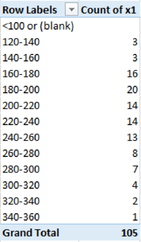
From the above output, the number of homes sold for less than $200,000 is 42
The percent of homes that are sold for more than $220,000 is 46.7%
In the data set, the minimum value is 125. Therefore, no homes are sold for less than $125,000. Therefore, the percentage of homes sold for less than $125,000 is 0%.
d.
Create a bar chart for the number of homes sold in each township.
Explain whether the number of homes sold is about the same in each township.
Answer to Problem 51DE
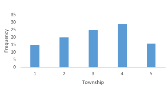
The bar chart that represents the number of homes sold in each township is as follows:
Explanation of Solution
For the variable Township, the frequency table is obtained as follows:
| Township | Frequency |
| 1 | 15 |
| 2 | 20 |
| 3 | 25 |
| 4 | 29 |
| 5 | 16 |
The bar chart for the given data can be drawn using EXCEL.
Step-by-step procedure to obtain the bar chart using EXCEL:
- Enter the column of township along with their frequency column.
- Select the total data range with labels.
- Go to Insert > Charts > bar chart.
- Select the appropriate bar chart.
- Click OK.
Thus, the bar chart is obtained.
From the above bar chart, the highest frequency occurred for townships 3 and 4 and the lowest frequency occurred for townships 1 and 5. Thus, the number of homes sold is not about the same in each township.
Want to see more full solutions like this?
Chapter 2 Solutions
STATISTICAL TECHNIQUES-ACCESS ONLY


- Faye cuts the sandwich in two fair shares to her. What is the first half s1arrow_forwardQuestion 2. An American option on a stock has payoff given by F = f(St) when it is exercised at time t. We know that the function f is convex. A person claims that because of convexity, it is optimal to exercise at expiration T. Do you agree with them?arrow_forwardQuestion 4. We consider a CRR model with So == 5 and up and down factors u = 1.03 and d = 0.96. We consider the interest rate r = 4% (over one period). Is this a suitable CRR model? (Explain your answer.)arrow_forward
- Question 3. We want to price a put option with strike price K and expiration T. Two financial advisors estimate the parameters with two different statistical methods: they obtain the same return rate μ, the same volatility σ, but the first advisor has interest r₁ and the second advisor has interest rate r2 (r1>r2). They both use a CRR model with the same number of periods to price the option. Which advisor will get the larger price? (Explain your answer.)arrow_forwardQuestion 5. We consider a put option with strike price K and expiration T. This option is priced using a 1-period CRR model. We consider r > 0, and σ > 0 very large. What is the approximate price of the option? In other words, what is the limit of the price of the option as σ∞. (Briefly justify your answer.)arrow_forwardQuestion 6. You collect daily data for the stock of a company Z over the past 4 months (i.e. 80 days) and calculate the log-returns (yk)/(-1. You want to build a CRR model for the evolution of the stock. The expected value and standard deviation of the log-returns are y = 0.06 and Sy 0.1. The money market interest rate is r = 0.04. Determine the risk-neutral probability of the model.arrow_forward
- Several markets (Japan, Switzerland) introduced negative interest rates on their money market. In this problem, we will consider an annual interest rate r < 0. We consider a stock modeled by an N-period CRR model where each period is 1 year (At = 1) and the up and down factors are u and d. (a) We consider an American put option with strike price K and expiration T. Prove that if <0, the optimal strategy is to wait until expiration T to exercise.arrow_forwardWe consider an N-period CRR model where each period is 1 year (At = 1), the up factor is u = 0.1, the down factor is d = e−0.3 and r = 0. We remind you that in the CRR model, the stock price at time tn is modeled (under P) by Sta = So exp (μtn + σ√AtZn), where (Zn) is a simple symmetric random walk. (a) Find the parameters μ and σ for the CRR model described above. (b) Find P Ste So 55/50 € > 1). StN (c) Find lim P 804-N (d) Determine q. (You can use e- 1 x.) Ste (e) Find Q So (f) Find lim Q 004-N StN Soarrow_forwardIn this problem, we consider a 3-period stock market model with evolution given in Fig. 1 below. Each period corresponds to one year. The interest rate is r = 0%. 16 22 28 12 16 12 8 4 2 time Figure 1: Stock evolution for Problem 1. (a) A colleague notices that in the model above, a movement up-down leads to the same value as a movement down-up. He concludes that the model is a CRR model. Is your colleague correct? (Explain your answer.) (b) We consider a European put with strike price K = 10 and expiration T = 3 years. Find the price of this option at time 0. Provide the replicating portfolio for the first period. (c) In addition to the call above, we also consider a European call with strike price K = 10 and expiration T = 3 years. Which one has the highest price? (It is not necessary to provide the price of the call.) (d) We now assume a yearly interest rate r = 25%. We consider a Bermudan put option with strike price K = 10. It works like a standard put, but you can exercise it…arrow_forward
- In this problem, we consider a 2-period stock market model with evolution given in Fig. 1 below. Each period corresponds to one year (At = 1). The yearly interest rate is r = 1/3 = 33%. This model is a CRR model. 25 15 9 10 6 4 time Figure 1: Stock evolution for Problem 1. (a) Find the values of up and down factors u and d, and the risk-neutral probability q. (b) We consider a European put with strike price K the price of this option at time 0. == 16 and expiration T = 2 years. Find (c) Provide the number of shares of stock that the replicating portfolio contains at each pos- sible position. (d) You find this option available on the market for $2. What do you do? (Short answer.) (e) We consider an American put with strike price K = 16 and expiration T = 2 years. Find the price of this option at time 0 and describe the optimal exercising strategy. (f) We consider an American call with strike price K ○ = 16 and expiration T = 2 years. Find the price of this option at time 0 and describe…arrow_forward2.2, 13.2-13.3) question: 5 point(s) possible ubmit test The accompanying table contains the data for the amounts (in oz) in cans of a certain soda. The cans are labeled to indicate that the contents are 20 oz of soda. Use the sign test and 0.05 significance level to test the claim that cans of this soda are filled so that the median amount is 20 oz. If the median is not 20 oz, are consumers being cheated? Click the icon to view the data. What are the null and alternative hypotheses? OA. Ho: Medi More Info H₁: Medi OC. Ho: Medi H₁: Medi Volume (in ounces) 20.3 20.1 20.4 Find the test stat 20.1 20.5 20.1 20.1 19.9 20.1 Test statistic = 20.2 20.3 20.3 20.1 20.4 20.5 Find the P-value 19.7 20.2 20.4 20.1 20.2 20.2 P-value= (R 19.9 20.1 20.5 20.4 20.1 20.4 Determine the p 20.1 20.3 20.4 20.2 20.3 20.4 Since the P-valu 19.9 20.2 19.9 Print Done 20 oz 20 oz 20 oz 20 oz ce that the consumers are being cheated.arrow_forwardT Teenage obesity (O), and weekly fast-food meals (F), among some selected Mississippi teenagers are: Name Obesity (lbs) # of Fast-foods per week Josh 185 10 Karl 172 8 Terry 168 9 Kamie Andy 204 154 12 6 (a) Compute the variance of Obesity, s²o, and the variance of fast-food meals, s², of this data. [Must show full work]. (b) Compute the Correlation Coefficient between O and F. [Must show full work]. (c) Find the Coefficient of Determination between O and F. [Must show full work]. (d) Obtain the Regression equation of this data. [Must show full work]. (e) Interpret your answers in (b), (c), and (d). (Full explanations required). Edit View Insert Format Tools Tablearrow_forward
 Big Ideas Math A Bridge To Success Algebra 1: Stu...AlgebraISBN:9781680331141Author:HOUGHTON MIFFLIN HARCOURTPublisher:Houghton Mifflin Harcourt
 Holt Mcdougal Larson Pre-algebra: Student Edition...AlgebraISBN:9780547587776Author:HOLT MCDOUGALPublisher:HOLT MCDOUGAL
 Glencoe Algebra 1, Student Edition, 9780079039897...AlgebraISBN:9780079039897Author:CarterPublisher:McGraw Hill
 Functions and Change: A Modeling Approach to Coll...AlgebraISBN:9781337111348Author:Bruce Crauder, Benny Evans, Alan NoellPublisher:Cengage Learning