Concept explainers
Videos
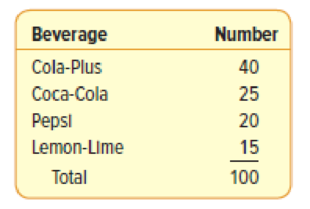
DeCenzo Specialty Food and Beverage Company has been serving a cola drink with an additional flavoring, Cola-Plus, that is very popular among its customers. The company is interested in customer preferences for Cola-Plus versus Coca-Cola. Pepsi, and a lemon-lime beverage. They ask 100 randomly sampled customers to take a taste test and select the beverage they prefer most. The results are shown in the following table:
- (a) Is the data qualitative or quantitative? Why?
- (b) What is the table called? What does it show?
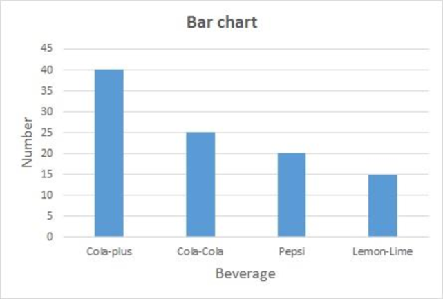
- (c) Develop a bar chart to depict the information.
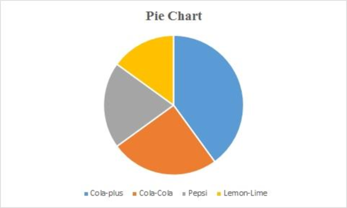
- (d) Develop a pie chart using the relative frequencies.
a.
Identify the nature of the data whether it is qualitative or quantitate.
Explain your answer.
Answer to Problem 1SR
The nature of the data is quantitative.
Explanation of Solution
The given table explains the frequencies of different cola drinks with additional flavors that people prefer the most. The number of people who liked each flavor of cola drink is represented as numerical values. Therefore, the nature of the data is quantitative.
b.
Identify the name of the table.
Explain what does the table represents.
Answer to Problem 1SR
The given table is called as the frequency table.
The table explains the frequencies of different cola drinks with additional flavors that people prefer the most.
Explanation of Solution
Frequency table:
The frequency table is a collection of mutually exclusive and exhaustive classes that show the number of observations in each class.
Here, the given table explains the frequencies of different cola drinks with additional flavors that people prefer the most. Therefore, the given table is called as the frequency table.
c.
Construct a bar chart to depict the given information.
Answer to Problem 1SR
The bar chart for the given data is represented as follows:
Explanation of Solution
The bar chart for the given data can be drawn using EXCEL.
Step-by-step procedure to obtain bar chart using EXCEL is given below:
- Select the total data range with labels.
- Go to Insert > Charts > Bar chart.
- Select the appropriate bar chart.
- Click OK.
d.
Construct a pie chart using the relative frequencies.
Answer to Problem 1SR
The pie chart for the given data is represented as follows:
Explanation of Solution
The pie chart for the given data can be drawn using EXCEL.
Step-by-step procedure to obtain pie chart using EXCEL is given below:
- Select the total data range with labels.
- Go to Insert > Charts > pie chart.
- Select the appropriate pie chart.
- Click OK.
Want to see more full solutions like this?
Chapter 2 Solutions
EBK STATISTICAL TECHNIQUES IN BUSINESS


- Name Harvard University California Institute of Technology Massachusetts Institute of Technology Stanford University Princeton University University of Cambridge University of Oxford University of California, Berkeley Imperial College London Yale University University of California, Los Angeles University of Chicago Johns Hopkins University Cornell University ETH Zurich University of Michigan University of Toronto Columbia University University of Pennsylvania Carnegie Mellon University University of Hong Kong University College London University of Washington Duke University Northwestern University University of Tokyo Georgia Institute of Technology Pohang University of Science and Technology University of California, Santa Barbara University of British Columbia University of North Carolina at Chapel Hill University of California, San Diego University of Illinois at Urbana-Champaign National University of Singapore…arrow_forwardA company found that the daily sales revenue of its flagship product follows a normal distribution with a mean of $4500 and a standard deviation of $450. The company defines a "high-sales day" that is, any day with sales exceeding $4800. please provide a step by step on how to get the answers in excel Q: What percentage of days can the company expect to have "high-sales days" or sales greater than $4800? Q: What is the sales revenue threshold for the bottom 10% of days? (please note that 10% refers to the probability/area under bell curve towards the lower tail of bell curve) Provide answers in the yellow cellsarrow_forwardFind the critical value for a left-tailed test using the F distribution with a 0.025, degrees of freedom in the numerator=12, and degrees of freedom in the denominator = 50. A portion of the table of critical values of the F-distribution is provided. Click the icon to view the partial table of critical values of the F-distribution. What is the critical value? (Round to two decimal places as needed.)arrow_forward
- A retail store manager claims that the average daily sales of the store are $1,500. You aim to test whether the actual average daily sales differ significantly from this claimed value. You can provide your answer by inserting a text box and the answer must include: Null hypothesis, Alternative hypothesis, Show answer (output table/summary table), and Conclusion based on the P value. Showing the calculation is a must. If calculation is missing,so please provide a step by step on the answers Numerical answers in the yellow cellsarrow_forwardShow all workarrow_forwardShow all workarrow_forward
 Glencoe Algebra 1, Student Edition, 9780079039897...AlgebraISBN:9780079039897Author:CarterPublisher:McGraw Hill
 Big Ideas Math A Bridge To Success Algebra 1: Stu...AlgebraISBN:9781680331141Author:HOUGHTON MIFFLIN HARCOURTPublisher:Houghton Mifflin Harcourt
 Holt Mcdougal Larson Pre-algebra: Student Edition...AlgebraISBN:9780547587776Author:HOLT MCDOUGALPublisher:HOLT MCDOUGAL
 College Algebra (MindTap Course List)AlgebraISBN:9781305652231Author:R. David Gustafson, Jeff HughesPublisher:Cengage Learning