Foundations of Economics, Student Value Edition (8th Edition)
8th Edition
ISBN: 9780134489230
Author: Robin Bade, Michael Parkin
Publisher: PEARSON
expand_more
expand_more
format_list_bulleted
Textbook Question
thumb_up100%
Chapter 1.A, Problem 2SPP
The spreadsheet in Table 1 provides data on the U.S. economy: Column A is the year; the other columns are quantities sold in millions per year of compact discs (column B), music videos (column C), and singles downloads (column D). Use this spreadsheet to work Problems 1 and 2.
Table 1
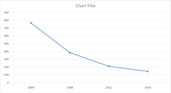
Draw a time-series graph of the quantity of compact discs sold. Say in which year or years the quantity sold (a) was highest, (b) was lowest, (c) increased the most, and (d) decreased the most.
If the data show a trend, describe it.
Expert Solution & Answer
Want to see the full answer?
Check out a sample textbook solution
Students have asked these similar questions
A monopolist had the following fixed costs and marginal revenue and costs for each unit of production:
0 units where fixed costs are 10
1 unit where MR = 60 & MC = 20 & FC = 10
2 units where MR = 50 & MC = 30 & FC = 10
3 units where MR = 45 & MC = 38 & FC = 10
4 units where MR = 40 & MC = 40 & FC = 10
How many units should the firm produce and why?
Respond to this post.
Hello Professor,
A rise in consumption in the economy would cause an increase in aggregate demand. Therefore, when consumers spend money on everyday goods and services, it not only helps to stimulate economic growth, but it could also present potential issues like unsustainable debt levels or inflation. I believe that it would be beneficial to consider such factors and adopt a purchasing strategy to help navigate the challenges posed by inflation or unsustainable debt levels.
First, do you think our business will be affected because inflation is rising? How?
Yes, I do believe that the business will be affected because of inflationary pressures. Inflation rising will affect the cost of goods, services, and labor, which could lead to higher operating expenses. The potential reduction of profit margin because of inflation could lead to a smaller percentage of revenue being retained as profit. Therefore, inflation rising will force us to raise prices for…
Not use ai please
Chapter 1 Solutions
Foundations of Economics, Student Value Edition (8th Edition)
Ch. 1.A - Prob. 1SPPCh. 1.A - The spreadsheet in Table 1 provides data on the...Ch. 1.A - Prob. 3SPPCh. 1.A - Prob. 4SPPCh. 1.A - Draw a scatter diagram to show the relationship...Ch. 1.A - Draw a time-series graph of the quantity of music...Ch. 1.A - Prob. 3IAPCh. 1.A - Prob. 4IAPCh. 1.A - Prob. 5IAPCh. 1 - Prob. 1SPPA
Ch. 1 - Prob. 2SPPACh. 1 - Prob. 3SPPACh. 1 - Prob. 4SPPACh. 1 - Prob. 5SPPACh. 1 - Prob. 6SPPACh. 1 - Prob. 7SPPACh. 1 - Prob. 8SPPACh. 1 - Prob. 9SPPACh. 1 - Prob. 10SPPACh. 1 - Prob. 11SPPACh. 1 - Prob. 12SPPACh. 1 - Prob. 13SPPACh. 1 - Prob. 1IAPACh. 1 - Prob. 2IAPACh. 1 - Prob. 3IAPACh. 1 - Prob. 4IAPACh. 1 - Prob. 5IAPACh. 1 - Prob. 6IAPACh. 1 - Prob. 7IAPACh. 1 - Prob. 8IAPACh. 1 - Prob. 9IAPACh. 1 - Prob. 10IAPACh. 1 - Prob. 11IAPACh. 1 - Prob. 12IAPACh. 1 - Prob. 1MCQCh. 1 - Prob. 2MCQCh. 1 - Prob. 3MCQCh. 1 - Prob. 4MCQCh. 1 - Prob. 5MCQCh. 1 - Prob. 6MCQCh. 1 - Prob. 7MCQCh. 1 - Prob. 8MCQ
Knowledge Booster
Learn more about
Need a deep-dive on the concept behind this application? Look no further. Learn more about this topic, economics and related others by exploring similar questions and additional content below.Similar questions
- Bzbsbsbdbdbdbdarrow_forwardRecent research indicates potential health benefits associated with coffee consumption, including a potential reduction in the incidence of liver disease. Simultaneously, new technology is being applied to coffee bean harvesting, leading to cost reductions in coffee production. How will these developmentsaffect the demand and supply of coffee? How will the equilibrium price and quantity of coffee change? Use both words and graphs to explain.arrow_forwardRecent research indicates potential health benefits associated with coffee consumption, including a potential reduction in the incidence of liver disease. Simultaneously, new technology is being applied to coffee bean harvesting, leading to cost reductions in coffee production. How will these developmentsaffect the demand and supply of coffee? How will the equilibrium price and quantity of coffee change? Use both words and graphs to explain.arrow_forward
- ► What are the 95% confidence intervals for the intercept and slope in this regression of college grade point average (GPA) on high school GPA? colGPA = 1.39 + .412 hsGPA (.33) (.094)arrow_forwardG Interpret the following estimated regression equations: wagehr = 0.5+ 2.5exper, where wagehr is the wage, measured in £/hour and exper is years of experience, colGPA = 1.39.412 hsGPA where colGPA is grade point average for a college student, and hsGPA is the grade point average they achieved in high school, cons 124.84 +0.853 inc where cons and inc are annual household consumption and income, both measured in dollars What is (i) the predicted hourly wage for someone with five years of experience? (ii) the predicted grade point average in college for a student whose grade point average in high school was 4.0, (iii) the predicted consumption when household income is $30000? =arrow_forward1. Solving the system of inequalities: I≥3 x+y1 2. Graph y=-2(x+2)(x-3) 3. Please graph the following quadratic inequalities Solve y≤ -1²+2+3arrow_forward
- Not use ai pleasearrow_forwardnot use ai pleasearrow_forwardWhat are the key factors that influence the decline of traditional retail businesses in the digital economy? 2. How does consumer behavior impact the success or failure of legacy retail brands? 3. What role does technological innovation play in sustaining long-term competitiveness for retailers? 4. How can traditional retailers effectively adapt their business models to meet evolving market demands?arrow_forward
arrow_back_ios
SEE MORE QUESTIONS
arrow_forward_ios
Recommended textbooks for you
 Economics (MindTap Course List)EconomicsISBN:9781337617383Author:Roger A. ArnoldPublisher:Cengage Learning

 Microeconomics: Principles & PolicyEconomicsISBN:9781337794992Author:William J. Baumol, Alan S. Blinder, John L. SolowPublisher:Cengage Learning
 Managerial Economics: Applications, Strategies an...EconomicsISBN:9781305506381Author:James R. McGuigan, R. Charles Moyer, Frederick H.deB. HarrisPublisher:Cengage Learning

Economics (MindTap Course List)
Economics
ISBN:9781337617383
Author:Roger A. Arnold
Publisher:Cengage Learning


Microeconomics: Principles & Policy
Economics
ISBN:9781337794992
Author:William J. Baumol, Alan S. Blinder, John L. Solow
Publisher:Cengage Learning


Managerial Economics: Applications, Strategies an...
Economics
ISBN:9781305506381
Author:James R. McGuigan, R. Charles Moyer, Frederick H.deB. Harris
Publisher:Cengage Learning
Forecasting: Exponential Smoothing, MSE; Author: Joshua Emmanuel;https://www.youtube.com/watch?v=k_HN0wOKDd0;License: Standard Youtube License