Women in the Workforce The number of women in the workforce (in millions) for selected years from 1890 to 2010 is shown in the following figure. a. Would the data in the scatter plot be modeled well by a linear function? Why or why not? b. The number of women in the workforce was 10.519 million in 1930 and 16.443 million in 1950. What is the average rate of change in the number of women in the workforce during this period? c. If the number of women in the workforce was 16.443 million in 1950 and 75.500 million in 2010, what is the average rate of change in the number of women in the workforce during this period? d. Is it reasonable that these two average rates of change are different? How can you tell this from the graph? (Source: Newsweek)
Women in the Workforce The number of women in the workforce (in millions) for selected years from 1890 to 2010 is shown in the following figure. a. Would the data in the scatter plot be modeled well by a linear function? Why or why not? b. The number of women in the workforce was 10.519 million in 1930 and 16.443 million in 1950. What is the average rate of change in the number of women in the workforce during this period? c. If the number of women in the workforce was 16.443 million in 1950 and 75.500 million in 2010, what is the average rate of change in the number of women in the workforce during this period? d. Is it reasonable that these two average rates of change are different? How can you tell this from the graph? (Source: Newsweek)
Solution Summary: The author explains how the data cannot be modeled well by a linear function.
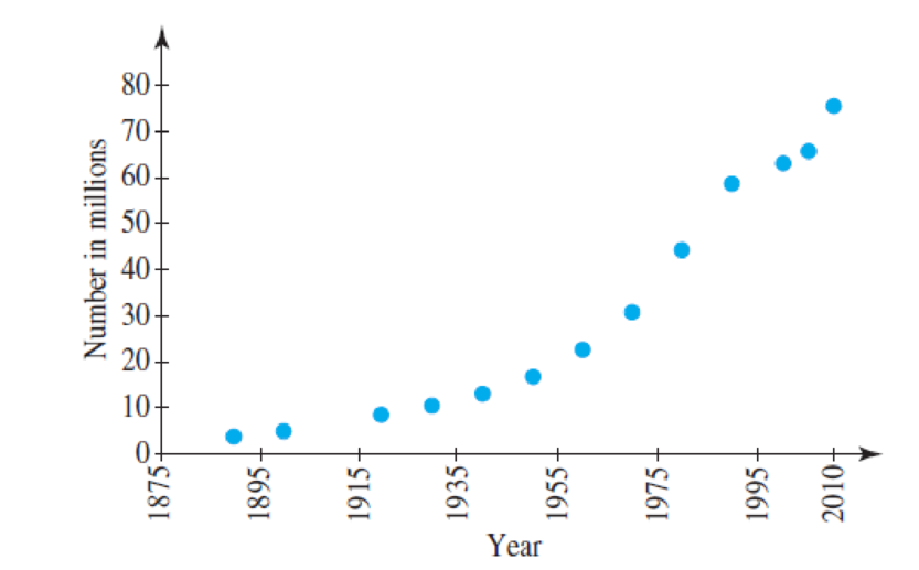
Women in the Workforce The number of women in the workforce (in millions) for selected years from 1890 to 2010 is shown in the following figure.
a. Would the data in the scatter plot be modeled well by a linear function? Why or why not?
b. The number of women in the workforce was 10.519 million in 1930 and 16.443 million in 1950. What is the average rate of change in the number of women in the workforce during this period?
c. If the number of women in the workforce was 16.443 million in 1950 and 75.500 million in 2010, what is the average rate of change in the number of women in the workforce during this period?
d. Is it reasonable that these two average rates of change are different? How can you tell this from the graph?
(Source: Newsweek)
Definition Definition Representation of the direction and degree of correlation in graphical form. The grouping of points that are plotted makes it a scatter diagram. A line can be drawn showing the relationship based on the direction of points and their distance from each other.
The areas of the regions bounded by the graph of the function f and the x-axis are labeled in the figure below. Let the function g be
C
defined by the equation g(x) = [* f(t)dt. What is the maximum value of the function g on the closed interval [-7, 8]?
17
y
Graph of f
00
8
76
5
4
3
2
1
-10 -9 -8 -7 -6 -5 -4 -3-2-1
-2
702
4
1
21
3 4
568
-4
-5
--6
-7
-8
x
5
6
7
8
9 10
17
No chatgpt pls will upvote Already got wrong chatgpt answer
Chapter 1 Solutions
College Algebra in Context with Integrated Review and Worksheets Plus MyLab Math with Pearson eText-- Access Card Package
Need a deep-dive on the concept behind this application? Look no further. Learn more about this topic, subject and related others by exploring similar questions and additional content below.
01 - What Is A Differential Equation in Calculus? Learn to Solve Ordinary Differential Equations.; Author: Math and Science;https://www.youtube.com/watch?v=K80YEHQpx9g;License: Standard YouTube License, CC-BY
Higher Order Differential Equation with constant coefficient (GATE) (Part 1) l GATE 2018; Author: GATE Lectures by Dishank;https://www.youtube.com/watch?v=ODxP7BbqAjA;License: Standard YouTube License, CC-BY


 College Algebra (MindTap Course List)AlgebraISBN:9781305652231Author:R. David Gustafson, Jeff HughesPublisher:Cengage Learning
 College AlgebraAlgebraISBN:9781305115545Author:James Stewart, Lothar Redlin, Saleem WatsonPublisher:Cengage Learning
 Algebra and Trigonometry (MindTap Course List)AlgebraISBN:9781305071742Author:James Stewart, Lothar Redlin, Saleem WatsonPublisher:Cengage Learning
 Trigonometry (MindTap Course List)TrigonometryISBN:9781337278461Author:Ron LarsonPublisher:Cengage Learning
 Glencoe Algebra 1, Student Edition, 9780079039897...AlgebraISBN:9780079039897Author:CarterPublisher:McGraw Hill