Concept explainers
Videos
(a)
To find: The Inter
(a)
Answer to Problem 63E
Solution: The Inter
Explanation of Solution
Calculation: The Inter Quartile Range
Step 1: Enter the provided data in a Minitab worksheet.
Step 2: Go to Stat and select basic statistics.
Step 3: Then select Display
Step 4: Next click on Statistics tab and tick mark the option against interquartile range and click on OK twice to get the results.
From the Minitab output the Inter Quartile Range
Interpretation: The Inter Quartile Range
(b)
To find: The outliers using
(b)
Answer to Problem 63E
Solution: The value of outliers in the provided data is 428 of London. Any value above 236.5 or below –35.5 would be considered outliers as they are upper whisker and lower whisker, respectively.
Explanation of Solution
Calculation: To obtain the value of first and third quartile, follow the steps given below in Minitab,
Step 1: Enter the data in a Minitab worksheet.
Step 2: Go to Stat and select basic statistics.
Step 3: Then select Display Descriptive Statistics. Enter the name of the column containing the provided data in the variables textbox.
Step 4: Then click on Statistics tab and tick mark the option against first quartile and third quartile and click on OK twice.
The value of
The formula for upper whisker is,
where
The formula for lower whisker is,
where
Upper whisker of boxplot is found to be 236.5, so any values above 236.5 would be considered outliers and from data provided, value of 428 of London is outlier. There is no value below lower whisker.
Interpretation: Outliers refers to those data points that lie either above upper whisker and below lower whisker in boxplot. There was one outlier found in this data, and it is 428 of London.
(c)
To graph: A boxplot of the provided data and describe the distribution using it.
(c)
Explanation of Solution
Graph: Plot the boxplot in Minitab by performing the following steps,
Step 1: Enter the data into a Minitab worksheet.
Step 2: Go to ‘Graph’ and click on ‘Boxplot’.
Step 3: In the dialogue box that appears select ‘Simple’ and click OK.
Step 4: Next enter the name of the column containing the data in the filed marked as ‘Graph variables’ and click on OK.
The boxplot is obtained as shown below,
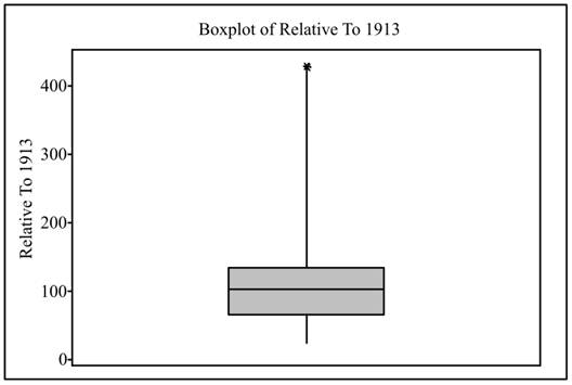
Interpretation: The boxplot is generally preferred to describe dataset having unsymmetrical distribution. The boxplot shows First quartile,
(d)
To graph: A modified boxplot and describes the distribution using it.
(d)
Explanation of Solution
Graph: Plot the modified boxplot in Minitab by performing the following steps,
Step 1: Enter the data into a Minitab worksheet.
Step 2: Go to ‘Graph’ and click on ‘Boxplot’.
Step 3: In the dialogue box that appears select ‘Simple’ and click OK.
Step 4: Next enter the name of the column containing the data in the filed marked as ‘Graph variables’ and click on OK.
The boxplot is obtained as shown below,
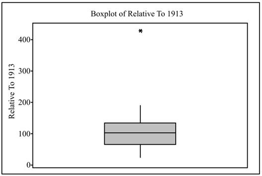
Interpretation: The modified boxplot is used to display data graphically when the distribution of data is unsymmetrical and skewed as it can clearly show outliers. In the modified boxplot it was found there is one data value which is upper outlier. This outlier is London. The modified boxplot does not display the outlier as a part of the whisker but marks the outlier away.
(e)
To graph: A stemplot of the provided data.
(e)
Explanation of Solution
Graph: Follow the steps given below to obtain the stemplot:
Step 1: Enter the data of sales in a Minitab worksheet.
Step 2: Go to Graph and select stem and leaves.
Step 3: Enter the name of the column containing the data in the Graph variables textbox and click OK.
The required stemplot is attached below,
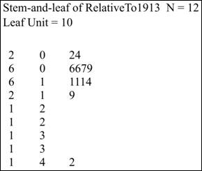
Interpretation: The stemplot of data is generally drawn when size of data is small and all the data values are positive. It shows all the data values on stemplot. In the stemplot shown above there is one outliers which is London whose data values is 428. Also the data does not seem to be symmetrically distributed.
(f)
To find: The comparison of Boxplot, Modified boxplot, and stemplot and mention advantages and disadvantages of each.
(f)
Answer to Problem 63E
Solution: In boxplot, data is displayed based on five-number summary, which included Minimum, Maximum, first quartile, third quartile, and Median and displaying the outlier as part of the whisker. In Modified boxplot also data is displayed based on five-number summary, but it displays the outliers such that they are not connected to the whiskers. In stemplot, data values are arranged in stem consisting of all digits except right most and leaves contain final digit. Advantage of boxplots is that it is suitable for unsymmetrical data while advantage of stemplot is that it shows all numerical value of data on graph itself. Disadvantage of Boxplot is that it is not suitable for unsymmetrical data while disadvantage of stemplot is that it is used only for positive numbers only and if the data size is small.
Explanation of Solution
The comparison of Boxplot, Modified boxplot, and stemplot is shown below:
Boxplot |
Modified Boxplot |
Stemplot |
|
Description |
It displays data based on |
It displays data based on five number summary including Minimum, Maximum, First quartile and Third Quartile and Median. The outliers are not displayed as part of the whiskers. |
In stemplot data values are arranged in stem consisting of all digits except right most digit and leaves contain final digit |
Advantages |
1. It displays five number summary graphically. 2. It is suitable for unsymmetrical data. |
1. It displays five number summary. 2. It is suitable for unsymmetrical data which is skewed. 3. It shows outliers clearly. |
1. It can display both symmetrical and unsymmetrical data graphically. 2. It can indicate outliers also 3. It displays all numerical values of data on stemplot. |
Disadvantages |
1. It is not suitable data set having symmetrical distribution. 2. It does not display outliers on graph. |
1. It is not suitable data set having symmetrical distribution. |
1. It is not suitable if data size is very large. 2. It is not used fornegative numbers. |
Want to see more full solutions like this?
Chapter 1 Solutions
Introduction to the Practice of Statistics: w/CrunchIt/EESEE Access Card


- To: [Boss's Name] From: Nathaniel D Sain Date: 4/5/2025 Subject: Decision Analysis for Business Scenario Introduction to the Business Scenario Our delivery services business has been experiencing steady growth, leading to an increased demand for faster and more efficient deliveries. To meet this demand, we must decide on the best strategy to expand our fleet. The three possible alternatives under consideration are purchasing new delivery vehicles, leasing vehicles, or partnering with third-party drivers. The decision must account for various external factors, including fuel price fluctuations, demand stability, and competition growth, which we categorize as the states of nature. Each alternative presents unique advantages and challenges, and our goal is to select the most viable option using a structured decision-making approach. Alternatives and States of Nature The three alternatives for fleet expansion were chosen based on their cost implications, operational efficiency, and…arrow_forwardBusinessarrow_forwardWhy researchers are interested in describing measures of the center and measures of variation of a data set?arrow_forward
- WHAT IS THE SOLUTION?arrow_forwardThe following ordered data list shows the data speeds for cell phones used by a telephone company at an airport: A. Calculate the Measures of Central Tendency from the ungrouped data list. B. Group the data in an appropriate frequency table. C. Calculate the Measures of Central Tendency using the table in point B. 0.8 1.4 1.8 1.9 3.2 3.6 4.5 4.5 4.6 6.2 6.5 7.7 7.9 9.9 10.2 10.3 10.9 11.1 11.1 11.6 11.8 12.0 13.1 13.5 13.7 14.1 14.2 14.7 15.0 15.1 15.5 15.8 16.0 17.5 18.2 20.2 21.1 21.5 22.2 22.4 23.1 24.5 25.7 28.5 34.6 38.5 43.0 55.6 71.3 77.8arrow_forwardII Consider the following data matrix X: X1 X2 0.5 0.4 0.2 0.5 0.5 0.5 10.3 10 10.1 10.4 10.1 10.5 What will the resulting clusters be when using the k-Means method with k = 2. In your own words, explain why this result is indeed expected, i.e. why this clustering minimises the ESS map.arrow_forward
- why the answer is 3 and 10?arrow_forwardPS 9 Two films are shown on screen A and screen B at a cinema each evening. The numbers of people viewing the films on 12 consecutive evenings are shown in the back-to-back stem-and-leaf diagram. Screen A (12) Screen B (12) 8 037 34 7 6 4 0 534 74 1645678 92 71689 Key: 116|4 represents 61 viewers for A and 64 viewers for B A second stem-and-leaf diagram (with rows of the same width as the previous diagram) is drawn showing the total number of people viewing films at the cinema on each of these 12 evenings. Find the least and greatest possible number of rows that this second diagram could have. TIP On the evening when 30 people viewed films on screen A, there could have been as few as 37 or as many as 79 people viewing films on screen B.arrow_forwardQ.2.4 There are twelve (12) teams participating in a pub quiz. What is the probability of correctly predicting the top three teams at the end of the competition, in the correct order? Give your final answer as a fraction in its simplest form.arrow_forward
- The table below indicates the number of years of experience of a sample of employees who work on a particular production line and the corresponding number of units of a good that each employee produced last month. Years of Experience (x) Number of Goods (y) 11 63 5 57 1 48 4 54 5 45 3 51 Q.1.1 By completing the table below and then applying the relevant formulae, determine the line of best fit for this bivariate data set. Do NOT change the units for the variables. X y X2 xy Ex= Ey= EX2 EXY= Q.1.2 Estimate the number of units of the good that would have been produced last month by an employee with 8 years of experience. Q.1.3 Using your calculator, determine the coefficient of correlation for the data set. Interpret your answer. Q.1.4 Compute the coefficient of determination for the data set. Interpret your answer.arrow_forwardCan you answer this question for mearrow_forwardTechniques QUAT6221 2025 PT B... TM Tabudi Maphoru Activities Assessments Class Progress lIE Library • Help v The table below shows the prices (R) and quantities (kg) of rice, meat and potatoes items bought during 2013 and 2014: 2013 2014 P1Qo PoQo Q1Po P1Q1 Price Ро Quantity Qo Price P1 Quantity Q1 Rice 7 80 6 70 480 560 490 420 Meat 30 50 35 60 1 750 1 500 1 800 2 100 Potatoes 3 100 3 100 300 300 300 300 TOTAL 40 230 44 230 2 530 2 360 2 590 2 820 Instructions: 1 Corall dawn to tha bottom of thir ceraan urina se se tha haca nariad in archerca antarand cubmit Q Search ENG US 口X 2025/05arrow_forward
 MATLAB: An Introduction with ApplicationsStatisticsISBN:9781119256830Author:Amos GilatPublisher:John Wiley & Sons Inc
 Probability and Statistics for Engineering and th...StatisticsISBN:9781305251809Author:Jay L. DevorePublisher:Cengage Learning
 Statistics for The Behavioral Sciences (MindTap C...StatisticsISBN:9781305504912Author:Frederick J Gravetter, Larry B. WallnauPublisher:Cengage Learning
 Elementary Statistics: Picturing the World (7th E...StatisticsISBN:9780134683416Author:Ron Larson, Betsy FarberPublisher:PEARSON
 The Basic Practice of StatisticsStatisticsISBN:9781319042578Author:David S. Moore, William I. Notz, Michael A. FlignerPublisher:W. H. Freeman
 Introduction to the Practice of StatisticsStatisticsISBN:9781319013387Author:David S. Moore, George P. McCabe, Bruce A. CraigPublisher:W. H. Freeman