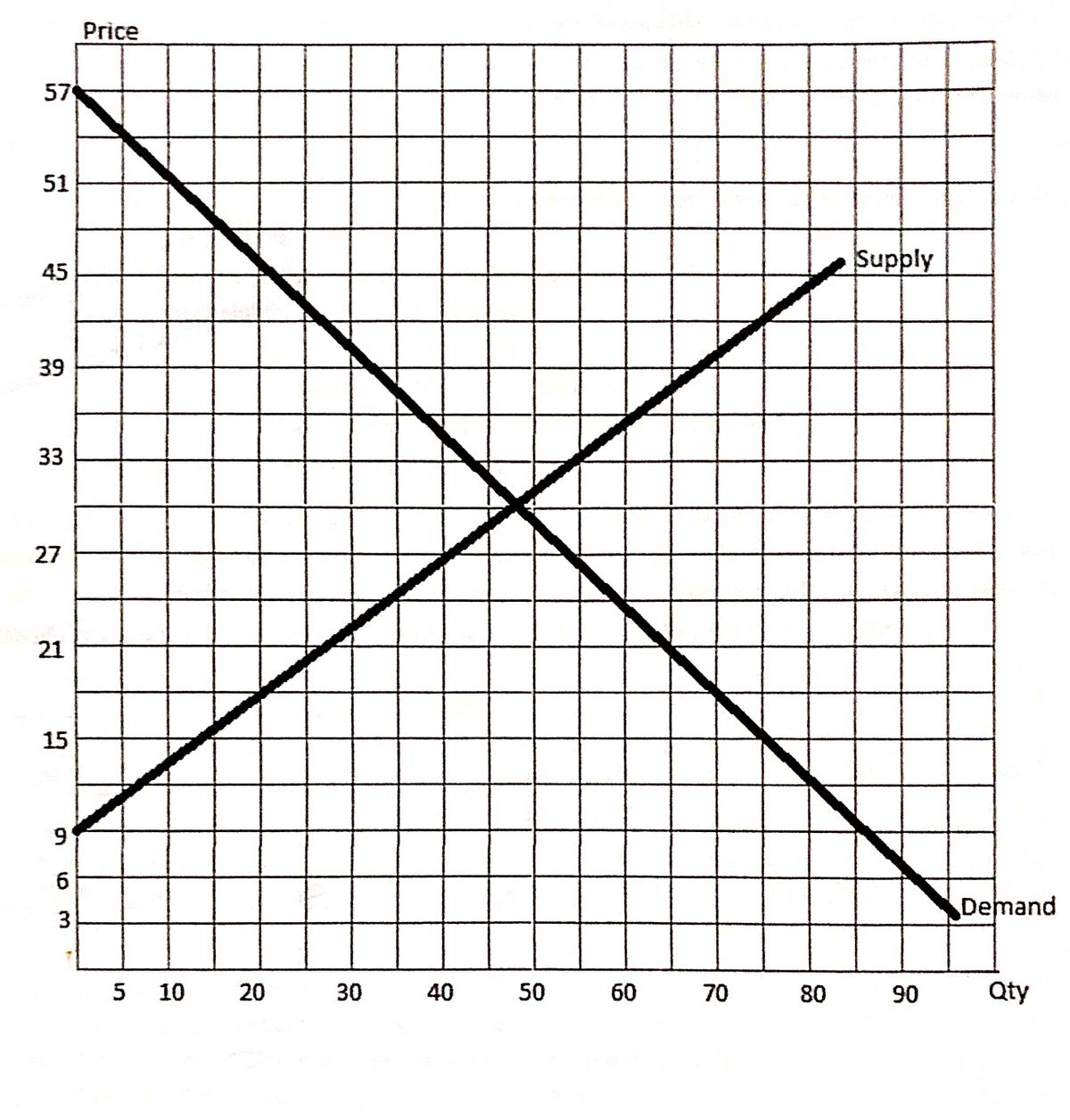
Use the graph below representing a monopolistic market A find the MR and MC curve B find a monopolistics quantity C find the monopolists price D find the markup and E find the resource misallocation
Use the graph below representing a monopolistic market A find the MR and MC curve B find a monopolistics quantity C find the monopolists price D find the markup and E find the resource misallocation
MATLAB: An Introduction with Applications
6th Edition
ISBN:9781119256830
Author:Amos Gilat
Publisher:Amos Gilat
Chapter1: Starting With Matlab
Section: Chapter Questions
Problem 1P
Related questions
Question
Use the graph below representing a monopolistic market A find the MR and MC curve B find a monopolistics quantity C find the monopolists price D find the markup and E find the resource misallocation

Transcribed Image Text:**Homework #4**
**Due:** Sun, Oct 17, 11:59pm
---
**Graph Explanation:**
This graph depicts a classic supply and demand curve.
- **Axes:**
- The vertical axis represents "Price," ranging from 3 to 57.
- The horizontal axis represents "Quantity" (Qty), ranging from 5 to 90.
- **Supply Curve:**
- The upward-sloping line is labeled "Supply." It starts from the bottom left and moves to the top right, indicating that as prices increase, the quantity supplied also increases.
- **Demand Curve:**
- The downward-sloping line is labeled "Demand." It starts from the top left and moves to the bottom right, indicating that as prices decrease, the quantity demanded increases.
- **Intersection:**
- The intersection point of the supply and demand curves represents the equilibrium price and quantity, where the quantity supplied equals the quantity demanded.
Expert Solution
Step 1
Given graph -

Trending now
This is a popular solution!
Step by step
Solved in 2 steps with 2 images

Recommended textbooks for you

MATLAB: An Introduction with Applications
Statistics
ISBN:
9781119256830
Author:
Amos Gilat
Publisher:
John Wiley & Sons Inc

Probability and Statistics for Engineering and th…
Statistics
ISBN:
9781305251809
Author:
Jay L. Devore
Publisher:
Cengage Learning

Statistics for The Behavioral Sciences (MindTap C…
Statistics
ISBN:
9781305504912
Author:
Frederick J Gravetter, Larry B. Wallnau
Publisher:
Cengage Learning

MATLAB: An Introduction with Applications
Statistics
ISBN:
9781119256830
Author:
Amos Gilat
Publisher:
John Wiley & Sons Inc

Probability and Statistics for Engineering and th…
Statistics
ISBN:
9781305251809
Author:
Jay L. Devore
Publisher:
Cengage Learning

Statistics for The Behavioral Sciences (MindTap C…
Statistics
ISBN:
9781305504912
Author:
Frederick J Gravetter, Larry B. Wallnau
Publisher:
Cengage Learning

Elementary Statistics: Picturing the World (7th E…
Statistics
ISBN:
9780134683416
Author:
Ron Larson, Betsy Farber
Publisher:
PEARSON

The Basic Practice of Statistics
Statistics
ISBN:
9781319042578
Author:
David S. Moore, William I. Notz, Michael A. Fligner
Publisher:
W. H. Freeman

Introduction to the Practice of Statistics
Statistics
ISBN:
9781319013387
Author:
David S. Moore, George P. McCabe, Bruce A. Craig
Publisher:
W. H. Freeman