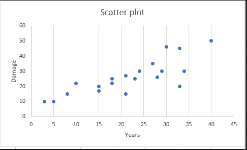
Background The Food and Drug Administration (FDA) tries to find out whether there is a relation between the number of years people smoked and the percentage of lung damage. FDA asks you for your help to find it out. You interviewed twenty people who have smoked and obtained the following data. II. Technical report: a) Draw a scatter plot. b) Based on the scatter plot, explain whether the number of years and the percentage of lung damage are correlated. If they are correlated, discuss the strength of correlation, and the direction (positive or negative). c) Find the correlation coefficient r.


Correlation
Correlation defines a relationship between two independent variables. It tells the degree to which variables move in relation to each other. When two sets of data are related to each other, there is a correlation between them.
Linear Correlation
A correlation is used to determine the relationships between numerical and categorical variables. In other words, it is an indicator of how things are connected to one another. The correlation analysis is the study of how variables are related.
Regression Analysis
Regression analysis is a statistical method in which it estimates the relationship between a dependent variable and one or more independent variable. In simple terms dependent variable is called as outcome variable and independent variable is called as predictors. Regression analysis is one of the methods to find the trends in data. The independent variable used in Regression analysis is named Predictor variable. It offers data of an associated dependent variable regarding a particular outcome.

Given Information:
| Years(X) | 23 | 15 | 30 | 33 | 8 | 40 | 18 | 5 | 28 | 15 | 3 | 29 | 10 | 21 | 33 | 34 | 24 | 27 | 21 | 18 |
| Damage(Y) | 25 | 17 | 46 | 45 | 15 | 50 | 22 | 10 | 26 | 20 | 10 | 30 | 22 | 15 | 20 | 30 | 30 | 35 | 27 | 25 |
(a) Scatter plot can be constructed using Excel:
Steps to follow are given below:
- Enter the data in Excel sheet
- Select the data, Go to Insert
- Under different chart types: Select Scatter plot
- Add chart title and axis titles
Excel output is given below:

Trending now
This is a popular solution!

Step by step
Solved in 2 steps with 2 images


