Refer to the figure. Price (dollars) 10 9 7 6 3 2 1 0 Market for Artichokes 50 100 D 150 200 Quantity (pounds of artichokes) 250 Tools CS The graph represents the market for artichokes (in pounds per week) at a Midwest farmers' market. Suppose the equilibrium price of artichokes is $3 per pound and the equilibrium quantity is 100 pounds of artichokes per week. Using the graph, show the area representing consumer surplus in this market, and then determine how much consumer surplus will be generated by the market each week. Instructions: Use the tool provided "CS" to illustrate this area on the graph. Consumer surplus: $
Refer to the figure. Price (dollars) 10 9 7 6 3 2 1 0 Market for Artichokes 50 100 D 150 200 Quantity (pounds of artichokes) 250 Tools CS The graph represents the market for artichokes (in pounds per week) at a Midwest farmers' market. Suppose the equilibrium price of artichokes is $3 per pound and the equilibrium quantity is 100 pounds of artichokes per week. Using the graph, show the area representing consumer surplus in this market, and then determine how much consumer surplus will be generated by the market each week. Instructions: Use the tool provided "CS" to illustrate this area on the graph. Consumer surplus: $
Chapter4: Demand, Supply, And Market Equilibrium
Section: Chapter Questions
Problem 20P
Related questions
Question

Transcribed Image Text:### Market for Artichokes
#### Graph Explanation:
The graph demonstrates the market for artichokes, displaying the relationship between price (in dollars) and quantity (in pounds of artichokes). The graph includes:
- **Supply Curve (S):** An upward-sloping red line indicating that as the price increases, the quantity supplied also increases.
- **Demand Curve (D):** A downward-sloping blue line showing that as the price decreases, the quantity demanded increases.
- **Equilibrium Point:** The intersection of the supply and demand curves, indicating an equilibrium price of $3 per pound and an equilibrium quantity of 100 pounds of artichokes per week.
#### Instructions:
Using the graph, identify and calculate the area representing consumer surplus, which is the gap between what consumers are willing to pay and the market price they actually pay.
- **Consumer Surplus Area:** The area above the equilibrium price line ($3) and below the demand curve (D) up to the equilibrium quantity (100 pounds).
You can employ the provided tool **CS** to visualize this area on the graph.
#### Task:
Determine the consumer surplus generated by the market each week.
**Consumer Surplus Calculation:**
- Mark the consumer surplus using the tool: \( \text{CS} \)
- Enter the calculated amount for consumer surplus: $ _______
Expert Solution
This question has been solved!
Explore an expertly crafted, step-by-step solution for a thorough understanding of key concepts.
This is a popular solution!
Trending now
This is a popular solution!
Step by step
Solved in 3 steps with 2 images

Follow-up Questions
Read through expert solutions to related follow-up questions below.
Follow-up Question

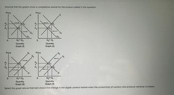
Transcribed Image Text:Assume that the graphs show a competitive market for the product stated in the question.
Price
P₂
t
P₁
O
Price
P₁
1
P₂
E₁
0
E2
Q₁ Q₂
Quantity
Graph (1)
E₁
E₂
D₁
S
D
D2
S1
Price
P₁
Į
P₂
52
O
Price
P₂
f
P₁
0
F
E₂
0O
0
Q₂ Q₁
Quantity
Graph (2)
E₁
E2
E₁
D₂
S
D₁
52
Q₁ Q₂
Q₂ Q₁
Quantity
Quantity
Graph (3)
Graph (4)
Select the graph above that best shows the change in the digital camera market when the productivity of workers who produce cameras increases.
51
Solution
Knowledge Booster
Learn more about
Need a deep-dive on the concept behind this application? Look no further. Learn more about this topic, economics and related others by exploring similar questions and additional content below.Recommended textbooks for you

Exploring Economics
Economics
ISBN:
9781544336329
Author:
Robert L. Sexton
Publisher:
SAGE Publications, Inc

Essentials of Economics (MindTap Course List)
Economics
ISBN:
9781337091992
Author:
N. Gregory Mankiw
Publisher:
Cengage Learning

Principles of Microeconomics (MindTap Course List)
Economics
ISBN:
9781305971493
Author:
N. Gregory Mankiw
Publisher:
Cengage Learning

Exploring Economics
Economics
ISBN:
9781544336329
Author:
Robert L. Sexton
Publisher:
SAGE Publications, Inc

Essentials of Economics (MindTap Course List)
Economics
ISBN:
9781337091992
Author:
N. Gregory Mankiw
Publisher:
Cengage Learning

Principles of Microeconomics (MindTap Course List)
Economics
ISBN:
9781305971493
Author:
N. Gregory Mankiw
Publisher:
Cengage Learning


Economics (MindTap Course List)
Economics
ISBN:
9781337617383
Author:
Roger A. Arnold
Publisher:
Cengage Learning