1. View the properties of the images in the Images/Responsive folder that you downloaded from Canvas a. Append the width of each image to the file name of each image file- separate the original file name and width using a hyphen (ex: if the image name is BigCat.png and it has a width of 100px then rename it to BigCat-100.png)
this is what I have so far
<!DOCTYPE html>
<html>
<head>
<meta charset=”utf-8”>
<title>Lab3</title>
</head>
<body>
<h1>Images</h1>
<img
src="C:\Users\332bo\Desktop\Week_3_Lab\images/meeting-5793.jpg"
alt="A meeting"
width="100%">
<img
src="https://images.unsplash.com/photo-1631130576582-2119bf5189e3?ixid=MnwxMjA3fDB8MHx0b3BpYy1mZWVkfDF8MjFhcGMzVFVFVm98fGVufDB8fHx8&ixlib=rb-1.2.1&auto=format&fit=crop&w=500&q=60"
alt="chair"
width="100%">
<img
src="C:\Users\332bo\Desktop\Week_3_Lab\images\responsive"
alt="sizes"
srcset="xl-box.png,
s-box.png,
m-box.png,
l-box.png"
sizes="100vw">
</body>
</html>
<meta name="viewport" content="width=device-width, initial-scale=1.0">

Our guidelines,we answer only first one.
===========================================================
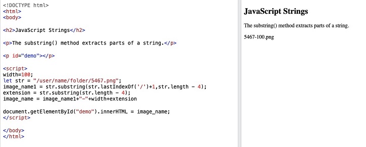
here intially we write code to extract the extension and image name.
then we append the width in url.
==============================================
<!DOCTYPE html>
<html>
<body>
<h2>JavaScript Strings</h2>
<p>The substring() method extracts parts of a string.</p>
<p id="demo"></p>
<script>
width=100;
let str = "/user/name/folder/5467.png";
image_name1 = str.substring(str.lastIndexOf('/')+1,str.length - 4);
extension = str.substring(str.length - 4);
image_name = image_name1+"-"+width+extension
document.getElementById("demo").innerHTML = image_name;
</script>
</body>
</html>
==========================
output:

Step by step
Solved in 2 steps with 2 images


