
Core Skill: Modeling The goal of this modeling challenge is to draw a graph showing a different relationship between ecosystem function and species richness, one based on the rivet hypothesis, which was proposed in 1981.
Modeling Challenge: In 1981, Paul and Ann Ehrlich proposed a relationship between ecosystem function and species richness called the rivet hypothesis. In this model, species are like the rivets on an airplane. Some species play a small but critical role in keeping the plane, the ecosystem, airborne, while other species do not, and we cannot tell beforehand which species affect the ecosystem function the most. The loss of a single rivet will probably not weaken the plane. However, the loss of few rivets would impair airworthiness. The plane could still function but not at maximum efficiency. Continuing on, the loss of a few more rivets could again be tolerated, but the loss of yet more rivets would prove critical to the airplane’s function. Thus, ecosystem function declines with decreased species richness in a stepwise fashion. Draw a graph that depicts a model for the rivet hypothesis. Use the same format as those in Figure 60.2.
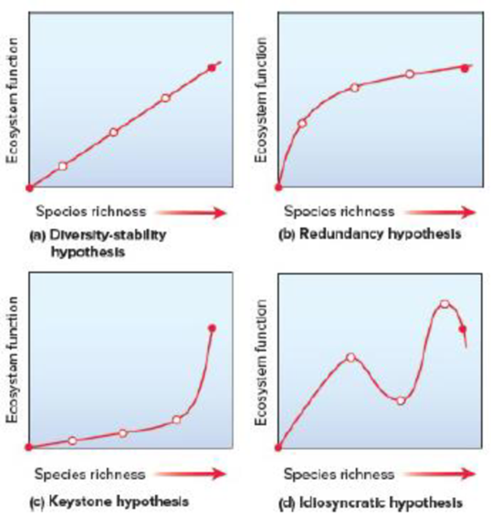
Figure 60.2 Graphical representations of possible relationships between ecosystem function and species richness. The two solid dots represent the end points of a continuum of species richness. The first dot is at the origin, where there are no species and no community services. The second dot represents a natural level of species richness. The relationship is strongest in (a) and weakest in (d).
Want to see the full answer?
Check out a sample textbook solution
Chapter 60 Solutions
BIOLOGY-TEXT
- Select all of the following that the ablation (knockout) or ectopoic expression (gain of function) of Hox can contribute to. Another set of wings in the fruit fly, duplication of fingernails, ectopic ears in mice, excess feathers in duck/quail chimeras, and homeosis of segment 2 to jaw in Hox2a mutantsarrow_forwardSelect all of the following that changes in the MC1R gene can lead to: Changes in spots/stripes in lizards, changes in coat coloration in mice, ectopic ear formation in Siberian hamsters, and red hair in humansarrow_forwardPleiotropic genes are genes that (blank) Cause a swapping of organs/structures, are the result of duplicated sets of chromosomes, never produce protein products, and have more than one purpose/functionarrow_forward
- A loss of function mutation in Pitx1 enhancers can cause (blank) Removal of Pitx1 exons and growth of ectopic hindlimbs, growth of extra ectopic forelimbs, loss of forelimb specification and development, and loss of hindlimb specification and developmentarrow_forwardHox1a most likely contributes to (blank) patterning in the developing embryo? Ventral, posterior, limb or anteriorarrow_forwardSelect all of the following that can help establish Hox gene expression boundaries (things that affect Hox and not things that Hox affects). Retinoic acid, anterior/posterior axis, fibroblast growth factors, vagal neural crest, and enhancersarrow_forward
- Ectopic expression of Hox often results in (blank) phenotypes. (Blank) transformations are characterized by the replacement of one body part/structure with another. Hoxeotic, homealoneotic, joexotic, or homeoticarrow_forwardWhat's the difference when drawing omega-6 and omega-3?arrow_forward. Consider a base substitution mutation that occurred in a DNA sequence that resulted in a change in the encoded protein from the amino acid glutamic acid to aspartic acid. Normally the glutamic acid amino acid is located on the outside of the soluble protein but not near an active site. O-H¨ A. What type of mutation occurred? O-H B. What 2 types of chemical bonds are found in the R-groups of each amino acid? The R groups are shaded. CH2 CH2 CH2 H2N-C-COOH H2N-C-COOH 1 H Glutamic acid H Aspartic acid C. What 2 types of bonds could each R-group of each of these amino acids form with other molecules? D. Consider the chemical properties of the two amino acids and the location of the amino acid in the protein. Explain what effect this mutation will have on this protein's function and why.arrow_forward
- engineered constructs that consist of hollow fibers are acting as synthetic capillaries, around which cells have been loaded. The cellular space around a single fiber can be modeled as if it were a Krogh tissue cylinder. Each fiber has an outside “capillary” radius of 100 µm and the “tissue” radius can be taken as 200 µm. The following values apply to the device:R0 = 20 µM/secaO2 = 1.35 µM/mmHgDO2,T = 1.67 x 10⁻⁵ cm2/secPO2,m = 4 x 10⁻³ cm/secInstead of blood inside the fibers, the oxygen transport and tissue consumption are being investigated by usingan aqueous solution saturated with pure oxygen. As a result, there is no mass transfer resistance in the synthetic“capillary”, only that due to the membrane itself. Rather than accounting for pO2 variations along the length ofthe fiber, use an average value in the “capillary” of 130 mmHg.Is the tissue fully oxygenated?arrow_forwardMolecular Biology Please help with question. thank you You are studying the expression of the lac operon. You have isolated mutants as described below. In the presence of glucose, explain/describe what would happen, for each mutant, to the expression of the lac operon when you add lactose AND what would happen when the bacteria has used up all of the lactose (if the mutant is able to use lactose).5. Mutations in the lac operator that strengthen the binding of the lac repressor 200 fold 6. Mutations in the promoter that prevent binding of RNA polymerase 7. Mutations in CRP/CAP protein that prevent binding of cAMP8. Mutations in sigma factor that prevent binding of sigma to core RNA polymerasearrow_forwardMolecular Biology Please help and there is an attached image. Thank you. A bacteria has a gene whose protein/enzyme product is involved with the synthesis of a lipid necessary for the synthesis of the cell membrane. Expression of this gene requires the binding of a protein (called ACT) to a control sequence (called INC) next to the promoter. A. Is the expression/regulation of this gene an example of induction or repression?Please explain:B. Is this expression/regulation an example of positive or negative control?C. When the lipid is supplied in the media, the expression of the enzyme is turned off.Describe one likely mechanism for how this “turn off” is accomplished.arrow_forward
 Biology 2eBiologyISBN:9781947172517Author:Matthew Douglas, Jung Choi, Mary Ann ClarkPublisher:OpenStax
 Biology: The Dynamic Science (MindTap Course List)BiologyISBN:9781305389892Author:Peter J. Russell, Paul E. Hertz, Beverly McMillanPublisher:Cengage Learning
- Case Studies In Health Information ManagementBiologyISBN:9781337676908Author:SCHNERINGPublisher:Cengage
 Biology (MindTap Course List)BiologyISBN:9781337392938Author:Eldra Solomon, Charles Martin, Diana W. Martin, Linda R. BergPublisher:Cengage Learning

