Concept explainers
Videos
a.
Construct box plot of the variable price.
Identify whether there are outliers or not.
Find the
Find the first
Find the third quartile value.
a.
Answer to Problem 37CE
Output of box plot for the variable price using MINITAB software is,
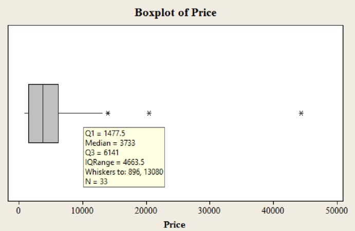
Yes, there are 3 outliers in the dataset.
The median price is 3,733.
The first quartile value is 1,478.
The third quartile value is 6,141.
Explanation of Solution
Calculation:
Step by step procedure to obtain boxplot using MINITAB software is given as,
- Choose Graph > Boxplot.
- In Graph variables enter the columns Price.
- Click OK.
Outliers:
In the boxplot, the outlier is represented using asterisk. In the boxplot of data set there are 3 asterisks representing outliers. Hence, there are three outliers in the dataset.
Median:
The median is the middle value of the data set. In the boxplot, the line in middle of the box represents median of the dataset. The line corresponds to value 3,733.
Hence, the median value is 3,733.
First quartile:
The border line towards the left side of the box represents the value of first quartile. In this box plot, the line of the box on left side corresponds to the value approximately 1,478.
Hence, the third quartile value is 6,141.
Third quartile:
The border line towards the right side of the box represents the value of third quartile. In this box plot, the line of the box on right side corresponds to the value approximately 6,141.
Hence, the first quartile value is 1,478.
b.
Construct box plot of the variable size.
Identify whether there are outliers or not.
Find the median price.
Find the first quartile value.
Find the third quartile value.
b.
Answer to Problem 37CE
Output of box plot for the variable size using MINITAB software is,
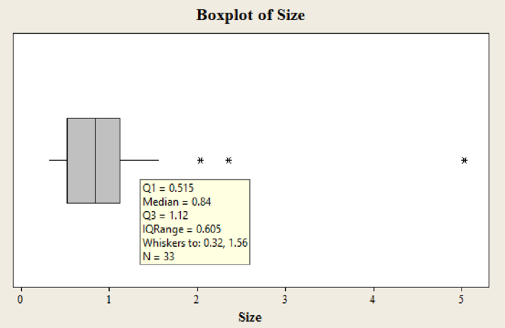
Yes, there are 3 outliers in the dataset.
The median price is 0.84.
The first quartile value is 0.515.
The third quartile value is 1.12.
Explanation of Solution
Calculation:
Step by step procedure to obtain boxplot using MINITAB software is given as,
- Choose Graph > Boxplot.
- In Graph variables enter the columns Size.
- Click OK.
Outliers:
In the boxplot, the outlier is represented using asterisk. In the boxplot of data set there are 3 asterisks representing outliers. Hence, there are three outliers in the dataset.
Median:
The median is the middle value of the data set. In the boxplot, the line in middle of the box represents median of the dataset. The line corresponds to value 0.84.
Hence, the median value is 0.84.
First quartile:
The border line towards the left side of the box represents the value of first quartile. In this box plot, the line of the box on left side corresponds to the value approximately 0.515.
Hence, the third quartile value is 0.515.
Third quartile:
The border line towards the right side of the box represents the value of third quartile. In this box plot, the line of the box on right side corresponds to the value approximately 1.12.
Hence, the first quartile value is 1.12.
c.
Construct
Identify whether there is association between the two variables or not.
Identify whether association is direct or indirect.
Identify whether any point seems to be different from the others.
c.
Answer to Problem 37CE
Output of scatter diagram for variables price and size using MINITAB software is,
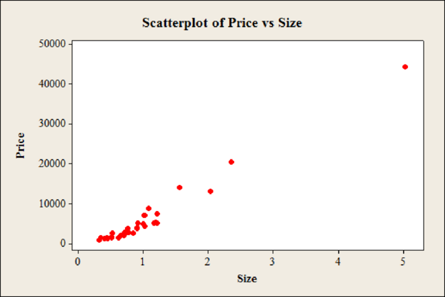
Yes, there is association between the variables price and size.
The association is direct.
Yes, the first observation of both the price and size is large when compared to other observations.
Explanation of Solution
Calculation:
Step by step procedure to obtain scatter diagram using MINITAB software is given as,
- Choose Graph > Scatterplot > select Simple.
- In Y variable enter the column Price.
- In X variable enter the column Size.
- Click OK.
In the scatter diagram it can be observed that, the Price has increased as the Size increases indicating that the association between the variables.
Hence, there is association between the variables price and size
The relation is said to be direct if value of one variable increases due to effect of another variable. From the scatter diagram, the value of Price has increased as the Size increases indicating a direct or positive association.
Hence, the association is direct.
From the scatter diagram, it can be observed that one of the observations corresponding to the value of 5.03 carats for size and $44,312 for price is far from all the other observations. Hence, one point seems to be different from the others.
d.
Construct a
Find the most common cut grade.
Find the most common shape.
Find the most common combination of cut grade and shape.
d.
Answer to Problem 37CE
The contingency table for the variables shape and cut grade is,
| Shape | Cut Grade | |||||
| Average | Good | Ideal | Premium | Ultra Ideal | Total | |
| Emerald | 0 | 0 | 1 | 0 | 0 | 1 |
| Marquise | 0 | 2 | 0 | 1 | 0 | 3 |
| Oval | 0 | 0 | 0 | 1 | 0 | 1 |
| Princess | 1 | 0 | 2 | 2 | 0 | 5 |
| Round | 1 | 3 | 3 | 13 | 3 | 23 |
| Total | 2 | 5 | 6 | 17 | 3 | 33 |
The most common cut grade is premium.
The most common shape is round.
The most common combination of cut grade and shape is premium and round.
Explanation of Solution
Calculation:
Contingency table:
A table that is used for classifying observations based on the two identifiable characteristics is termed as contingency table. It is used for summarizing two variables.
The variable cut grade is classified into 5 different categories ‘average, good, ideal, premium, ultra ideal’. The variable shape is classified into 5 different categories ‘emerald, marquise, oval, princess, and round’.
Count the number of cut grades are average with shape of emerald. From the data, there is no combination of average cut grades with shape of emerald. Hence, the frequency is 0.
Similarly, count the frequency for each of the possible combination of cut grade and shape. Then calculate the totals for each column and row. The contingency table is obtained as below,
| Shape | Cut Grade | |||||
| Average | Good | Ideal | Premium | Ultra Ideal | Total | |
| Emerald | 0 | 0 | 1 | 0 | 0 | 1 |
| Marquise | 0 | 2 | 0 | 1 | 0 | 3 |
| Oval | 0 | 0 | 0 | 1 | 0 | 1 |
| Princess | 1 | 0 | 2 | 2 | 0 | 5 |
| Round | 1 | 3 | 3 | 13 | 3 | 23 |
| Total | 2 | 5 | 6 | 17 | 3 | 33 |
The cut grade ‘Premium’ has a total of 17, which is large when compared to other cut grades. This shows that, the most common cut grade of diamonds is ‘Premium.
Hence, the most common cut grade is premium.
The shape ‘Round’ has a total of 23, which is large when compared to other shapes. This shows that, the most common shape of diamonds is ‘Round’.
Hence, the most common shape is round.
The combination of cut grade ‘Premium’ and shape ‘Round’ has a total of 13, which is large when compared to other combinations. This shows that, the most common combination of diamonds is cut grade ‘Premium’ and shape ‘Round’.
Hence, the most common combination of cut grade and shape is premium and round.
Want to see more full solutions like this?
Chapter 4 Solutions
Statistical Techniques in Business and Economics


- ian income of $50,000. erty rate of 13. Using data from 50 workers, a researcher estimates Wage = Bo+B,Education + B₂Experience + B3Age+e, where Wage is the hourly wage rate and Education, Experience, and Age are the years of higher education, the years of experience, and the age of the worker, respectively. A portion of the regression results is shown in the following table. ni ogolloo bash 1 Standard Coefficients error t stat p-value Intercept 7.87 4.09 1.93 0.0603 Education 1.44 0.34 4.24 0.0001 Experience 0.45 0.14 3.16 0.0028 Age -0.01 0.08 -0.14 0.8920 a. Interpret the estimated coefficients for Education and Experience. b. Predict the hourly wage rate for a 30-year-old worker with four years of higher education and three years of experience.arrow_forward1. If a firm spends more on advertising, is it likely to increase sales? Data on annual sales (in $100,000s) and advertising expenditures (in $10,000s) were collected for 20 firms in order to estimate the model Sales = Po + B₁Advertising + ε. A portion of the regression results is shown in the accompanying table. Intercept Advertising Standard Coefficients Error t Stat p-value -7.42 1.46 -5.09 7.66E-05 0.42 0.05 8.70 7.26E-08 a. Interpret the estimated slope coefficient. b. What is the sample regression equation? C. Predict the sales for a firm that spends $500,000 annually on advertising.arrow_forwardCan you help me solve problem 38 with steps im stuck.arrow_forward
- How do the samples hold up to the efficiency test? What percentages of the samples pass or fail the test? What would be the likelihood of having the following specific number of efficiency test failures in the next 300 processors tested? 1 failures, 5 failures, 10 failures and 20 failures.arrow_forwardThe battery temperatures are a major concern for us. Can you analyze and describe the sample data? What are the average and median temperatures? How much variability is there in the temperatures? Is there anything that stands out? Our engineers’ assumption is that the temperature data is normally distributed. If that is the case, what would be the likelihood that the Safety Zone temperature will exceed 5.15 degrees? What is the probability that the Safety Zone temperature will be less than 4.65 degrees? What is the actual percentage of samples that exceed 5.25 degrees or are less than 4.75 degrees? Is the manufacturing process producing units with stable Safety Zone temperatures? Can you check if there are any apparent changes in the temperature pattern? Are there any outliers? A closer look at the Z-scores should help you in this regard.arrow_forwardNeed help pleasearrow_forward
- Please conduct a step by step of these statistical tests on separate sheets of Microsoft Excel. If the calculations in Microsoft Excel are incorrect, the null and alternative hypotheses, as well as the conclusions drawn from them, will be meaningless and will not receive any points. 4. One-Way ANOVA: Analyze the customer satisfaction scores across four different product categories to determine if there is a significant difference in means. (Hints: The null can be about maintaining status-quo or no difference among groups) H0 = H1=arrow_forwardPlease conduct a step by step of these statistical tests on separate sheets of Microsoft Excel. If the calculations in Microsoft Excel are incorrect, the null and alternative hypotheses, as well as the conclusions drawn from them, will be meaningless and will not receive any points 2. Two-Sample T-Test: Compare the average sales revenue of two different regions to determine if there is a significant difference. (Hints: The null can be about maintaining status-quo or no difference among groups; if alternative hypothesis is non-directional use the two-tailed p-value from excel file to make a decision about rejecting or not rejecting null) H0 = H1=arrow_forwardPlease conduct a step by step of these statistical tests on separate sheets of Microsoft Excel. If the calculations in Microsoft Excel are incorrect, the null and alternative hypotheses, as well as the conclusions drawn from them, will be meaningless and will not receive any points 3. Paired T-Test: A company implemented a training program to improve employee performance. To evaluate the effectiveness of the program, the company recorded the test scores of 25 employees before and after the training. Determine if the training program is effective in terms of scores of participants before and after the training. (Hints: The null can be about maintaining status-quo or no difference among groups; if alternative hypothesis is non-directional, use the two-tailed p-value from excel file to make a decision about rejecting or not rejecting the null) H0 = H1= Conclusion:arrow_forward
- Please conduct a step by step of these statistical tests on separate sheets of Microsoft Excel. If the calculations in Microsoft Excel are incorrect, the null and alternative hypotheses, as well as the conclusions drawn from them, will be meaningless and will not receive any points. The data for the following questions is provided in Microsoft Excel file on 4 separate sheets. Please conduct these statistical tests on separate sheets of Microsoft Excel. If the calculations in Microsoft Excel are incorrect, the null and alternative hypotheses, as well as the conclusions drawn from them, will be meaningless and will not receive any points. 1. One Sample T-Test: Determine whether the average satisfaction rating of customers for a product is significantly different from a hypothetical mean of 75. (Hints: The null can be about maintaining status-quo or no difference; If your alternative hypothesis is non-directional (e.g., μ≠75), you should use the two-tailed p-value from excel file to…arrow_forwardPlease conduct a step by step of these statistical tests on separate sheets of Microsoft Excel. If the calculations in Microsoft Excel are incorrect, the null and alternative hypotheses, as well as the conclusions drawn from them, will be meaningless and will not receive any points. 1. One Sample T-Test: Determine whether the average satisfaction rating of customers for a product is significantly different from a hypothetical mean of 75. (Hints: The null can be about maintaining status-quo or no difference; If your alternative hypothesis is non-directional (e.g., μ≠75), you should use the two-tailed p-value from excel file to make a decision about rejecting or not rejecting null. If alternative is directional (e.g., μ < 75), you should use the lower-tailed p-value. For alternative hypothesis μ > 75, you should use the upper-tailed p-value.) H0 = H1= Conclusion: The p value from one sample t-test is _______. Since the two-tailed p-value is _______ 2. Two-Sample T-Test:…arrow_forwardPlease conduct a step by step of these statistical tests on separate sheets of Microsoft Excel. If the calculations in Microsoft Excel are incorrect, the null and alternative hypotheses, as well as the conclusions drawn from them, will be meaningless and will not receive any points. What is one sample T-test? Give an example of business application of this test? What is Two-Sample T-Test. Give an example of business application of this test? .What is paired T-test. Give an example of business application of this test? What is one way ANOVA test. Give an example of business application of this test? 1. One Sample T-Test: Determine whether the average satisfaction rating of customers for a product is significantly different from a hypothetical mean of 75. (Hints: The null can be about maintaining status-quo or no difference; If your alternative hypothesis is non-directional (e.g., μ≠75), you should use the two-tailed p-value from excel file to make a decision about rejecting or not…arrow_forward
 Big Ideas Math A Bridge To Success Algebra 1: Stu...AlgebraISBN:9781680331141Author:HOUGHTON MIFFLIN HARCOURTPublisher:Houghton Mifflin Harcourt
 Glencoe Algebra 1, Student Edition, 9780079039897...AlgebraISBN:9780079039897Author:CarterPublisher:McGraw Hill
 Holt Mcdougal Larson Pre-algebra: Student Edition...AlgebraISBN:9780547587776Author:HOLT MCDOUGALPublisher:HOLT MCDOUGAL