Concept explainers
Videos
Compare the frequency histograms of men’s winning scores and women’s winning scores for different classes of 5, 7, and 10 and comment on general shape of the histograms.
Answer to Problem 2UT
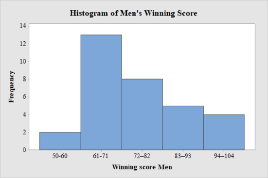
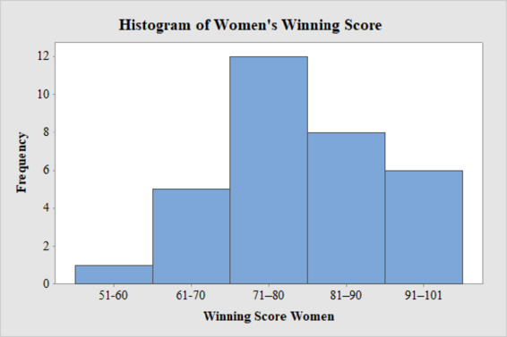
The frequency histogram for the data on men’s and women’s winning scores with five classes is shown below:
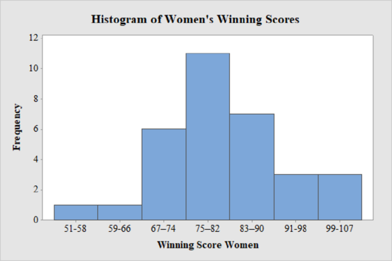
The frequency histogram for the data on men’s and women’s winning scores with seven classes is shown below:
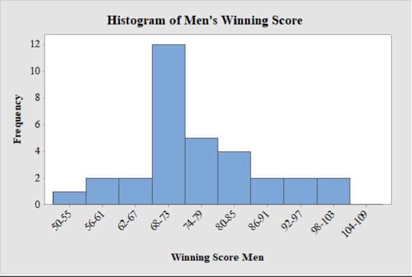
The frequency histogram for the data on men’s winning scores with ten classes is shown below:
The best choice for number of classes is seven.
Explanation of Solution
Calculation:
Class limits:
Class limits are the maximum and minimum values in the class interval.
Class Boundaries:
A class boundary is the midpoint between the upper limit of one class and the lower limit of the next class where the upper limit of the preceding class interval and the lower limit of the next class interval will be equal. The upper class boundary is calculated by adding 0.5 to the upper class limit and the lower class boundary is calculated by subtracting 0.5 from the lower class limit.
Frequency:
Frequency is the number of data points that fall under each class.
Men’s Winning Score with five classes:
From the given data set, the largest data point is 101 and the smallest data point is 50.
Class Width:
The class width is calculated as follows:
The class width is 11. Hence, the lower class limit for the second class 61 is calculated by adding 11 to 50. Following this pattern, all the lower class limits are established. Then, the upper class limits are calculated.
The frequency distribution table is given below:
| Class Limits | Class Boundaries | Frequency |
| 50-60 | 49.5-60.5 | 2 |
| 61-71 | 60.5-71.5 | 13 |
| 72–82 | 71.5–82.5 | 8 |
| 83–93 | 82.5–93.5 | 5 |
| 94–104 | 93.5–104.5 | 4 |
Step-by-step procedure to draw the histogram using MINITAB software:
- Choose Graph > Bar Chart.
- From Bars represent, choose Values from a table.
- Under One column of values, choose Simple. Click OK.
- In Graph variables, enter the column of Frequency.
- In Categorical variables, enter the column of Winning Score Men.
- Click OK.
Thus, the histogram for men’s winning score with five classes is obtained.
Men’s Winning Score with seven classes:
From the given data set, the largest data point is 101 and the smallest data point is 50.
Class Width:
The class width is calculated as follows:
The class width is 8. Hence, the lower class limit for the second class 58 is calculated by adding 8 to 50. Following this pattern, all the lower class limits are established. Then, the upper class limits are calculated.
The frequency distribution table is given below:
| Class Limits | Class Boundaries | Frequency |
| 50-57 | 49.5-57.5 | 1 |
| 58-65 | 57.5-65.5 | 3 |
| 66-73 | 65.5-73.5 | 13 |
| 74-81 | 73.5-81.5 | 5 |
| 82-89 | 81.5-89.5 | 6 |
| 90-97 | 89.5-97.5 | 2 |
| 98-106 | 97.5-106.5 | 2 |
Step-by-step procedure to draw the histogram using MINITAB software:
- Choose Graph > Bar Chart.
- From Bars represent, choose Values from a table.
- Under One column of values, choose Simple. Click OK.
- In Graph variables, enter the column of Frequency.
- In Categorical variables, enter the column of Winning Score Men.
- Click OK.
Thus, the histogram for men’s winning score with seven classes is obtained.
Men’s Winning Score with ten classes:
From the given data set, the largest data point is 101 and the smallest data point is 50.
Class Width:
The class width is calculated as follows:
The class width is 6. Hence, the lower class limit for the second class 56 is calculated by adding 6 to 50. Following this pattern, all the lower class limits are established. Then, the upper class limits are calculated.
The frequency distribution table is given below:
| Class Limits | Class Boundaries | Frequency |
| 50-55 | 49.5-55.5 | 1 |
| 56-61 | 55.5-61.5 | 2 |
| 62-67 | 61.5-67.5 | 2 |
| 68-73 | 67.5-73.5 | 12 |
| 74-79 | 73.5-79.5 | 5 |
| 80-85 | 79.5-85.5 | 4 |
| 86-91 | 85.5-91.5 | 2 |
| 92-97 | 91.5-97.5 | 2 |
| 98-103 | 97.5-103.5 | 2 |
| 104-109 | 103.5-109.5 | 0 |
Step-by-step procedure to draw the histogram using MINITAB software:
- Choose Graph > Bar Chart.
- From Bars represent, choose Values from a table.
- Under One column of values, choose Simple. Click OK.
- In Graph variables, enter the column of Frequency.
- In Categorical variables, enter the column of Winning Score Men.
- Click OK.
Thus, the histogram for men’s winning score with ten classes is obtained.
Women’s Winning Score with five classes:
From the given data set, the largest data point is 101 and the smallest data point is 51.
Class Width:
The class width is calculated as follows:
The class width is 10. Hence, the lower class limit for the second class 61 is calculated by adding 10 to 51. Following this pattern, all the lower class limits are established. Then, the upper class limits are calculated.
The frequency distribution table is given below:
| Class Limits | Class Boundaries | Frequency |
| 51-60 | 50.5-60.5 | 1 |
| 61-70 | 60.5-70.5 | 5 |
| 71–80 | 70.5–80.5 | 12 |
| 81–90 | 80.5–90.5 | 8 |
| 91–101 | 90.5–101.5 | 6 |
Step-by-step procedure to draw the histogram using MINITAB software:
- Choose Graph > Bar Chart.
- From Bars represent, choose Values from a table.
- Under One column of values, choose Simple. Click OK.
- In Graph variables, enter the column of Frequency.
- In Categorical variables, enter the column of Winning Score Women.
- Click OK.
Thus, the histogram for women’s winning score with five classes is obtained.
Women’s Winning Score with seven classes:
From the given data set, the largest data point is 101 and the smallest data point is 51.
Class Width:
The class width is calculated as follows:
The class width is 8. Hence, the lower class limit for the second class 59 is calculated by adding 8 to 51. Following this pattern, all the lower class limits are established. Then, the upper class limits are calculated.
The frequency distribution table is given below:
| Class Limits | Class Boundaries | Frequency |
| 51-58 | 50.5-58.5 | 1 |
| 59-66 | 58.5-66.5 | 1 |
| 67–74 | 66.5–74.5 | 6 |
| 75–82 | 74.5–82.5 | 11 |
| 83–90 | 82.5–90.5 | 7 |
| 91-98 | 90.5-98.5 | 3 |
| 99-107 | 98.5-107.5 | 3 |
Step-by-step procedure to draw the histogram using MINITAB software:
- Choose Graph > Bar Chart.
- From Bars represent, choose Values from a table.
- Under One column of values, choose Simple. Click OK.
- In Graph variables, enter the column of Frequency.
- In Categorical variables, enter the column of Winning Score Women.
- Click OK.
Thus, the histogram for women’s winning score with seven classes is obtained.
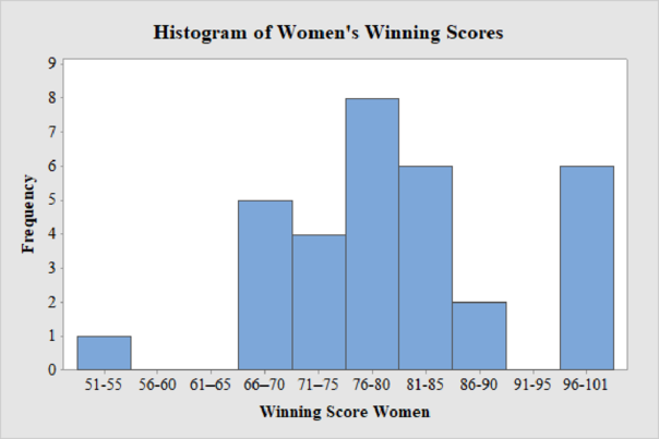
Women’s Winning Score with ten classes:
From the given data set, the largest data point is 101 and the smallest data point is 51.
Class Width:
The class width is calculated as follows:
The class width is 5. Hence, the lower class limit for the second class 56 is calculated by adding 5 to 51. Following this pattern, all the lower class limits are established. Then, the upper class limits are calculated.
The frequency distribution table is given below:
| Class Limits | Class Boundaries | Frequency |
| 51-55 | 50.5-55.5 | 1 |
| 56-60 | 55.5-60.5 | 0 |
| 61–65 | 60.5–65.5 | 0 |
| 66–70 | 65.5–70.5 | 5 |
| 71–75 | 70.5–75.5 | 4 |
| 76-80 | 75.5-80.5 | 8 |
| 81-85 | 80.5-85.5 | 6 |
| 86-90 | 85.5-90.5 | 2 |
| 91-95 | 90.5-95.5 | 0 |
| 96-101 | 95.5-101.5 | 6 |
Step-by-step procedure to draw the histogram using MINITAB software:
- Choose Graph > Bar Chart.
- From Bars represent, choose Values from a table.
- Under One column of values, choose Simple. Click OK.
- In Graph variables, enter the column of Frequency.
- In Categorical variables, enter the column of Winning Score Women.
- Click OK.
Thus, the histogram for women’s winning score with ten classes is obtained.
Comparison of men’s and women’s winning score:
Five classes:
From the histogram on men’s and women’s winning scores with five classes, the following can be observed:
- The data values of men’s winning scores fall within 50 and 101, and the data values of women’s winning scores range between 51 and 101.
- The shape of distribution of men’s winning scores is skewed to the right and there are no unusual observations in the data as not even one data point is far from the overall bulk of data.
- The shape of distribution of women’s winning scores is approximately mound-shaped and there are no outliers.
Seven classes:
From the histogram on men’s and women’s winning scores with seven classes, the following can be observed:
- The data values of men’s winning scores fall within 50 and 101, and the data values of women’s winning scores range between 51 and 101.
- The shape of distribution of men’s winning scores is almost skewed to the right and there are no unusual observations in the data as not even one data point is far from the overall bulk of data.
- The shape of distribution of women’s winning scores is approximately mound-shaped and there are no outliers.
Ten classes:
From the histogram on men’s and women’s winning scores with seven classes, the following can be observed:
- The data values of men’s winning scores fall within 50 and 101 and the data values of women’s winning scores range between 51 and 101.
- The shape of distribution of men’s winning scores is slightly skewed to the right and there are no unusual observations in the data as not even one data point is far from the overall bulk of data. There is only one peak in the distribution.
- The shape of distribution of women’s winning scores is skewed to the left and there is an unusual observation in the data as there are few observations that fall away from the overall bulk of data.
Want to see more full solutions like this?
Chapter 2 Solutions
UNDERSTANDABLE STATISTICS(LL)/ACCESS


- Show all workarrow_forwardplease find the answers for the yellows boxes using the information and the picture belowarrow_forwardA marketing agency wants to determine whether different advertising platforms generate significantly different levels of customer engagement. The agency measures the average number of daily clicks on ads for three platforms: Social Media, Search Engines, and Email Campaigns. The agency collects data on daily clicks for each platform over a 10-day period and wants to test whether there is a statistically significant difference in the mean number of daily clicks among these platforms. Conduct ANOVA test. You can provide your answer by inserting a text box and the answer must include: also please provide a step by on getting the answers in excel Null hypothesis, Alternative hypothesis, Show answer (output table/summary table), and Conclusion based on the P value.arrow_forward
- A company found that the daily sales revenue of its flagship product follows a normal distribution with a mean of $4500 and a standard deviation of $450. The company defines a "high-sales day" that is, any day with sales exceeding $4800. please provide a step by step on how to get the answers Q: What percentage of days can the company expect to have "high-sales days" or sales greater than $4800? Q: What is the sales revenue threshold for the bottom 10% of days? (please note that 10% refers to the probability/area under bell curve towards the lower tail of bell curve) Provide answers in the yellow cellsarrow_forwardBusiness Discussarrow_forwardThe following data represent total ventilation measured in liters of air per minute per square meter of body area for two independent (and randomly chosen) samples. Analyze these data using the appropriate non-parametric hypothesis testarrow_forward
 Big Ideas Math A Bridge To Success Algebra 1: Stu...AlgebraISBN:9781680331141Author:HOUGHTON MIFFLIN HARCOURTPublisher:Houghton Mifflin Harcourt
 Glencoe Algebra 1, Student Edition, 9780079039897...AlgebraISBN:9780079039897Author:CarterPublisher:McGraw Hill
 Holt Mcdougal Larson Pre-algebra: Student Edition...AlgebraISBN:9780547587776Author:HOLT MCDOUGALPublisher:HOLT MCDOUGAL