Concept explainers
Videos
Compare the frequency histograms of men’s winning scores and women’s winning scores for different classes of 5, 7, and 10 and comment on general shape of the histograms.
Answer to Problem 2UT
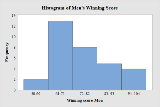
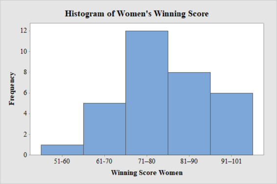
The frequency histogram for the data on men’s and women’s winning scores with five classes is shown below:
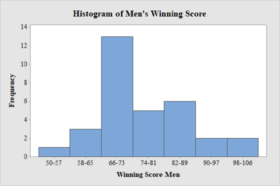
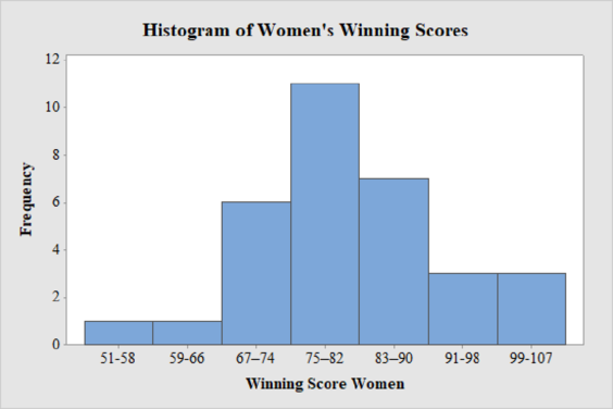
The frequency histogram for the data on men’s and women’s winning scores with seven classes is shown below:
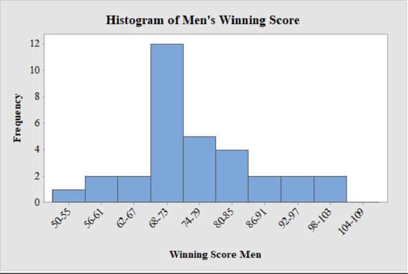
The frequency histogram for the data on men’s winning scores with ten classes is shown below:
The best choice for number of classes is seven.
Explanation of Solution
Calculation:
Class limits:
Class limits are the maximum and minimum values in the class interval.
Class Boundaries:
A class boundary is the midpoint between the upper limit of one class and the lower limit of the next class where the upper limit of the preceding class interval and the lower limit of the next class interval will be equal. The upper class boundary is calculated by adding 0.5 to the upper class limit and the lower class boundary is calculated by subtracting 0.5 from the lower class limit.
Frequency:
Frequency is the number of data points that fall under each class.
Men’s Winning Score with five classes:
From the given data set, the largest data point is 101 and the smallest data point is 50.
Class Width:
The class width is calculated as follows:
The class width is 11. Hence, the lower class limit for the second class 61 is calculated by adding 11 to 50. Following this pattern, all the lower class limits are established. Then, the upper class limits are calculated.
The frequency distribution table is given below:
| Class Limits | Class Boundaries | Frequency |
| 50-60 | 49.5-60.5 | 2 |
| 61-71 | 60.5-71.5 | 13 |
| 72–82 | 71.5–82.5 | 8 |
| 83–93 | 82.5–93.5 | 5 |
| 94–104 | 93.5–104.5 | 4 |
Step-by-step procedure to draw the histogram using MINITAB software:
- Choose Graph > Bar Chart.
- From Bars represent, choose Values from a table.
- Under One column of values, choose Simple. Click OK.
- In Graph variables, enter the column of Frequency.
- In Categorical variables, enter the column of Winning Score Men.
- Click OK.
Thus, the histogram for men’s winning score with five classes is obtained.
Men’s Winning Score with seven classes:
From the given data set, the largest data point is 101 and the smallest data point is 50.
Class Width:
The class width is calculated as follows:
The class width is 8. Hence, the lower class limit for the second class 58 is calculated by adding 8 to 50. Following this pattern, all the lower class limits are established. Then, the upper class limits are calculated.
The frequency distribution table is given below:
| Class Limits | Class Boundaries | Frequency |
| 50-57 | 49.5-57.5 | 1 |
| 58-65 | 57.5-65.5 | 3 |
| 66-73 | 65.5-73.5 | 13 |
| 74-81 | 73.5-81.5 | 5 |
| 82-89 | 81.5-89.5 | 6 |
| 90-97 | 89.5-97.5 | 2 |
| 98-106 | 97.5-106.5 | 2 |
Step-by-step procedure to draw the histogram using MINITAB software:
- Choose Graph > Bar Chart.
- From Bars represent, choose Values from a table.
- Under One column of values, choose Simple. Click OK.
- In Graph variables, enter the column of Frequency.
- In Categorical variables, enter the column of Winning Score Men.
- Click OK.
Thus, the histogram for men’s winning score with seven classes is obtained.
Men’s Winning Score with ten classes:
From the given data set, the largest data point is 101 and the smallest data point is 50.
Class Width:
The class width is calculated as follows:
The class width is 6. Hence, the lower class limit for the second class 56 is calculated by adding 6 to 50. Following this pattern, all the lower class limits are established. Then, the upper class limits are calculated.
The frequency distribution table is given below:
| Class Limits | Class Boundaries | Frequency |
| 50-55 | 49.5-55.5 | 1 |
| 56-61 | 55.5-61.5 | 2 |
| 62-67 | 61.5-67.5 | 2 |
| 68-73 | 67.5-73.5 | 12 |
| 74-79 | 73.5-79.5 | 5 |
| 80-85 | 79.5-85.5 | 4 |
| 86-91 | 85.5-91.5 | 2 |
| 92-97 | 91.5-97.5 | 2 |
| 98-103 | 97.5-103.5 | 2 |
| 104-109 | 103.5-109.5 | 0 |
Step-by-step procedure to draw the histogram using MINITAB software:
- Choose Graph > Bar Chart.
- From Bars represent, choose Values from a table.
- Under One column of values, choose Simple. Click OK.
- In Graph variables, enter the column of Frequency.
- In Categorical variables, enter the column of Winning Score Men.
- Click OK.
Thus, the histogram for men’s winning score with ten classes is obtained.
Women’s Winning Score with five classes:
From the given data set, the largest data point is 101 and the smallest data point is 51.
Class Width:
The class width is calculated as follows:
The class width is 10. Hence, the lower class limit for the second class 61 is calculated by adding 10 to 51. Following this pattern, all the lower class limits are established. Then, the upper class limits are calculated.
The frequency distribution table is given below:
| Class Limits | Class Boundaries | Frequency |
| 51-60 | 50.5-60.5 | 1 |
| 61-70 | 60.5-70.5 | 5 |
| 71–80 | 70.5–80.5 | 12 |
| 81–90 | 80.5–90.5 | 8 |
| 91–101 | 90.5–101.5 | 6 |
Step-by-step procedure to draw the histogram using MINITAB software:
- Choose Graph > Bar Chart.
- From Bars represent, choose Values from a table.
- Under One column of values, choose Simple. Click OK.
- In Graph variables, enter the column of Frequency.
- In Categorical variables, enter the column of Winning Score Women.
- Click OK.
Thus, the histogram for women’s winning score with five classes is obtained.
Women’s Winning Score with seven classes:
From the given data set, the largest data point is 101 and the smallest data point is 51.
Class Width:
The class width is calculated as follows:
The class width is 8. Hence, the lower class limit for the second class 59 is calculated by adding 8 to 51. Following this pattern, all the lower class limits are established. Then, the upper class limits are calculated.
The frequency distribution table is given below:
| Class Limits | Class Boundaries | Frequency |
| 51-58 | 50.5-58.5 | 1 |
| 59-66 | 58.5-66.5 | 1 |
| 67–74 | 66.5–74.5 | 6 |
| 75–82 | 74.5–82.5 | 11 |
| 83–90 | 82.5–90.5 | 7 |
| 91-98 | 90.5-98.5 | 3 |
| 99-107 | 98.5-107.5 | 3 |
Step-by-step procedure to draw the histogram using MINITAB software:
- Choose Graph > Bar Chart.
- From Bars represent, choose Values from a table.
- Under One column of values, choose Simple. Click OK.
- In Graph variables, enter the column of Frequency.
- In Categorical variables, enter the column of Winning Score Women.
- Click OK.
Thus, the histogram for women’s winning score with seven classes is obtained.
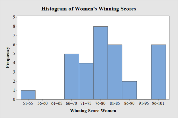
Women’s Winning Score with ten classes:
From the given data set, the largest data point is 101 and the smallest data point is 51.
Class Width:
The class width is calculated as follows:
The class width is 5. Hence, the lower class limit for the second class 56 is calculated by adding 5 to 51. Following this pattern, all the lower class limits are established. Then, the upper class limits are calculated.
The frequency distribution table is given below:
| Class Limits | Class Boundaries | Frequency |
| 51-55 | 50.5-55.5 | 1 |
| 56-60 | 55.5-60.5 | 0 |
| 61–65 | 60.5–65.5 | 0 |
| 66–70 | 65.5–70.5 | 5 |
| 71–75 | 70.5–75.5 | 4 |
| 76-80 | 75.5-80.5 | 8 |
| 81-85 | 80.5-85.5 | 6 |
| 86-90 | 85.5-90.5 | 2 |
| 91-95 | 90.5-95.5 | 0 |
| 96-101 | 95.5-101.5 | 6 |
Step-by-step procedure to draw the histogram using MINITAB software:
- Choose Graph > Bar Chart.
- From Bars represent, choose Values from a table.
- Under One column of values, choose Simple. Click OK.
- In Graph variables, enter the column of Frequency.
- In Categorical variables, enter the column of Winning Score Women.
- Click OK.
Thus, the histogram for women’s winning score with ten classes is obtained.
Comparison of men’s and women’s winning score:
Five classes:
From the histogram on men’s and women’s winning scores with five classes, the following can be observed:
- The data values of men’s winning scores fall within 50 and 101, and the data values of women’s winning scores range between 51 and 101.
- The shape of distribution of men’s winning scores is skewed to the right and there are no unusual observations in the data as not even one data point is far from the overall bulk of data.
- The shape of distribution of women’s winning scores is approximately mound-shaped and there are no outliers.
Seven classes:
From the histogram on men’s and women’s winning scores with seven classes, the following can be observed:
- The data values of men’s winning scores fall within 50 and 101, and the data values of women’s winning scores range between 51 and 101.
- The shape of distribution of men’s winning scores is almost skewed to the right and there are no unusual observations in the data as not even one data point is far from the overall bulk of data.
- The shape of distribution of women’s winning scores is approximately mound-shaped and there are no outliers.
Ten classes:
From the histogram on men’s and women’s winning scores with seven classes, the following can be observed:
- The data values of men’s winning scores fall within 50 and 101 and the data values of women’s winning scores range between 51 and 101.
- The shape of distribution of men’s winning scores is slightly skewed to the right and there are no unusual observations in the data as not even one data point is far from the overall bulk of data. There is only one peak in the distribution.
- The shape of distribution of women’s winning scores is skewed to the left and there is an unusual observation in the data as there are few observations that fall away from the overall bulk of data.
Want to see more full solutions like this?
Chapter 2 Solutions
UNDERSTANDABLE STAT. >PRINT UPGRADE<


- 2. Hypothesis Testing - Two Sample Means A nutritionist is investigating the effect of two different diet programs, A and B, on weight loss. Two independent samples of adults were randomly assigned to each diet for 12 weeks. The weight losses (in kg) are normally distributed. Sample A: n = 35, 4.8, s = 1.2 Sample B: n=40, 4.3, 8 = 1.0 Questions: a) State the null and alternative hypotheses to test whether there is a significant difference in mean weight loss between the two diet programs. b) Perform a hypothesis test at the 5% significance level and interpret the result. c) Compute a 95% confidence interval for the difference in means and interpret it. d) Discuss assumptions of this test and explain how violations of these assumptions could impact the results.arrow_forward1. Sampling Distribution and the Central Limit Theorem A company produces batteries with a mean lifetime of 300 hours and a standard deviation of 50 hours. The lifetimes are not normally distributed—they are right-skewed due to some batteries lasting unusually long. Suppose a quality control analyst selects a random sample of 64 batteries from a large production batch. Questions: a) Explain whether the distribution of sample means will be approximately normal. Justify your answer using the Central Limit Theorem. b) Compute the mean and standard deviation of the sampling distribution of the sample mean. c) What is the probability that the sample mean lifetime of the 64 batteries exceeds 310 hours? d) Discuss how the sample size affects the shape and variability of the sampling distribution.arrow_forwardA biologist is investigating the effect of potential plant hormones by treating 20 stem segments. At the end of the observation period he computes the following length averages: Compound X = 1.18 Compound Y = 1.17 Based on these mean values he concludes that there are no treatment differences. 1) Are you satisfied with his conclusion? Why or why not? 2) If he asked you for help in analyzing these data, what statistical method would you suggest that he use to come to a meaningful conclusion about his data and why? 3) Are there any other questions you would ask him regarding his experiment, data collection, and analysis methods?arrow_forward
- Businessarrow_forwardWhat is the solution and answer to question?arrow_forwardTo: [Boss's Name] From: Nathaniel D Sain Date: 4/5/2025 Subject: Decision Analysis for Business Scenario Introduction to the Business Scenario Our delivery services business has been experiencing steady growth, leading to an increased demand for faster and more efficient deliveries. To meet this demand, we must decide on the best strategy to expand our fleet. The three possible alternatives under consideration are purchasing new delivery vehicles, leasing vehicles, or partnering with third-party drivers. The decision must account for various external factors, including fuel price fluctuations, demand stability, and competition growth, which we categorize as the states of nature. Each alternative presents unique advantages and challenges, and our goal is to select the most viable option using a structured decision-making approach. Alternatives and States of Nature The three alternatives for fleet expansion were chosen based on their cost implications, operational efficiency, and…arrow_forward
- The following ordered data list shows the data speeds for cell phones used by a telephone company at an airport: A. Calculate the Measures of Central Tendency from the ungrouped data list. B. Group the data in an appropriate frequency table. C. Calculate the Measures of Central Tendency using the table in point B. 0.8 1.4 1.8 1.9 3.2 3.6 4.5 4.5 4.6 6.2 6.5 7.7 7.9 9.9 10.2 10.3 10.9 11.1 11.1 11.6 11.8 12.0 13.1 13.5 13.7 14.1 14.2 14.7 15.0 15.1 15.5 15.8 16.0 17.5 18.2 20.2 21.1 21.5 22.2 22.4 23.1 24.5 25.7 28.5 34.6 38.5 43.0 55.6 71.3 77.8arrow_forwardII Consider the following data matrix X: X1 X2 0.5 0.4 0.2 0.5 0.5 0.5 10.3 10 10.1 10.4 10.1 10.5 What will the resulting clusters be when using the k-Means method with k = 2. In your own words, explain why this result is indeed expected, i.e. why this clustering minimises the ESS map.arrow_forwardwhy the answer is 3 and 10?arrow_forward
 Big Ideas Math A Bridge To Success Algebra 1: Stu...AlgebraISBN:9781680331141Author:HOUGHTON MIFFLIN HARCOURTPublisher:Houghton Mifflin Harcourt
 Glencoe Algebra 1, Student Edition, 9780079039897...AlgebraISBN:9780079039897Author:CarterPublisher:McGraw Hill
 Holt Mcdougal Larson Pre-algebra: Student Edition...AlgebraISBN:9780547587776Author:HOLT MCDOUGALPublisher:HOLT MCDOUGAL