Concept explainers
Videos
Construct a histogram, frequency
To construct: The histogram, frequency polygon, and ogive for given data.
Answer to Problem 2.2.9RE
The histogram, frequency polygon and Ogive shown below:
Histogram:
Frequency polygon:
Ogive:
Explanation of Solution
Given info: The given data is shown below,
| 90 | 420 | 300 | 194 |
| 640 | 68 | 268 | 276 |
| 620 | 76 | 165 | 833 |
| 370 | 53 | 132 | 600 |
| 594 | 70 | 308 | |
| 574 | 215 | 109 | |
| 317 | 850 | 212 | |
| 300 | 256 | 187 |
Calculation:
Step-by-step procedure to construct frequency distribution table is as follows:
The number of classes is 6.
Here the minimum number is 53 and maximum number is 850.
Thus, the range is,
Class width is obtained by dividing the range by the number of classes.
Thus,
Since, we have to make 6 classes for given data we take class width 135 for convenient.
Lower class limits:
The class limits are obtained by taking the minimum value or less than minimum value as lower limit for the first class. For second class, the lower limit is obtained by adding the class width to the previous class lower limit. That is,
Similarly, the lower limits for the remaining classes can be obtained.
Upper class limits:
For the first class, the upper limit is one less than the lower limit of the second class that is,
The other upper limits are obtained by adding the upper limit of the preceding class and the class width.
Thus, the lower class and upper class limits are as follows:
| Lower limit | Upper limit |
| 52.5 |
|
| 52.5+135=187.5 | 322.5 |
| 187.5+135=322.5 | 457.5 |
| 322.5+135=457.5 | 592.5 |
| 457.5+135=592.5 | 727.5 |
| 592.5+135=727.7 | 862.5 |
| 727.5+135=862.5 | 997.5 |
Make a tally mark for each entry in the corresponding class and continue for all number of children in the data.
The number of tally marks in each class represents the frequency, f of that class.
Thus, the frequency distribution table the distribution of declaration of independence is as follows,
| Class | Tally | Frequency
|
| 52.5-187.5 |
|
9 |
| 187.5-322.5 |
|
10 |
| 322.5-457.5 |
|
3 |
| 457.5-592.5 |
|
3 |
| 592.5-727.5 |
|
1 |
| 727.5-862.5 |
|
2 |
Relative frequency:
The portion of the data that falls in the corresponding class is relative frequency of that class.
Thus, the relative frequency for each class is tabulated below,
| Class | Frequency
|
Relative frequency |
| 52.5-187.5 | 9 |
|
| 187.5-322.5 | 10 |
|
| 322.5-457.5 | 3 |
|
| 457.5-592.5 | 3 |
|
| 592.5-727.5 | 1 |
|
| 727.5-862.5 | 2 |
|
| Total | 28 |
From the frequency table it is observed that maximum relative frequency is for class 187.5-322.5 and also frequency is maximum for that class.
Adding the frequency and write in next column.
Determine the mid value of class boundaries as taking average between the lower boundaries and higher boundaries.
Thus grouped frequency table for the given data is,
| Class | Frequency
|
Mid value | Cumulative frequency | Cumulative percentage |
| 52.5-187.5 | 9 | 120 | 9 | 32.14 |
| 187.5-322.5 | 10 | 255 | 19 | 67.85 |
| 322.5-457.5 | 3 | 390 | 22 | 78.57 |
| 457.5-592.5 | 3 | 525 | 25 | 89.28 |
| 592.5-727.5 | 1 | 660 | 26 |
|
| 727.5-862.5 | 2 | 795 | 28 |
|
| Total | 28 |
Thus, the table shows the frequency distribution table for the given data.
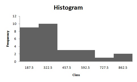
Histogram:
Software procedure:
Step-by-step procedure to construct the histogram by using EXCEL is given below:
- Enter the data in column A of new worksheet, one number per cell.
- Enter the boundaries in column B.
- From the toolbar, select the Data tab, the select data analysis.
- In data analysis, select HISTOGRAM and click ok.
- In HISTOGRAM dialog box, type A1:A6 in the input range.
- Click ok and histogram shown below,
The shape of the distribution is positive skewed.
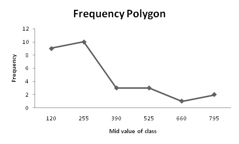
Frequency polygon:
Software procedure:
Step-by-step procedure to construct the histogram by using EXCEL is given below:
- Enter midpoint and frequency in column A and column B respectively.
- Select the insert tab from the toolbar and line chart option.
- Select 2-D line chart.
- Frequency polygon shown below,
The frequency polygon shows that distribution is positively skewed.
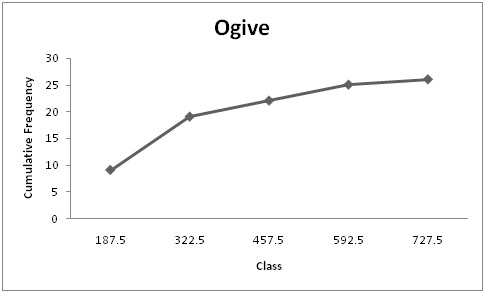
Ogive:
Software procedure:
- Enter upper class boundaries and cumulative frequency in column A and column B respectively.
- Select the insert tab from the toolbar and line chart option.
- Select 2-D line chart.
Therefore, from the ogive it can say that distribution is increasing in trend.
Want to see more full solutions like this?
Chapter 2 Solutions
Elementary Statistics: A Step-by-Step Approach with Formula Card


- please find the answers for the yellows boxes using the information and the picture belowarrow_forwardA marketing agency wants to determine whether different advertising platforms generate significantly different levels of customer engagement. The agency measures the average number of daily clicks on ads for three platforms: Social Media, Search Engines, and Email Campaigns. The agency collects data on daily clicks for each platform over a 10-day period and wants to test whether there is a statistically significant difference in the mean number of daily clicks among these platforms. Conduct ANOVA test. You can provide your answer by inserting a text box and the answer must include: also please provide a step by on getting the answers in excel Null hypothesis, Alternative hypothesis, Show answer (output table/summary table), and Conclusion based on the P value.arrow_forwardA company found that the daily sales revenue of its flagship product follows a normal distribution with a mean of $4500 and a standard deviation of $450. The company defines a "high-sales day" that is, any day with sales exceeding $4800. please provide a step by step on how to get the answers Q: What percentage of days can the company expect to have "high-sales days" or sales greater than $4800? Q: What is the sales revenue threshold for the bottom 10% of days? (please note that 10% refers to the probability/area under bell curve towards the lower tail of bell curve) Provide answers in the yellow cellsarrow_forward
- Business Discussarrow_forwardThe following data represent total ventilation measured in liters of air per minute per square meter of body area for two independent (and randomly chosen) samples. Analyze these data using the appropriate non-parametric hypothesis testarrow_forwardeach column represents before & after measurements on the same individual. Analyze with the appropriate non-parametric hypothesis test for a paired design.arrow_forward
 Holt Mcdougal Larson Pre-algebra: Student Edition...AlgebraISBN:9780547587776Author:HOLT MCDOUGALPublisher:HOLT MCDOUGAL
 Glencoe Algebra 1, Student Edition, 9780079039897...AlgebraISBN:9780079039897Author:CarterPublisher:McGraw Hill
 Big Ideas Math A Bridge To Success Algebra 1: Stu...AlgebraISBN:9781680331141Author:HOUGHTON MIFFLIN HARCOURTPublisher:Houghton Mifflin Harcourt