Videos
Create frequency histograms for the data on men’s winning scores with classes of 5, 7, and 10.
Create frequency histograms for the data on women’s winning scores with classes of 5, 7, and 10.
Identify the best choice of the number of classes and give reason.
Answer to Problem 1UT
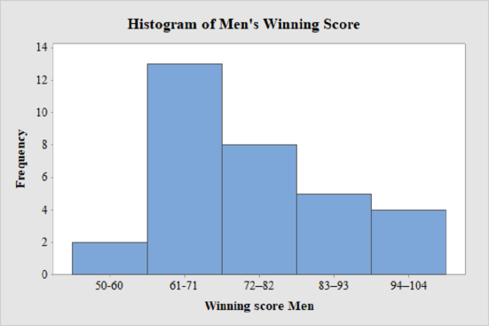
The frequency histogram for the data on men’s winning scores with five classes is shown below:
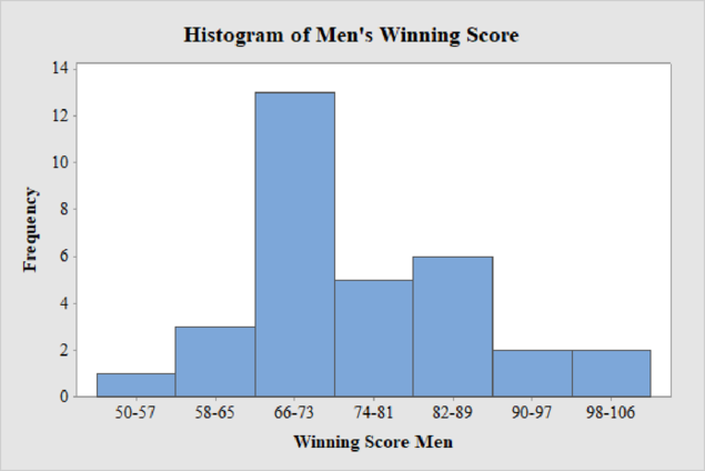
The frequency histogram for the data on men’s winning scores with seven classes is shown below:
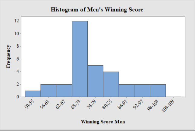
The frequency histogram for the data on men’s winning scores with ten classes is shown below:
The frequency histogram for the data on women’s winning scores with five classes is shown below:
The frequency histogram for the data on women’s winning scores with seven classes is shown below:
The frequency histogram for the data on women’s winning scores with ten classes is shown below:
The best choice for the number of classes is seven.
Explanation of Solution
Calculation:
Class limits:
Class limits are the maximum and minimum values in the class interval
Class Boundaries:
A class boundary is the midpoint between the upper limit of one class and the lower limit of the next class where the upper limit of the preceding class interval and the lower limit of the next class interval will be equal. The upper class boundary is calculated by adding 0.5 to the upper class limit and the lower class boundary is calculated by subtracting 0.5 from the lower class limit.
Frequency:
Frequency is the number of data points that fall under each class.
Men’s Winning Score with five classes:
From the given data set, the largest data point is 101 and the smallest data point is 50.
Class Width:
The class width is calculated as follows:
The class width is 11. Hence, the lower class limit for the second class 61 is calculated by adding 11 to 50. Following this pattern, all the lower class limits are established. Then, the upper class limits are calculated.
The frequency distribution table is given below:
| Class Limits | Class Boundaries | Frequency |
| 50-60 | 49.5–60.5 | 2 |
| 61-71 | 60.5–71.5 | 13 |
| 72–82 | 71.5–82.5 | 8 |
| 83–93 | 82.5–93.5 | 5 |
| 94–104 | 93.5–104.5 | 4 |
Step-by-step procedure to draw the histogram using MINITAB software:
- Choose Graph > Bar Chart.
- From Bars represent, choose Values from a table.
- Under One column of values, choose Simple. Click OK.
- In Graph variables, enter the column of Frequency.
- In Categorical variables, enter the column of Winning Score Men.
- Click OK.
Thus, the histogram for men’s winning score with five classes is obtained.
Men’s Winning Score with seven classes:
From the given data set, the largest data point is 101 and the smallest data point is 50.
Class Width:
The class width is calculated as follows:
The class width is 8. Hence, the lower class limit for the second class 58 is calculated by adding 8 to 50. Following this pattern, all the lower class limits are established. Then, the upper class limits are calculated.
The frequency distribution table is given below:
| Class Limits | Class Boundaries | Frequency |
| 50-57 | 49.5-57.5 | 1 |
| 58-65 | 57.5-65.5 | 3 |
| 66-73 | 65.5-73.5 | 13 |
| 74-81 | 73.5-81.5 | 5 |
| 82-89 | 81.5-89.5 | 6 |
| 90-97 | 89.5-97.5 | 2 |
| 98-106 | 97.5-106.5 | 2 |
Step-by-step procedure to draw the histogram using MINITAB software:
- Choose Graph > Bar Chart.
- From Bars represent, choose Values from a table.
- Under One column of values, choose Simple. Click OK.
- In Graph variables, enter the column of Frequency.
- In Categorical variables, enter the column of Winning Score Men.
- Click OK.
Thus, the histogram for men’s winning score with seven classes is obtained.
Men’s Winning Score with ten classes:
From the given data set, the largest data point is 101 and the smallest data point is 50.
Class Width:
The class width is calculated as follows:
The class width is 6. Hence, the lower class limit for the second class 56 is calculated by adding 6 to 50. Following this pattern, all the lower class limits are established. Then, the upper class limits are calculated.
The frequency distribution table is given below:
| Class Limits | Class Boundaries | Frequency |
| 50-55 | 49.5-55.5 | 1 |
| 56-61 | 55.5-61.5 | 2 |
| 62-67 | 61.5-67.5 | 2 |
| 68-73 | 67.5-73.5 | 12 |
| 74-79 | 73.5-79.5 | 5 |
| 80-85 | 79.5-85.5 | 4 |
| 86-91 | 85.5-91.5 | 2 |
| 92-97 | 91.5-97.5 | 2 |
| 98-103 | 97.5-103.5 | 2 |
| 104-109 | 103.5-109.5 | 0 |
Step-by-step procedure to draw the histogram using MINITAB software:
- Choose Graph > Bar Chart.
- From Bars represent, choose Values from a table.
- Under One column of values, choose Simple. Click OK.
- In Graph variables, enter the column of Frequency.
- In Categorical variables, enter the column of Winning Score Men.
- Click OK.
Thus, the histogram for men’s winning score with ten classes is obtained.
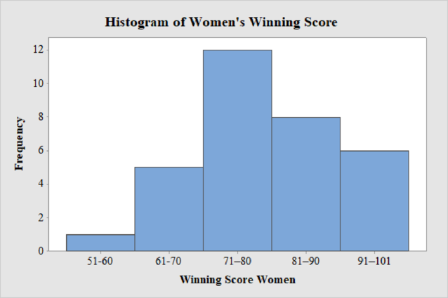
Women’s Winning Score with five classes:
From the given data set, the largest data point is 101 and the smallest data point is 51.
Class Width:
The class width is calculated as follows:
The class width is 10. Hence, the lower class limit for the second class 61 is calculated by adding 10 to 51. Following this pattern, all the lower class limits are established. Then, the upper class limits are calculated.
The frequency distribution table is given below:
| Class Limits | Class Boundaries | Frequency |
| 51-60 | 50.5-60.5 | 1 |
| 61-70 | 60.5-70.5 | 5 |
| 71–80 | 70.5–80.5 | 12 |
| 81–90 | 80.5–90.5 | 8 |
| 91–101 | 90.5–101.5 | 6 |
Step-by-step procedure to draw the histogram using MINITAB software:
- Choose Graph > Bar Chart.
- From Bars represent, choose Values from a table.
- Under One column of values, choose Simple. Click OK.
- In Graph variables, enter the column of Frequency.
- In Categorical variables, enter the column of Winning Score Women.
- Click OK.
Thus, the histogram for women’s winning score with five classes is obtained.
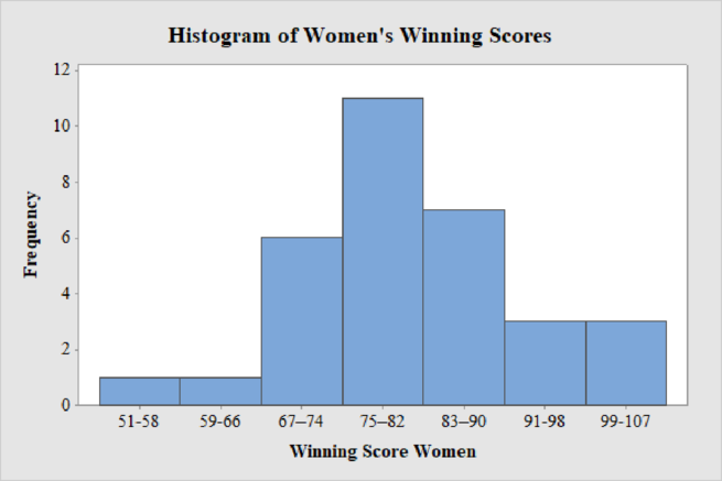
Women’s Winning Score with seven classes:
From the given data set, the largest data point is 101 and the smallest data point is 51.
Class Width:
The class width is calculated as follows:
The class width is 8. Hence, the lower class limit for the second class 59 is calculated by adding 8 to 51. Following this pattern, all the lower class limits are established. Then, the upper class limits are calculated.
The frequency distribution table is given below:
| Class Limits | Class Boundaries | Frequency |
| 51-58 | 50.5-58.5 | 1 |
| 59-66 | 58.5-66.5 | 1 |
| 67–74 | 66.5–74.5 | 6 |
| 75–82 | 74.5–82.5 | 11 |
| 83–90 | 82.5–90.5 | 7 |
| 91-98 | 90.5-98.5 | 3 |
| 99-107 | 98.5-107.5 | 3 |
Step-by-step procedure to draw the histogram using MINITAB software:
- Choose Graph > Bar Chart.
- From Bars represent, choose Values from a table.
- Under One column of values, choose Simple. Click OK.
- In Graph variables, enter the column of Frequency.
- In Categorical variables, enter the column of Winning Score Women.
- Click OK.
Thus, the histogram for women’s winning score with seven classes is obtained.
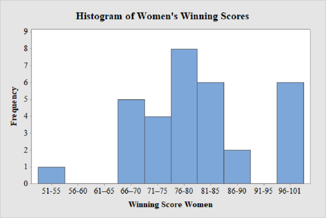
Women’s Winning Score with ten classes:
From the given data set, the largest data point is 101 and the smallest data point is 51.
Class Width:
The class width is calculated as follows:
The class width is 5. Hence, the lower class limit for the second class 56 is calculated by adding 5 to 51. Following this pattern, all the lower class limits are established. Then, the upper class limits are calculated.
The frequency distribution table is given below:
| Class Limits | Class Boundaries | Frequency |
| 51-55 | 50.5–55.5 | 1 |
| 56-60 | 55.5–60.5 | 0 |
| 61–65 | 60.5–65.5 | 0 |
| 66–70 | 65.5–70.5 | 5 |
| 71–75 | 70.5–75.5 | 4 |
| 76-80 | 75.5-80.5 | 8 |
| 81-85 | 80.5-85.5 | 6 |
| 86-90 | 85.5-90.5 | 2 |
| 91-95 | 90.5-95.5 | 0 |
| 96-101 | 95.5-101.5 | 6 |
Step-by-step procedure to draw the histogram using MINITAB software:
- Choose Graph > Bar Chart.
- From Bars represent, choose Values from a table.
- Under One column of values, choose Simple. Click OK.
- In Graph variables, enter the column of Frequency.
- In Categorical variables, enter the column of Winning Score Women.
- Click OK.
Thus, the histogram for women’s winning score with ten classes is obtained.
Best Choice of Number of classes:
From the Histograms of men and women winning scores for three different classes 5, 7 and 10, it can be observed that the histogram with seven numbers of classes is the best choice as the distribution of both men’s and women’s winning scores are approximately mound-shaped or symmetric with a single peak without any outliers.
Want to see more full solutions like this?
Chapter 2 Solutions
Understandable Statistics: Concepts And Methods


- Question: A company launches two different marketing campaigns to promote the same product in two different regions. After one month, the company collects the sales data (in units sold) from both regions to compare the effectiveness of the campaigns. The company wants to determine whether there is a significant difference in the mean sales between the two regions. Perform a two sample T-test You can provide your answer by inserting a text box and the answer must include: Null hypothesis, Alternative hypothesis, Show answer (output table/summary table), and Conclusion based on the P value. (2 points = 0.5 x 4 Answers) Each of these is worth 0.5 points. However, showing the calculation is must. If calculation is missing, the whole answer won't get any credit.arrow_forwardBinomial Prob. Question: A new teaching method claims to improve student engagement. A survey reveals that 60% of students find this method engaging. If 15 students are randomly selected, what is the probability that: a) Exactly 9 students find the method engaging?b) At least 7 students find the method engaging? (2 points = 1 x 2 answers) Provide answers in the yellow cellsarrow_forwardIn a survey of 2273 adults, 739 say they believe in UFOS. Construct a 95% confidence interval for the population proportion of adults who believe in UFOs. A 95% confidence interval for the population proportion is ( ☐, ☐ ). (Round to three decimal places as needed.)arrow_forward
- Find the minimum sample size n needed to estimate μ for the given values of c, σ, and E. C=0.98, σ 6.7, and E = 2 Assume that a preliminary sample has at least 30 members. n = (Round up to the nearest whole number.)arrow_forwardIn a survey of 2193 adults in a recent year, 1233 say they have made a New Year's resolution. Construct 90% and 95% confidence intervals for the population proportion. Interpret the results and compare the widths of the confidence intervals. The 90% confidence interval for the population proportion p is (Round to three decimal places as needed.) J.D) .arrow_forwardLet p be the population proportion for the following condition. Find the point estimates for p and q. In a survey of 1143 adults from country A, 317 said that they were not confident that the food they eat in country A is safe. The point estimate for p, p, is (Round to three decimal places as needed.) ...arrow_forward
- (c) Because logistic regression predicts probabilities of outcomes, observations used to build a logistic regression model need not be independent. A. false: all observations must be independent B. true C. false: only observations with the same outcome need to be independent I ANSWERED: A. false: all observations must be independent. (This was marked wrong but I have no idea why. Isn't this a basic assumption of logistic regression)arrow_forwardBusiness discussarrow_forwardSpam filters are built on principles similar to those used in logistic regression. We fit a probability that each message is spam or not spam. We have several variables for each email. Here are a few: to_multiple=1 if there are multiple recipients, winner=1 if the word 'winner' appears in the subject line, format=1 if the email is poorly formatted, re_subj=1 if "re" appears in the subject line. A logistic model was fit to a dataset with the following output: Estimate SE Z Pr(>|Z|) (Intercept) -0.8161 0.086 -9.4895 0 to_multiple -2.5651 0.3052 -8.4047 0 winner 1.5801 0.3156 5.0067 0 format -0.1528 0.1136 -1.3451 0.1786 re_subj -2.8401 0.363 -7.824 0 (a) Write down the model using the coefficients from the model fit.log_odds(spam) = -0.8161 + -2.5651 + to_multiple + 1.5801 winner + -0.1528 format + -2.8401 re_subj(b) Suppose we have an observation where to_multiple=0, winner=1, format=0, and re_subj=0. What is the predicted probability that this message is spam?…arrow_forward
- Consider an event X comprised of three outcomes whose probabilities are 9/18, 1/18,and 6/18. Compute the probability of the complement of the event. Question content area bottom Part 1 A.1/2 B.2/18 C.16/18 D.16/3arrow_forwardJohn and Mike were offered mints. What is the probability that at least John or Mike would respond favorably? (Hint: Use the classical definition.) Question content area bottom Part 1 A.1/2 B.3/4 C.1/8 D.3/8arrow_forwardThe details of the clock sales at a supermarket for the past 6 weeks are shown in the table below. The time series appears to be relatively stable, without trend, seasonal, or cyclical effects. The simple moving average value of k is set at 2. What is the simple moving average root mean square error? Round to two decimal places. Week Units sold 1 88 2 44 3 54 4 65 5 72 6 85 Question content area bottom Part 1 A. 207.13 B. 20.12 C. 14.39 D. 0.21arrow_forward
 Glencoe Algebra 1, Student Edition, 9780079039897...AlgebraISBN:9780079039897Author:CarterPublisher:McGraw Hill
 Big Ideas Math A Bridge To Success Algebra 1: Stu...AlgebraISBN:9781680331141Author:HOUGHTON MIFFLIN HARCOURTPublisher:Houghton Mifflin Harcourt
 Holt Mcdougal Larson Pre-algebra: Student Edition...AlgebraISBN:9780547587776Author:HOLT MCDOUGALPublisher:HOLT MCDOUGAL
 Functions and Change: A Modeling Approach to Coll...AlgebraISBN:9781337111348Author:Bruce Crauder, Benny Evans, Alan NoellPublisher:Cengage Learning