Concept explainers
Videos
(a)
To graph: A
(a)
Explanation of Solution
Given: The data of people who regularly eat five or more serving of fruits and vegetables (FruitVeg5) and people earning a college degree (EdCollege) is provided in the below table.
| State | EdCollege | FruitVeg5 |
| Alabama | 19.7 | 20.3 |
| Alaska | 23.7 | 23.4 |
| Arizona | 23.7 | 24.1 |
| Arkansas | 17.4 | 20.4 |
| California | 27.0 | 27.7 |
| Colorado | 32.6 | 24.8 |
| Connecticut | 32.5 | 28.3 |
| Delaware | 25.3 | 25.0 |
| District of Columbia | 45.2 | 31.5 |
| Florida | 23.8 | 24.4 |
| Georgia | 24.6 | 24.5 |
| Guam | 26.0 | 24.3 |
| Hawaii | 26.7 | 23.5 |
| Idaho | 21.7 | 24.6 |
| Illinois | 27.8 | 22.5 |
| Indiana | 20.5 | 20.6 |
| Iowa | 22.6 | 18.5 |
| Kansas | 26.5 | 18.6 |
| Kentucky | 18.7 | 21.1 |
| Louisiana | 18.9 | 16.9 |
| Maine | 24.5 | 28.0 |
| Maryland | 32.8 | 27.6 |
| Massachusetts | 35.4 | 26.2 |
| Michigan | 22.8 | 22.6 |
| Minnesota | 28.8 | 21.9 |
| Mississippi | 17.5 | 16.8 |
| Missouri | 23.0 | 19.9 |
| Montana | 25.1 | 25.7 |
| Nebraska | 25.2 | 20.9 |
| Nevada | 19.9 | 23.7 |
| New Hampshire | 30.2 | 27.9 |
| New Jersey | 32.3 | 26.4 |
| New Mexico | 22.7 | 23.2 |
| New York | 29.9 | 26.8 |
| North Carolina | 23.8 | 20.6 |
| North Dakota | 23.6 | 22.5 |
| Ohio | 22.3 | 21.0 |
| Oklahoma | 20.4 | 14.6 |
| Oregon | 26.1 | 26.3 |
| Pennsylvania | 24.5 | 24.1 |
| Puerto Rico | 19.4 | 17.7 |
| Rhode Island | 27.5 | 26.1 |
| South Carolina | 21.8 | 17.4 |
| South Dakota | 22.9 | 15.7 |
| Tennessee | 20.9 | 23.3 |
| Texas | 23.1 | 23.8 |
| Utah | 25.4 | 23.3 |
| Vermont | 30.2 | 29.3 |
| Virginia | 30.9 | 27.3 |
| Washington | 28.1 | 28.6 |
| West Virginia | 16.1 | 25.1 |
| Wisconsin | 23.6 | 16.2 |
| Wyoming | 21.2 | 22.7 |
Graph: To draw the scatterplot of the provided data do the following steps in Minitab mentioned below:
Step 1: Enter the data into Minitab worksheet.
Step 2: Go to Graph, select Scatterplot and select simple and click OK.
Step 3: Select the data variable column of “FruitVeg5” for x-axis and column of “EdCollege” for y-axis click on OK.
The obtained scatterplot is as follows:
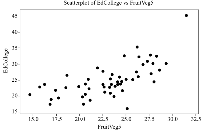
Interpretation: The obtained scatterplot of the data is plotted and it shows that there is moderate, linear, and positive relationship between the variables “FruitVeg5” and “EdCollege”.
(b)
To graph: A regression line to the scatter plot of the data with 5 fruits and vegetables per day and EdCollege.
(b)
Explanation of Solution
Graph: To draw the regression line of the provided data do the following steps in Minitab mentioned below:
Step 1: Enter the data into Minitab worksheet.
Step 2: Go to Graph, select Scatterplot and select with regression and click OK.
Step 3: Select the data variable column of “FruitVeg5” for x-axis and column of “EdCollege” for y-axis click on OK.
The obtained scatterplot is as follows:
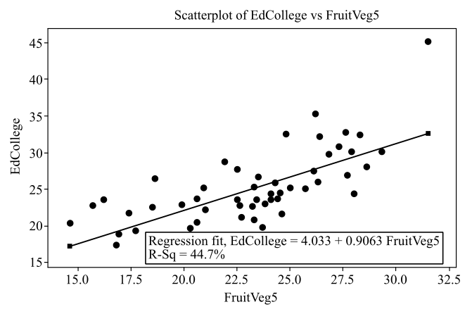
Interpretation: The obtained scatterplot of the data is plotted with regression line and it is observed that the regression line that fits best to the plot is given by
(c)
The position of some states in the scatterplot graph and write a summary on the comparison of these states with other states.
(c)
Answer to Problem 171E
Solution: The states District of Colombia, Massachusetts and West Virginia are away from the regression line whereas the states like Vermont, Rhode Island, Guam and Louisiana lies on the regression line.
Explanation of Solution
The scatterplot and the regression line of the data of the variables “FruitVeg5” and “EdCollege” is as follows:
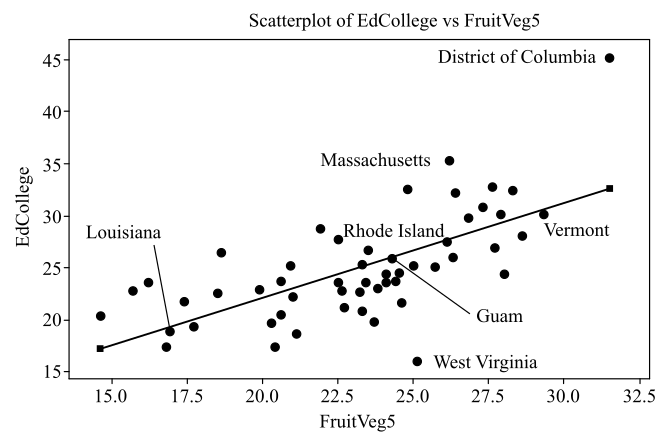
From the graph it can be seen that there is an outlier at the upper right of the scatterplot corresponds to District of Colombia, another outlier at the upper right of the scatterplot corresponds to Massachusetts, outlier at the lower middle of the scatterplot corresponds to West Virginia. These states are away from the regression line whereas the states like Vermont, Rhode Island, Guam and Louisiana lies on the regression line.
(d)
Whether earning a college degree is a cause people eat five servings of fruits and vegetables per day.
(d)
Answer to Problem 171E
Solution: The relationship between the variable cannot be considered as a result of the causation because there is a possibility of the presence of lurking and confounding variable.
Explanation of Solution
The scatterplot and the regression line of the data of the variables “FruitVeg5” and “EdCollege” is shown below and it shows that the relationship between the variables is linear and positive.
Though the diagram shows a positive and linear relationship, but it not indicates the causation. It may be possible that the
Want to see more full solutions like this?
Chapter 2 Solutions
LaunchPad for Moore's Introduction to the Practice of Statistics (12 month access)


- Discuss and explain in the picturearrow_forwardBob and Teresa each collect their own samples to test the same hypothesis. Bob’s p-value turns out to be 0.05, and Teresa’s turns out to be 0.01. Why don’t Bob and Teresa get the same p-values? Who has stronger evidence against the null hypothesis: Bob or Teresa?arrow_forwardReview a classmate's Main Post. 1. State if you agree or disagree with the choices made for additional analysis that can be done beyond the frequency table. 2. Choose a measure of central tendency (mean, median, mode) that you would like to compute with the data beyond the frequency table. Complete either a or b below. a. Explain how that analysis can help you understand the data better. b. If you are currently unable to do that analysis, what do you think you could do to make it possible? If you do not think you can do anything, explain why it is not possible.arrow_forward
- 0|0|0|0 - Consider the time series X₁ and Y₁ = (I – B)² (I – B³)Xt. What transformations were performed on Xt to obtain Yt? seasonal difference of order 2 simple difference of order 5 seasonal difference of order 1 seasonal difference of order 5 simple difference of order 2arrow_forwardCalculate the 90% confidence interval for the population mean difference using the data in the attached image. I need to see where I went wrong.arrow_forwardMicrosoft Excel snapshot for random sampling: Also note the formula used for the last column 02 x✓ fx =INDEX(5852:58551, RANK(C2, $C$2:$C$51)) A B 1 No. States 2 1 ALABAMA Rand No. 0.925957526 3 2 ALASKA 0.372999976 4 3 ARIZONA 0.941323044 5 4 ARKANSAS 0.071266381 Random Sample CALIFORNIA NORTH CAROLINA ARKANSAS WASHINGTON G7 Microsoft Excel snapshot for systematic sampling: xfx INDEX(SD52:50551, F7) A B E F G 1 No. States Rand No. Random Sample population 50 2 1 ALABAMA 0.5296685 NEW HAMPSHIRE sample 10 3 2 ALASKA 0.4493186 OKLAHOMA k 5 4 3 ARIZONA 0.707914 KANSAS 5 4 ARKANSAS 0.4831379 NORTH DAKOTA 6 5 CALIFORNIA 0.7277162 INDIANA Random Sample Sample Name 7 6 COLORADO 0.5865002 MISSISSIPPI 8 7:ONNECTICU 0.7640596 ILLINOIS 9 8 DELAWARE 0.5783029 MISSOURI 525 10 15 INDIANA MARYLAND COLORADOarrow_forward
- Suppose the Internal Revenue Service reported that the mean tax refund for the year 2022 was $3401. Assume the standard deviation is $82.5 and that the amounts refunded follow a normal probability distribution. Solve the following three parts? (For the answer to question 14, 15, and 16, start with making a bell curve. Identify on the bell curve where is mean, X, and area(s) to be determined. 1.What percent of the refunds are more than $3,500? 2. What percent of the refunds are more than $3500 but less than $3579? 3. What percent of the refunds are more than $3325 but less than $3579?arrow_forwardA normal distribution has a mean of 50 and a standard deviation of 4. Solve the following three parts? 1. Compute the probability of a value between 44.0 and 55.0. (The question requires finding probability value between 44 and 55. Solve it in 3 steps. In the first step, use the above formula and x = 44, calculate probability value. In the second step repeat the first step with the only difference that x=55. In the third step, subtract the answer of the first part from the answer of the second part.) 2. Compute the probability of a value greater than 55.0. Use the same formula, x=55 and subtract the answer from 1. 3. Compute the probability of a value between 52.0 and 55.0. (The question requires finding probability value between 52 and 55. Solve it in 3 steps. In the first step, use the above formula and x = 52, calculate probability value. In the second step repeat the first step with the only difference that x=55. In the third step, subtract the answer of the first part from the…arrow_forwardIf a uniform distribution is defined over the interval from 6 to 10, then answer the followings: What is the mean of this uniform distribution? Show that the probability of any value between 6 and 10 is equal to 1.0 Find the probability of a value more than 7. Find the probability of a value between 7 and 9. The closing price of Schnur Sporting Goods Inc. common stock is uniformly distributed between $20 and $30 per share. What is the probability that the stock price will be: More than $27? Less than or equal to $24? The April rainfall in Flagstaff, Arizona, follows a uniform distribution between 0.5 and 3.00 inches. What is the mean amount of rainfall for the month? What is the probability of less than an inch of rain for the month? What is the probability of exactly 1.00 inch of rain? What is the probability of more than 1.50 inches of rain for the month? The best way to solve this problem is begin by a step by step creating a chart. Clearly mark the range, identifying the…arrow_forward
- Client 1 Weight before diet (pounds) Weight after diet (pounds) 128 120 2 131 123 3 140 141 4 178 170 5 121 118 6 136 136 7 118 121 8 136 127arrow_forwardClient 1 Weight before diet (pounds) Weight after diet (pounds) 128 120 2 131 123 3 140 141 4 178 170 5 121 118 6 136 136 7 118 121 8 136 127 a) Determine the mean change in patient weight from before to after the diet (after – before). What is the 95% confidence interval of this mean difference?arrow_forwardIn order to find probability, you can use this formula in Microsoft Excel: The best way to understand and solve these problems is by first drawing a bell curve and marking key points such as x, the mean, and the areas of interest. Once marked on the bell curve, figure out what calculations are needed to find the area of interest. =NORM.DIST(x, Mean, Standard Dev., TRUE). When the question mentions “greater than” you may have to subtract your answer from 1. When the question mentions “between (two values)”, you need to do separate calculation for both values and then subtract their results to get the answer. 1. Compute the probability of a value between 44.0 and 55.0. (The question requires finding probability value between 44 and 55. Solve it in 3 steps. In the first step, use the above formula and x = 44, calculate probability value. In the second step repeat the first step with the only difference that x=55. In the third step, subtract the answer of the first part from the…arrow_forward
 Glencoe Algebra 1, Student Edition, 9780079039897...AlgebraISBN:9780079039897Author:CarterPublisher:McGraw Hill
 Big Ideas Math A Bridge To Success Algebra 1: Stu...AlgebraISBN:9781680331141Author:HOUGHTON MIFFLIN HARCOURTPublisher:Houghton Mifflin Harcourt
 Holt Mcdougal Larson Pre-algebra: Student Edition...AlgebraISBN:9780547587776Author:HOLT MCDOUGALPublisher:HOLT MCDOUGAL
 Functions and Change: A Modeling Approach to Coll...AlgebraISBN:9781337111348Author:Bruce Crauder, Benny Evans, Alan NoellPublisher:Cengage Learning
 College AlgebraAlgebraISBN:9781305115545Author:James Stewart, Lothar Redlin, Saleem WatsonPublisher:Cengage Learning