Videos
a.
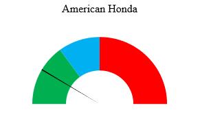
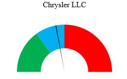
Create a gauge for each automaker.
a.
Explanation of Solution
The gauge for each automaker can be made using the Excel software.
Software Procedure:
Enter the data in Excel using following steps:
Open Excel sheet and name column A as Complaint (A1) and column B as Gauge (B1).
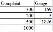
Enter 300, 200 and 500 in the cells A2:A4 (complaint levels-low, medium and high) and 1000 in A5 (sum of all entries in the column).
Under the gauge column, enter 169 (number of complaints received by American Honda) in B2, 5 (width of the pointer of the gauge) in B3, and enter the formula,
The constructed table in excel looks as follows:
Procedure to construct Gauge:
Select both the columns together.
Go to Insert > Charts > All Charts > Combo > Create Custom Combo Chart…
Change the first Chart type to Doughnut and second Chart type to Pie.
Check the secondary axis box for Pie and keep the secondary axis box for doughnut unchecked.
Click on OK.
Click on graph and go to Format and select Series “gauge� from the drop-down box in the Current Selection area.
Click on Format Selection in the Current Selection area.
In the Format Data Series area, change the ‘Angle of first slice’ of the secondary Axis to
Use Ctrl plus the right arrow key to move to each section of the pie.
Go to the Series ‘gauge’ Point 1 using the above method.
Click on Fill & Line option in the Format Data Series area.
Under the Fill list, select no fill.
Do the same above three steps to select solid fill (Black color) for Series ‘gauge’ Point 2 and no fill for Series ‘gauge’ Point 3.
From the drop-down box in the Current Selection area change Series “gauge� to Series ‘Complaint’.
Click on Format Selection in the Current Selection area.
In the Format Data Series area, change the ‘Angle of first slice’ of the secondary Axis to
Use Ctrl plus the right arrow key to move to each section of the doughnut.
Go to the Series ‘Complaint’ Point 1 using the above method.
Click on Fill & Line option in the Format Data Series area.
Under the Fill list, select solid fill and choose a green color.
Perform the same above three steps to select solid fill (blue color) for Series ‘Complaint’ Point 2, solid fill (red color) for Series ‘Complaint’ Point 3 and no fill for Series ‘Complaint’ Point 4.
Delete legends from the pie chart.
Rename the chart title as per the company.
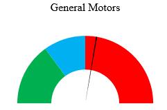
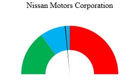
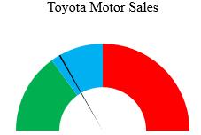
Now, replace the number of complaints received by individual automakers to obtain the respective gauge one by one.
From the above procedure, the obtained gauge for each automaker are as follows:

b.
Construct the bullet graph for the automakers.
b.
Explanation of Solution
The bullet graph for the automakers can be created using the Excel software.
Software procedure:
Step by step procedure to create the required bullet graph is as follows:
Enter the given data in Excel and select the data.
Select Insert, then the bar chart icon, and select first 2-D Bar gallery item (Clustered bar).
In the newly constructed bar chart, click on plus sign and uncheck Gridlines.
Right click in the whitespace to the right of chart title and click Format chart area in the shortcut menu.
In the fill part of format chart area pane select No fill.
In the cell
Select Insert, then the bar chart icon, and select second 2-D bar gallery item (Stacked bar).
In the newly constructed bar chart, click on plus sign and uncheck every box.
Right click in the white space to the right of chart title area and click on Select Data in the shortcut menu.
In the data Select Source Dialog box, click Switch Row/Column and then click on OK.
Right click one stacked bar and then click on Format Data Series. In the series option part, change the gap width to
Adjust the size of chart and right click the chart border and select Send to Back > Send to Back in the shortcut menu.
Drag the bar chart with transparent background over the stacked bar chart, such that both charts coincide.
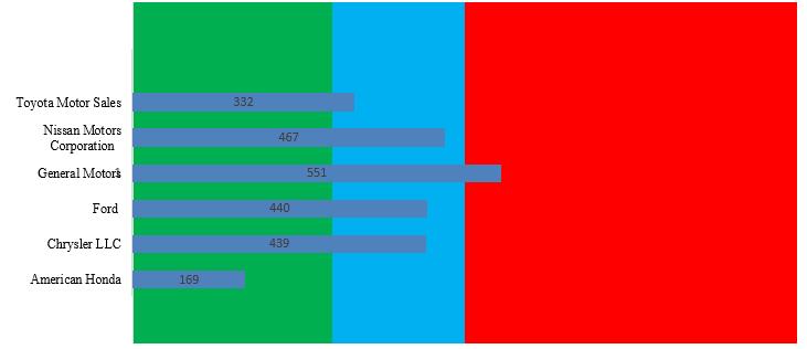
The obtained bullet graph in Excel is as shown below:
c.
Mention the display that is more effective at comparing the number of complaints received by each automaker.
c.
Explanation of Solution
The bullet graph displays the data in a single graph, while gauges should be plotted for each automaker separately. Thus, the bullet graph is a more efficient way to display the data as it requires less space than the gauges. Moreover, the bullet graph also provides the ease of comparing the data at the same time.
Want to see more full solutions like this?
Chapter 17 Solutions
Basic Business Statistics, Student Value Edition (13th Edition)


- 1. A consumer group claims that the mean annual consumption of cheddar cheese by a person in the United States is at most 10.3 pounds. A random sample of 100 people in the United States has a mean annual cheddar cheese consumption of 9.9 pounds. Assume the population standard deviation is 2.1 pounds. At a = 0.05, can you reject the claim? (Adapted from U.S. Department of Agriculture) State the hypotheses: Calculate the test statistic: Calculate the P-value: Conclusion (reject or fail to reject Ho): 2. The CEO of a manufacturing facility claims that the mean workday of the company's assembly line employees is less than 8.5 hours. A random sample of 25 of the company's assembly line employees has a mean workday of 8.2 hours. Assume the population standard deviation is 0.5 hour and the population is normally distributed. At a = 0.01, test the CEO's claim. State the hypotheses: Calculate the test statistic: Calculate the P-value: Conclusion (reject or fail to reject Ho): Statisticsarrow_forward21. find the mean. and variance of the following: Ⓒ x(t) = Ut +V, and V indepriv. s.t U.VN NL0, 63). X(t) = t² + Ut +V, U and V incepires have N (0,8) Ut ①xt = e UNN (0162) ~ X+ = UCOSTE, UNNL0, 62) SU, Oct ⑤Xt= 7 where U. Vindp.rus +> ½ have NL, 62). ⑥Xn = ΣY, 41, 42, 43, ... Yn vandom sample K=1 Text with mean zen and variance 6arrow_forwardA psychology researcher conducted a Chi-Square Test of Independence to examine whether there is a relationship between college students’ year in school (Freshman, Sophomore, Junior, Senior) and their preferred coping strategy for academic stress (Problem-Focused, Emotion-Focused, Avoidance). The test yielded the following result: image.png Interpret the results of this analysis. In your response, clearly explain: Whether the result is statistically significant and why. What this means about the relationship between year in school and coping strategy. What the researcher should conclude based on these findings.arrow_forward
- A school counselor is conducting a research study to examine whether there is a relationship between the number of times teenagers report vaping per week and their academic performance, measured by GPA. The counselor collects data from a sample of high school students. Write the null and alternative hypotheses for this study. Clearly state your hypotheses in terms of the correlation between vaping frequency and academic performance. EditViewInsertFormatToolsTable 12pt Paragrapharrow_forwardA smallish urn contains 25 small plastic bunnies – 7 of which are pink and 18 of which are white. 10 bunnies are drawn from the urn at random with replacement, and X is the number of pink bunnies that are drawn. (a) P(X = 5) ≈ (b) P(X<6) ≈ The Whoville small urn contains 100 marbles – 60 blue and 40 orange. The Grinch sneaks in one night and grabs a simple random sample (without replacement) of 15 marbles. (a) The probability that the Grinch gets exactly 6 blue marbles is [ Select ] ["≈ 0.054", "≈ 0.043", "≈ 0.061"] . (b) The probability that the Grinch gets at least 7 blue marbles is [ Select ] ["≈ 0.922", "≈ 0.905", "≈ 0.893"] . (c) The probability that the Grinch gets between 8 and 12 blue marbles (inclusive) is [ Select ] ["≈ 0.801", "≈ 0.760", "≈ 0.786"] . The Whoville small urn contains 100 marbles – 60 blue and 40 orange. The Grinch sneaks in one night and grabs a simple random sample (without replacement) of 15 marbles. (a)…arrow_forwardSuppose an experiment was conducted to compare the mileage(km) per litre obtained by competing brands of petrol I,II,III. Three new Mazda, three new Toyota and three new Nissan cars were available for experimentation. During the experiment the cars would operate under same conditions in order to eliminate the effect of external variables on the distance travelled per litre on the assigned brand of petrol. The data is given as below: Brands of Petrol Mazda Toyota Nissan I 10.6 12.0 11.0 II 9.0 15.0 12.0 III 12.0 17.4 13.0 (a) Test at the 5% level of significance whether there are signi cant differences among the brands of fuels and also among the cars. [10] (b) Compute the standard error for comparing any two fuel brands means. Hence compare, at the 5% level of significance, each of fuel brands II, and III with the standard fuel brand I. [10] �arrow_forward
- Analyze the residuals of a linear regression model and select the best response. yes, the residual plot does not show a curve no, the residual plot shows a curve yes, the residual plot shows a curve no, the residual plot does not show a curve I answered, "No, the residual plot shows a curve." (and this was incorrect). I am not sure why I keep getting these wrong when the answer seems obvious. Please help me understand what the yes and no references in the answer.arrow_forwarda. Find the value of A.b. Find pX(x) and py(y).c. Find pX|y(x|y) and py|X(y|x)d. Are x and y independent? Why or why not?arrow_forwardAnalyze the residuals of a linear regression model and select the best response.Criteria is simple evaluation of possible indications of an exponential model vs. linear model) no, the residual plot does not show a curve yes, the residual plot does not show a curve yes, the residual plot shows a curve no, the residual plot shows a curve I selected: yes, the residual plot shows a curve and it is INCORRECT. Can u help me understand why?arrow_forward
 Glencoe Algebra 1, Student Edition, 9780079039897...AlgebraISBN:9780079039897Author:CarterPublisher:McGraw Hill
 Big Ideas Math A Bridge To Success Algebra 1: Stu...AlgebraISBN:9781680331141Author:HOUGHTON MIFFLIN HARCOURTPublisher:Houghton Mifflin Harcourt
 Holt Mcdougal Larson Pre-algebra: Student Edition...AlgebraISBN:9780547587776Author:HOLT MCDOUGALPublisher:HOLT MCDOUGAL
 Functions and Change: A Modeling Approach to Coll...AlgebraISBN:9781337111348Author:Bruce Crauder, Benny Evans, Alan NoellPublisher:Cengage Learning