Concept explainers
Videos
(a)
To graph: A
(a)
Explanation of Solution
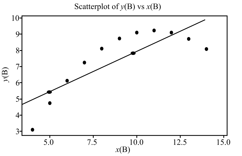
Graph: A scatterplot is the graphical representation of the relationship between two quantitative variables for the same individuals. The explanatory variable is represented on the horizontal axis and the response variable is represented on the vertical axis.
In the provided problem, x is the explanatory variable and y is the response variable. To obtain the scatterplot for the provided data, Minitab is used. The steps followed to obtain the scatterplot are as follows:
Step 1: Open the Minitab file that contains the provided data.
Step 2: Go to Graph and then select Scatterplot.
Step 3: Select Simple and click Ok.
Step 4: Enter “y (A)” in the Y variables column and “x (A)” in the X variables column and click Ok.
The scatterplot appears as obtained in the Minitab file.
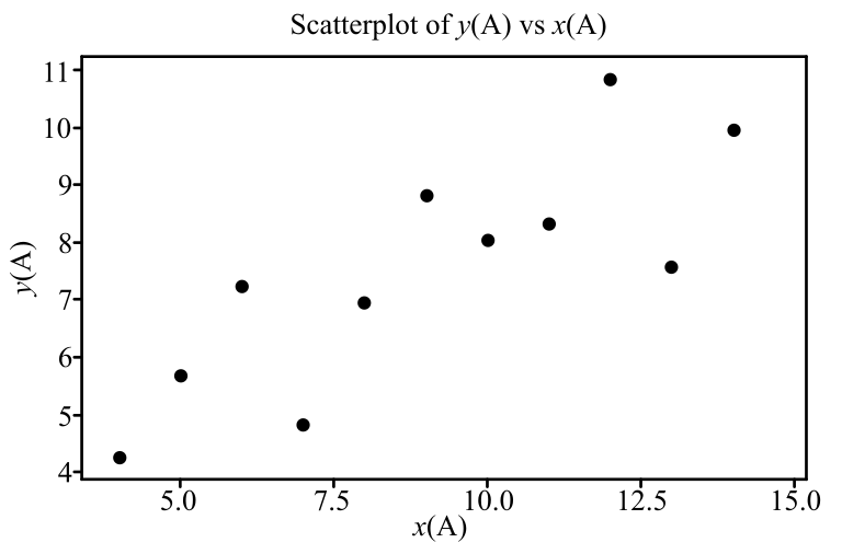
In the scatterplot, the horizontal axis shows the x values and the vertical axis shows the y values.
Graph: The scatterplot shows that there is a moderate linear association between the variables.
To graph: The regression line for the provided regression equation for data set A.
Explanation:
Calculation:
To draw the regression line, use the provided equation to predict the y for
The predicted y for
Therefore, the points are
Graph:
Step 1: Open the scatterplot obtained in previous part.
Step 2: Mark the two obtained points
Step 3: Connect the two points through a line.
The regression line appears on the scatterplot as follows:
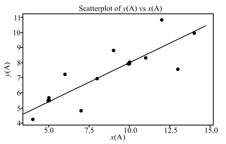
The line that passes through the two points
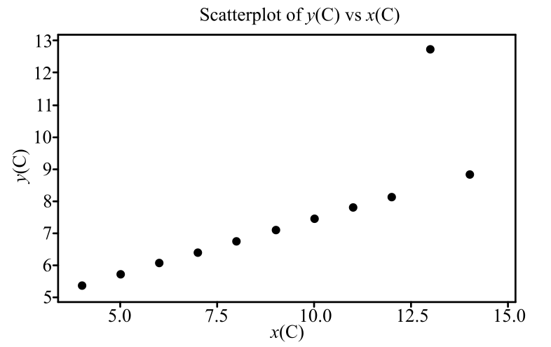
To graph: A scatterplot for the provided data set B.
Explanation:
Graph: A scatterplot is the graphical representation of the relationship between two quantitative variables for the same individuals. The explanatory variable is represented on the horizontal axis and the response variable is represented on the vertical axis.
In the provided problem, x is the explanatory variable and y is the response variable. To obtain the scatterplot for the provided data, Minitab is used. The steps followed to obtain the scatterplot are as follows:
Step 1: Open the Minitab file that contains the provided data.
Step 2: Go to Graph and then select Scatterplot.
Step 3: Select Simple and click Ok.
Step 4: Enter “y (B)” in the Y variables column and “x (B)” in the X variables column and click Ok.
The scatterplot appears as obtained in the Minitab file.
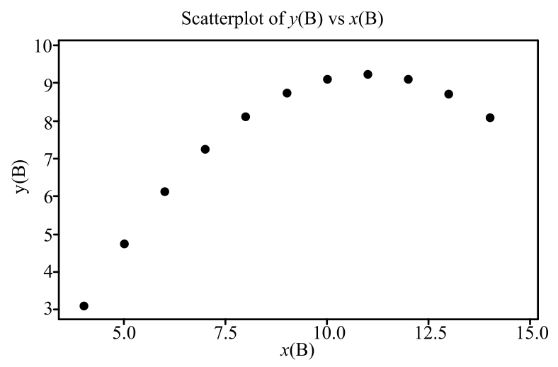
In the scatterplot, the horizontal axis shows the x values and the vertical axis shows the y values.
Interpretation: The scatterplot shows that there is a nonlinear relationship or a curved relationship between the variables.
To graph: The regression line for the provided regression equation for data set B.
Explanation:
Calculation:
To draw the regression line, use the provided equation to predict the y for
The predicted y for
Therefore, the points are
Graph:
Step 1: Open the scatterplot obtained in previous part.
Step 2: Mark the two obtained points
Step 3: Connect the two points through a line.
The regression line appears on the scatterplot as follows:
The line that passes through the two points
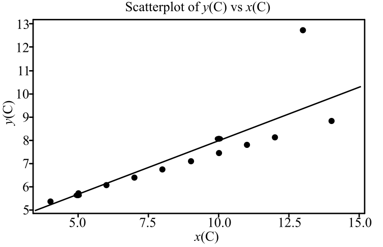
To graph: A scatterplot for the provided data set C.
Explanation:
Graph: A scatterplot is the graphical representation of the relationship between two quantitative variables for the same individuals. The explanatory variable is represented on the horizontal axis and the response variable is represented on the vertical axis.
In the provided problem, x is the explanatory variable and y is the response variable. To obtain the scatterplot for the provided data, Minitab is used. The steps followed to obtain the scatterplot are as follows:
Step 1: Open the Minitab file that contains the provided data.
Step 2: Go to Graph and then select Scatterplot.
Step 3: Select Simple and click Ok.
Step 4: Enter “y (C)” in the Y variables column and “x (C)” in the X variables column and click Ok.
The scatterplot appears as obtained in the Minitab file.
In the scatterplot, the horizontal axis shows the x values and the vertical axis shows the y values.
Interpretation: The scatterplot shows that there is an extreme outlier. The association can be linear if the outlier is omitted.
To graph: The regression line for the provided regression equation for data set C.
Explanation:
Calculation:
To draw the regression line, use the provided equation to predict the y for
The predicted y for
Therefore, the points are
Graph:
Step 1: Open the scatterplot obtained in previous part.
Step 2: Mark the two obtained points
Step 3: Connect the two points through a line.
The regression line appears on the scatterplot as follows:
The line that passes through the two points
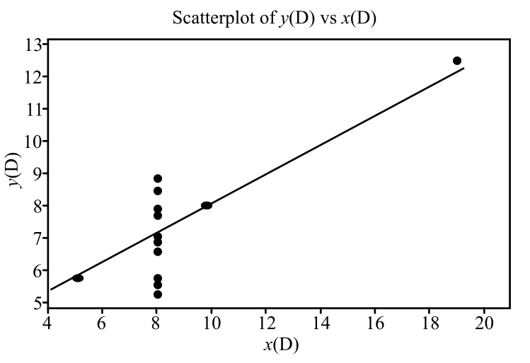
To graph: A scatterplot for the provided data set D.
Explanation:
Graph: A scatterplot is the graphical representation of the relationship between two quantitative variables for the same individuals. The explanatory variable is represented on the horizontal axis and the response variable is represented on the vertical axis.
In the provided problem, x is the explanatory variable and y is the response variable. To obtain the scatterplot for the provided data, Minitab is used. The steps followed to obtain the scatterplot are as follows:
Step 1: Open the Minitab file that contains the provided data.
Step 2: Go to Graph and then select Scatterplot.
Step 3: Select Simple and click Ok.
Step 4: Enter “y (D)” in the Y variables column and “x (D)” in the X variables column and click Ok.
The scatterplot appears as obtained in the Minitab file.
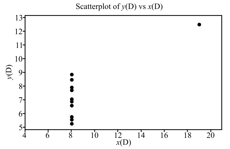
In the scatterplot, the horizontal axis shows the x values and the vertical axis shows the y values.
Interpretation: The scatterplot shows that there is an extreme influential point. The other points alone do not predict any indication for slope of the line.
To graph: The regression line for the provided regression equation for data set D.
Explanation:
Calculation:
To draw the regression line, use the provided equation to predict the y for
The predicted y for
Therefore the points are
Graph:
Step 1: Open the scatterplot obtained in previous part.
Step 2: Mark the two obtained points
Step 3: Connect the two points through a line.
The regression line appears on the scatterplot as follows:
The line that passes through the two points
(b)
To find: The data set for which the provided regression line equation is best suited to predict y for provided
(b)
Answer to Problem 26E
Solution: The provided regression line equation is best suited to predict y for provided
Explanation of Solution
Calculation:
For the data set A, the regression line seems to have a moderate linear association between the variables. Hence the use of the regression line equation is reasonable.
For the data set B, the scatterplot does not show any obvious linear relationship. It shows a curved relationship, and hence, the regression line equation cannot fit the data set B.
For the data set C, the point
For the data set D, the point
Want to see more full solutions like this?
Chapter 15 Solutions
Statistics: Concepts and Controversies


- Show all workarrow_forwardplease find the answers for the yellows boxes using the information and the picture belowarrow_forwardA marketing agency wants to determine whether different advertising platforms generate significantly different levels of customer engagement. The agency measures the average number of daily clicks on ads for three platforms: Social Media, Search Engines, and Email Campaigns. The agency collects data on daily clicks for each platform over a 10-day period and wants to test whether there is a statistically significant difference in the mean number of daily clicks among these platforms. Conduct ANOVA test. You can provide your answer by inserting a text box and the answer must include: also please provide a step by on getting the answers in excel Null hypothesis, Alternative hypothesis, Show answer (output table/summary table), and Conclusion based on the P value.arrow_forward
- A company found that the daily sales revenue of its flagship product follows a normal distribution with a mean of $4500 and a standard deviation of $450. The company defines a "high-sales day" that is, any day with sales exceeding $4800. please provide a step by step on how to get the answers Q: What percentage of days can the company expect to have "high-sales days" or sales greater than $4800? Q: What is the sales revenue threshold for the bottom 10% of days? (please note that 10% refers to the probability/area under bell curve towards the lower tail of bell curve) Provide answers in the yellow cellsarrow_forwardBusiness Discussarrow_forwardThe following data represent total ventilation measured in liters of air per minute per square meter of body area for two independent (and randomly chosen) samples. Analyze these data using the appropriate non-parametric hypothesis testarrow_forward
 MATLAB: An Introduction with ApplicationsStatisticsISBN:9781119256830Author:Amos GilatPublisher:John Wiley & Sons Inc
 Probability and Statistics for Engineering and th...StatisticsISBN:9781305251809Author:Jay L. DevorePublisher:Cengage Learning
 Statistics for The Behavioral Sciences (MindTap C...StatisticsISBN:9781305504912Author:Frederick J Gravetter, Larry B. WallnauPublisher:Cengage Learning
 Elementary Statistics: Picturing the World (7th E...StatisticsISBN:9780134683416Author:Ron Larson, Betsy FarberPublisher:PEARSON
 The Basic Practice of StatisticsStatisticsISBN:9781319042578Author:David S. Moore, William I. Notz, Michael A. FlignerPublisher:W. H. Freeman
 Introduction to the Practice of StatisticsStatisticsISBN:9781319013387Author:David S. Moore, George P. McCabe, Bruce A. CraigPublisher:W. H. Freeman