Which two of the four scatter plots have most positive correlation and closer to zero correlation

A First Course in Probability (10th Edition)
10th Edition
ISBN:9780134753119
Author:Sheldon Ross
Publisher:Sheldon Ross
Chapter1: Combinatorial Analysis
Section: Chapter Questions
Problem 1.1P: a. How many different 7-place license plates are possible if the first 2 places are for letters and...
icon
Related questions
icon
Concept explainers
Question

Which two of the four scatter plots have most positive correlation and closer to zero correlation

The image contains a grid with four scatter plots, labeled A, B, C, and D.

- **Scatter Plot A (Top Left):** This chart shows a negative correlation between the two variables. The data points are distributed such that as the value of one variable increases, the other decreases.

- **Scatter Plot B (Top Right):** This chart displays a positive correlation. The data points suggest that as one variable increases, so does the other, forming an upward trend.

- **Scatter Plot C (Bottom Left):** This plot has a random distribution of points, indicating no clear correlation between the variables. The data points are scattered without a discernible pattern.

- **Scatter Plot D (Bottom Right):** Similar to Plot C, this plot also shows a spread of data points with no evident correlation, suggesting a lack of a linear relationship between the variables.

Each scatter plot illustrates a different type of correlation, useful for understanding how pairs of variables might be related.
Transcribed Image Text:The image contains a grid with four scatter plots, labeled A, B, C, and D. - **Scatter Plot A (Top Left):** This chart shows a negative correlation between the two variables. The data points are distributed such that as the value of one variable increases, the other decreases. - **Scatter Plot B (Top Right):** This chart displays a positive correlation. The data points suggest that as one variable increases, so does the other, forming an upward trend. - **Scatter Plot C (Bottom Left):** This plot has a random distribution of points, indicating no clear correlation between the variables. The data points are scattered without a discernible pattern. - **Scatter Plot D (Bottom Right):** Similar to Plot C, this plot also shows a spread of data points with no evident correlation, suggesting a lack of a linear relationship between the variables. Each scatter plot illustrates a different type of correlation, useful for understanding how pairs of variables might be related.
Expert Solution
Step 1

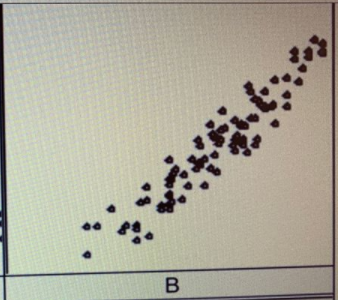
The most positive correlation is showing in plot B because there is an increasing trend present.
Probability homework question answer, step 1, image 1


steps

Step by step

Solved in 2 steps with 2 images

Blurred answer
Knowledge Booster
Correlation, Regression, and Association
Learn more about
Need a deep-dive on the concept behind this application? Look no further. Learn more about this topic, probability and related others by exploring similar questions and additional content below.
Similar questions
Recommended textbooks for you
A First Course in Probability (10th Edition)
Probability
ISBN:
9780134753119
Author:
Sheldon Ross
Publisher:
PEARSON
A First Course in Probability
Probability
ISBN:
9780321794772
Author:
Sheldon Ross
Publisher:
PEARSON