the data below show the percentage of students who use public transportation to commute to school. a. scatter plot the data with excel or a graphing calculator and then use linear regression to model the data. write your model the coefficients to two decimal places and define all variables. b. what does your model predict the percentage will be in 2004? c. what does your model estimate the percentage was in 2010? d. what is the y-intercept of your model? interpret it in the context of the problem using the correct unit. year x.years after 2000 % use public trans 2000 0 20.1
the data below show the percentage of students who use public transportation to commute to school.
a.
b. what does your model predict the percentage will be in 2004?
c. what does your model estimate the percentage was in 2010?
d. what is the y-intercept of your model? interpret it in the context of the problem using the correct unit.
year x.years after 2000 % use public trans
2000 0 20.1
2002 19.2
2004 18.8
2006 17.5
2008 1.7
2010 15.8
Hello! As you have posted more than 3 sub parts, we are answering the first 3 sub-parts. In case you require the unanswered parts also, kindly re-post that parts separately.
a.
Given data table is,
| year | x | % use public trans, y |
| 2000 | 0 | 20.1 |
| 2002 | 1 | 19.2 |
| 2004 | 2 | 18.8 |
| 2006 | 3 | 17.5 |
| 2008 | 4 | 1.7 |
| 2010 | 5 | 15.8 |
Scatter plot:
Steps to construct scatter plot in Excel:
- Enter the data for x and y in Excel sheet
- Select the columns of x and y
- Go to Insert menu.
- Click on “Insert scatter or bubble chart” option.
- Select Scatter under Charts.
- Under chart elements, check Trend line as linear.
Excel Output:
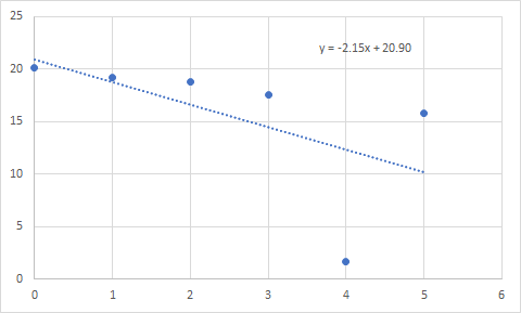
The scatter plot is,

From the scatter plot, y=20.90-2.15x
Step by step
Solved in 2 steps with 1 images


