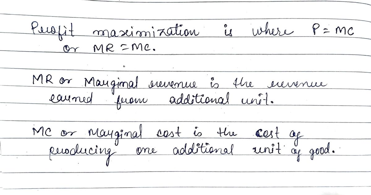
O Determine the profit maximizing level of output when the marketing price for the good is $75 unit. -show this on graph by making. drawing (straight edgej write # (good estinate) below graph
O Determine the profit maximizing level of output when the marketing price for the good is $75 unit. -show this on graph by making. drawing (straight edgej write # (good estinate) below graph
Chapter1: Making Economics Decisions
Section: Chapter Questions
Problem 1QTC
Related questions
Question
1A please follow instructions fill out graph. Assume that the hood being produced and sold is almonds measured in palettes. Follow word problem. Thanks show work

Transcribed Image Text:The image contains a graph that illustrates the relationship between price and quantity, with two curves labeled “MC” (Marginal Cost) and “ATC” (Average Total Cost).
### Graph Explanation:
- **Axes**:
- The horizontal axis represents the quantity produced or sold, ranging from 0 to 55 in increments of 5.
- The vertical axis represents the price, ranging from $0 to $105 in increments of 5.
- **Curves**:
- **MC (Marginal Cost)**: This curve generally slopes upward, indicating that the cost of producing an additional unit increases as the quantity increases.
- **ATC (Average Total Cost)**: This curve starts relatively high, declines, reaches a minimum, and then begins to rise again, showing the typical U-shape reflecting economies and diseconomies of scale. The point where it crosses the MC curve is of particular importance, often representing the efficient scale of production.
- **Intersection Point**:
- The curves intersect at a point labeled “I,” usually significant as it represents the price and quantity where the marginal cost equals the average total cost.
This graph is a typical representation used in economics to discuss concepts such as cost curves and optimal production levels. It’s an essential tool for understanding how firms determine pricing and output decisions to maximize efficiency and profit.

Transcribed Image Text:**Task: Determine the Profit Maximizing Level of Output**
1. **Objective:** Determine the profit maximizing level of output when the marketing price for the good is $75 per unit.
2. **Instructions:**
- Show this on a graph by making a drawing (use a straight edge).
- Write the estimated quantity (a good estimate) below the graph.
*Note: A graph should be included to visually represent the profit maximizing output level as per the given price.*
Expert Solution
Step 1
Step by step
Solved in 3 steps with 3 images

Knowledge Booster
Learn more about
Need a deep-dive on the concept behind this application? Look no further. Learn more about this topic, economics and related others by exploring similar questions and additional content below.Recommended textbooks for you

Principles of Economics (12th Edition)
Economics
ISBN:
9780134078779
Author:
Karl E. Case, Ray C. Fair, Sharon E. Oster
Publisher:
PEARSON

Engineering Economy (17th Edition)
Economics
ISBN:
9780134870069
Author:
William G. Sullivan, Elin M. Wicks, C. Patrick Koelling
Publisher:
PEARSON


Principles of Economics (12th Edition)
Economics
ISBN:
9780134078779
Author:
Karl E. Case, Ray C. Fair, Sharon E. Oster
Publisher:
PEARSON

Engineering Economy (17th Edition)
Economics
ISBN:
9780134870069
Author:
William G. Sullivan, Elin M. Wicks, C. Patrick Koelling
Publisher:
PEARSON
Principles of Economics (MindTap Course List)
Economics
ISBN:
9781305585126
Author:
N. Gregory Mankiw
Publisher:
Cengage Learning
Managerial Economics: A Problem Solving Approach
Economics
ISBN:
9781337106665
Author:
Luke M. Froeb, Brian T. McCann, Michael R. Ward, Mike Shor
Publisher:
Cengage Learning
Managerial Economics & Business Strategy (Mcgraw-…
Economics
ISBN:
9781259290619
Author:
Michael Baye, Jeff Prince
Publisher:
McGraw-Hill Education