

Make necessary Graph Chart of Highlight definiation with labels

Answer:
In the first case, the relationship between the two substitute goods is shown. Let the two substitute goods are good 1 (tea) and the good 2 (coffee).
As calculated there is a 6% increase in the price of a good (coffee) due to which there is a 5% increase in the demand for other goods (tea).
Graphical presentation:
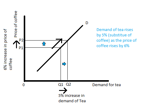
According to the above figure, the x-axis measures the demand for good 1 (tea), and the y-axis measures the price of good 2 (coffee) (y-axis measures the price of substitute). As given in the question quantity demand of a good (say good 1) has increased by 5% as the price of good 2 (say coffee) increases by 6%. In this case, there will be an upward movement along the D curve. The demand for tea has increased from Q1 to Q2 as the price of coffee increases from P1 to P2 keeping other things constant. in the case, of substitute goods, the curve will upward-sloping.

Step by step
Solved in 2 steps with 2 images


