Global average temperature compared to the middle of the 20th century W I 1880 1900 1920 -0.25° 1940 1960 +0.25° 1980 +0.50° +0.75°C I 2000 2019 This graph above and map below, both showing the global temperatures since 1880 as compared to the average global temperature for the mid-20th century years of 1951 - 1980. All temperatures are in degrees Celsius. The average is taken from the window of 1951-1980. The period of 1951-1980 was chosen largely because the U.S. National Weather Service uses a three-decade period to define "normal" or average temperature. The NASA GISS analysis effort began around 1980, so the most recent 30 years at the time was 1951-1980. It is also a period when many of today's adults grew up, so it is a common reference that many people can remember. Anomaly in temperatures refers to the comparison for a given place and time with the equivalent average temperature for that place and time based on data from a particular span of time So an
Global average temperature compared to the middle of the 20th century W I 1880 1900 1920 -0.25° 1940 1960 +0.25° 1980 +0.50° +0.75°C I 2000 2019 This graph above and map below, both showing the global temperatures since 1880 as compared to the average global temperature for the mid-20th century years of 1951 - 1980. All temperatures are in degrees Celsius. The average is taken from the window of 1951-1980. The period of 1951-1980 was chosen largely because the U.S. National Weather Service uses a three-decade period to define "normal" or average temperature. The NASA GISS analysis effort began around 1980, so the most recent 30 years at the time was 1951-1980. It is also a period when many of today's adults grew up, so it is a common reference that many people can remember. Anomaly in temperatures refers to the comparison for a given place and time with the equivalent average temperature for that place and time based on data from a particular span of time So an
MATLAB: An Introduction with Applications
6th Edition
ISBN:9781119256830
Author:Amos Gilat
Publisher:Amos Gilat
Chapter1: Starting With Matlab
Section: Chapter Questions
Problem 1P
Related questions
Question
Both images attached go together

Transcribed Image Text:Pacific
Ocean
CANADA
UNITED STATES
Degrees cooler or warmer in 2019
compared to the middle of the 20th century
-2°C
-1°
Atlantic
Ocean
BRAZIL
0°
Atlantic
Ocean
Southern
Ocean
SOUTH
AFRICA
RUSSIA
ANTARCTICA
No data
INDIA
Indian
Ocean
CHINA
AUSTRALIA
Pacific
Ocean
After looking closely at the graph and map above, think about these three questions:
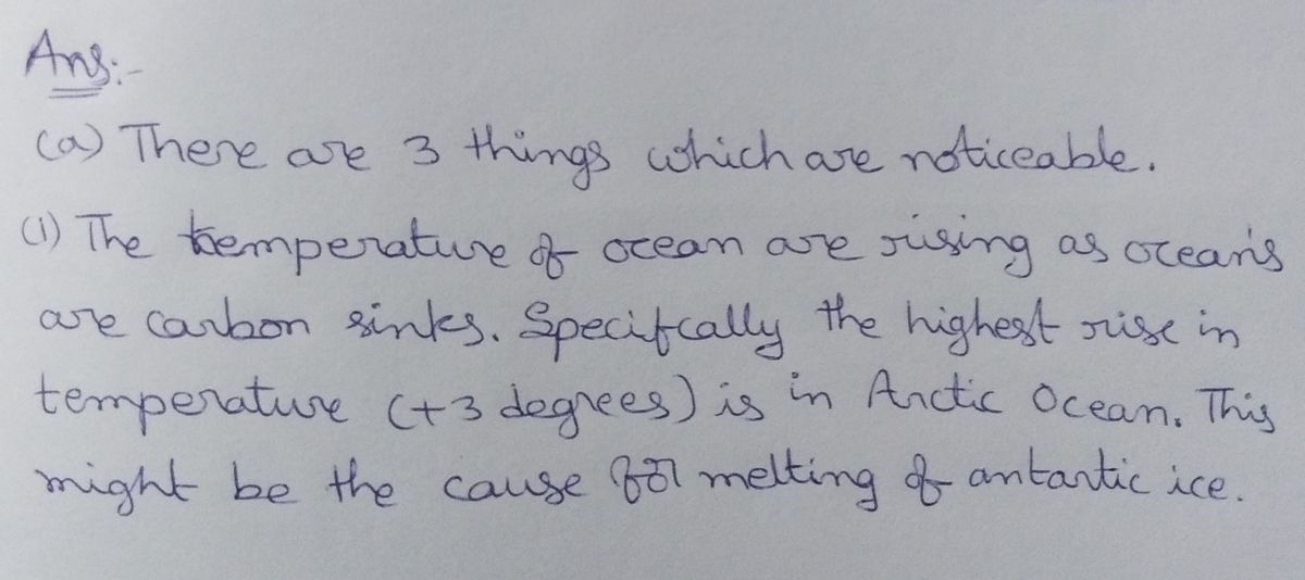
(a) What do you notice? Use a statistic(s) that supports your claim.
Note: There is no need to crunch any numbers. You can use the statistics given to you in the graphs.
(b) What do you wonder? What are you curious about that comes from what you notice in the graph
and map?
(c) What's going on in this graph and map? Write a catchy headline that captures the graph and map's
main idea. Best headline, IMHO, will get the EC

Transcribed Image Text:Global average temperature compared
to the middle of the 20th century
W
I
1880
1900
1920
-0.25°
1940
1960
+0.25°
1980
+0.50°
+0.75°C
1
2000
2019
This graph above and map below, both showing the global temperatures since 1880 as compared to the
average global temperature for the mid-20th century years of 1951 - 1980. All temperatures are in
degrees Celsius.
The average is taken from the window of 1951-1980. The period of 1951-1980 was chosen largely
because the U.S. National Weather Service uses a three-decade period to define "normal" or average
temperature. The NASA GISS analysis effort began around 1980, so the most recent 30 years at the
time was 1951-1980. It is also a period when many of today's adults grew up, so it is a common
reference that many people can remember.
Anomaly in temperatures refers to the comparison for a given place and time with the equivalent
average temperature for that place and time, based on data from a particular span of time. So an
anomaly of +0.5. C for a location would mean that the temperature there was 0.5 degrees higher than
the average for that location in the 30-year span from 1951-1980.
Expert Solution
Step 1

Step by step
Solved in 2 steps with 2 images

Recommended textbooks for you

MATLAB: An Introduction with Applications
Statistics
ISBN:
9781119256830
Author:
Amos Gilat
Publisher:
John Wiley & Sons Inc

Probability and Statistics for Engineering and th…
Statistics
ISBN:
9781305251809
Author:
Jay L. Devore
Publisher:
Cengage Learning

Statistics for The Behavioral Sciences (MindTap C…
Statistics
ISBN:
9781305504912
Author:
Frederick J Gravetter, Larry B. Wallnau
Publisher:
Cengage Learning

MATLAB: An Introduction with Applications
Statistics
ISBN:
9781119256830
Author:
Amos Gilat
Publisher:
John Wiley & Sons Inc

Probability and Statistics for Engineering and th…
Statistics
ISBN:
9781305251809
Author:
Jay L. Devore
Publisher:
Cengage Learning

Statistics for The Behavioral Sciences (MindTap C…
Statistics
ISBN:
9781305504912
Author:
Frederick J Gravetter, Larry B. Wallnau
Publisher:
Cengage Learning

Elementary Statistics: Picturing the World (7th E…
Statistics
ISBN:
9780134683416
Author:
Ron Larson, Betsy Farber
Publisher:
PEARSON

The Basic Practice of Statistics
Statistics
ISBN:
9781319042578
Author:
David S. Moore, William I. Notz, Michael A. Fligner
Publisher:
W. H. Freeman

Introduction to the Practice of Statistics
Statistics
ISBN:
9781319013387
Author:
David S. Moore, George P. McCabe, Bruce A. Craig
Publisher:
W. H. Freeman